
Donald Trump uses misleading map to overstate his support in fight against impeachment
Donald Trump sent an ominous message to his political enemies when he shared this map. But there is something blatantly wrong with it.

“Try to impeach this.”
That was Donald Trump’s defiant message to his political opponents this week as the push to impeach the US President and remove him from office gathered steam.
RELATED: What happens next in impeachment inquiry
RELATED: Trump labels impeachment efforts a ‘coup’
RELATED: Concerns grow for Trump whistleblower
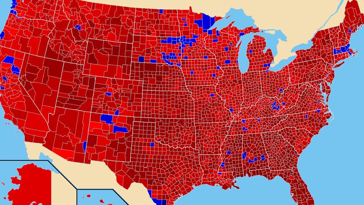
His words were plastered across a map of the United States, which showed the county-by-county results of the 2016 presidential election — an overwhelming sea of Republican red, surrounding small, isolated pockets of Democratic blue.
The implication was unmistakeable — the vast majority of the country is behind me. Impeach me if you dare.
— Donald J. Trump (@realDonaldTrump) October 1, 2019
Mr Trump’s map certainly looks impressive, but it doesn’t tell the full story.
First up, for the sake of accuracy, we should note that it incorrectly colours some of the counties won by Mr Trump’s opponent Hillary Clinton red. The most significant is probably Orange County, California.
That doesn’t disprove the broader point of the image though.
It is true that an overwhelming majority of counties voted for Mr Trump. He won 2626 of them, compared to Ms Clinton’s 487. A handful of incorrectly coloured counties doesn’t change that.
The bigger problem with the map is what it doesn’t show you at all.
Yes, Mr Trump won more than five times as many counties as Ms Clinton. But the number of counties matters less than the number of voters living in them, and crucially, Mr Trump’s were far more sparsely populated.
A huge chunk of that red space in the middle of the map is just that — empty space. Hardly anyone lives there.
So there is no distinction between a place like LA County, which has a population of 10.2 million, and somewhere like Loving County in Texas, with just 82 people.
In response to Mr Trump, people have been sharing an alternative graphic from XKCD, which shows the election results by population density. Each stick figure in this image represents 250,000 voters.
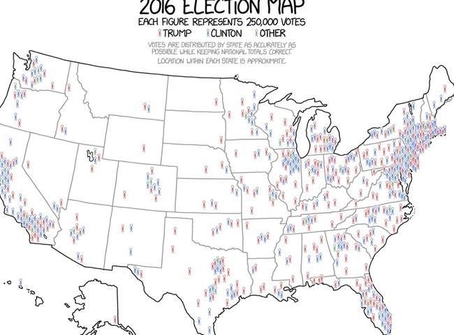
As you can see, it makes the election appear far more even.
The map Mr Trump shared is not inherently misleading. It gives you an entirely fair impression of the county-level results.
This is all about context.
While the map itself is mostly accurate, Mr Trump’s use of it to suggest Americans overwhelmingly support him is not.
Land doesn’t vote. People do.
And Mr Trump actually lost the popular vote to Ms Clinton — a fact she likes to point out whenever she gets the chance.
It wasn’t close either. The margin was 2.87 million votes.
For context, when George Bush controversially won the 2000 election despite losing the popular vote, his deficit was only 500,000.
In a purely practical sense, that number doesn’t matter. The American president is not elected by popular vote, but via the electoral college, a delightfully complicated system which you can read all about here.
RELATED: How the American electoral college works
Under the rules of that system, Mr Trump is a perfectly legitimate president.
He’s just not a popular one.
It is false for the President to claim a majority of Americans oppose impeachment. Polls show the country is essentially evenly split, after a recent surge in support for his removal.
And the 2016 election result has very little relevance to the question of impeachment anyway.
This map shows the even more lopsided county results from Richard Nixon’s victory over Democrat George McGovern in 1972.
Mr Nixon won 60.7 per cent of the vote (compared to Mr Trump’s 46.1 per cent) and 49 of America’s 50 states. It was a historic landslide.
A couple of years later, Mr Nixon resigned in disgrace, before Congress could impeach him over the Watergate scandal.
That’s not a sign Mr Trump will meet the same fate; merely a reminder of how quickly and brutally a president’s fortunes can turn.

UK shocks world with enormous call on Gaza
The British Prime Minister has made a huge call on the crisis in the Middle East, declaring “this is the moment to act”.

‘Excessive’: Anger rising over CEO salaries
Australia’s “millionaires factory” and its $24 million CEO have been delivered a humiliating rebuke by investors, with more top companies in the firing line.

‘No alternative’: Huge France call stuns world
The French President has left the world stunned with an enormous call on the Middle East crisis.