How did Australia get its new $5 note so wrong when other countries have got theirs so right?
AUSTRALIA’S new fiver has been savaged and even compared to vomit. So, how did we get our new note so wrong when other countries got theirs so right?

IT’S FAIR to say the reaction to Australia’s new $5 note has been mixed. And when I say “mixed”, I mean Australia is currently, as a nation, ropeable about what’s just happened to their beer tokens.
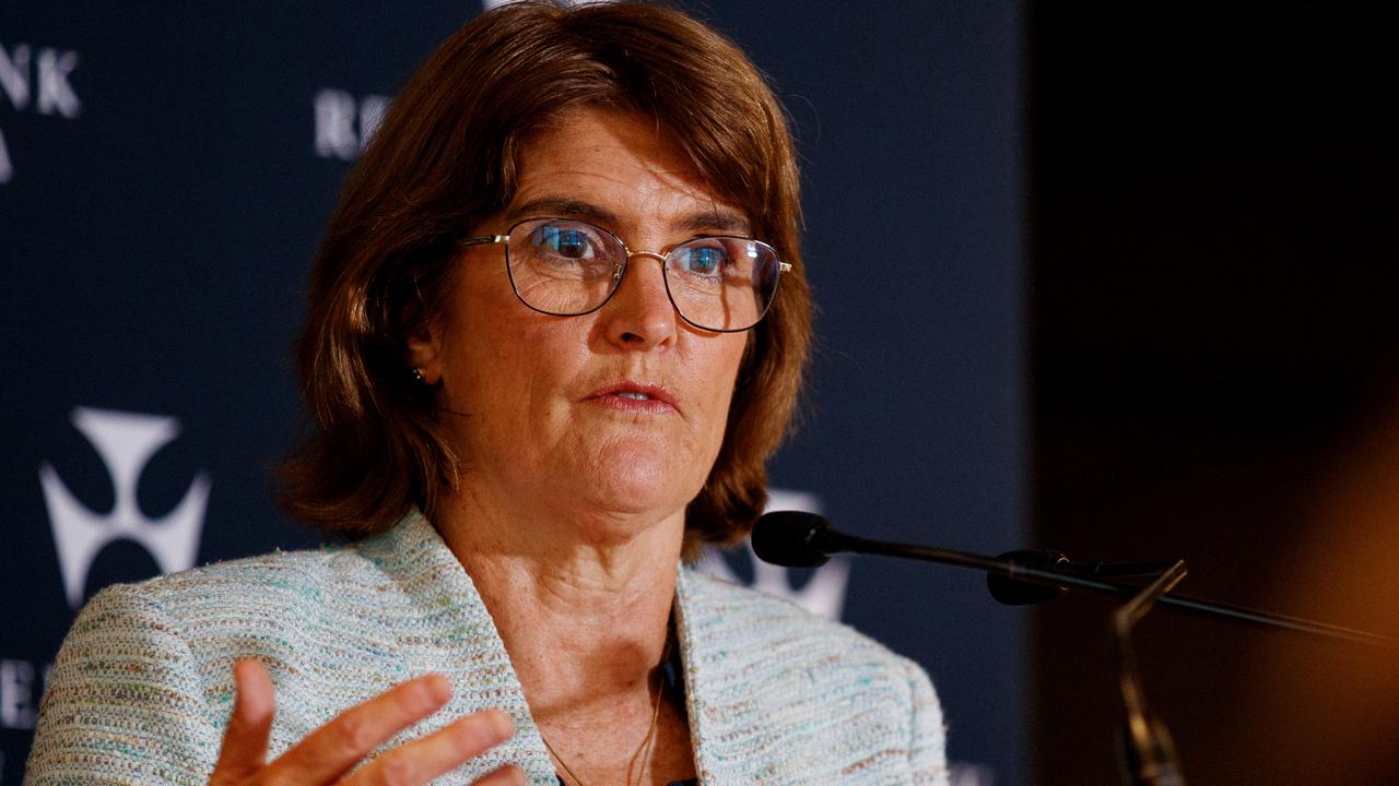
On Tuesday, Reserve Bank Governor Glenn Stevens lauded the new pink note’s true blue features: “Each banknote will depict a different species of Australian wattle and a native bird within a number of the elements. On the $5 banknote, these are the Prickly Moses wattle and the Eastern Spinebill.”
But it’s Australians themselves who are feeling prickly as the new note instantly faced an avalanche of criticism.
It has variously been called similar to a “mid-80s primary school mural”, having all the appeal of “vomit” or simply “HIIIIIIIIIDEOUS”.
Is that seriously it? Not a joke? Honestly, truly, the real design? Of a real banknote? For Australia? In 2016? https://t.co/8Susdm2bKP
— Dom Knight (@domknight) April 12, 2016
The new $5 note looks horrific. Looks like children's play money
— AJ (@AJ_M08) April 12, 2016
A thousand monkeys with a thousand versions of Photoshop could never come up with something as hideous as the new Australian $5 note.
— Chris Miller (@plumbat) April 12, 2016
Look, I've never been one to complain about soft lighting, but isn't it a tad ageist that Her Majesty looks HALF her age on the new $5 note?
— Lisa Wilkinson (@Lisa_Wilkinson) April 12, 2016
The Today Show’s Lisa Wilkinson even wondered if the Queen had been given a bit of a nip and tuck on the new note.
But it all could have been so different. Across the globe, central banks have been revamping their banknotes, coming up with truly memorable and, some might argue, more on point designs than Australia’s new fiver.
Norwegian Kroner
In 2014, the Scandinavian nation held a competition between professional graphic designers to revamp its currency. The theme was simply ‘the sea’.
The winning look for the reverse side of the notes, by design house Snøhetta, is a stunning and abstract rendition of the Beaufort wind scale.
The lower denomination notes depict slower winds and are more pixelated but the 1000 kroner note shows a fierce gale leaving long streaks in its path.
According to Norges Bank, the pixel motifs give the notes, “both a traditional and a modern expression”. The expression of Norwegians, who know a thing or two about design, is near universal approval.
Swiss Francs
Turn that banknote frown upside down and look to Switzerland where the bills are tipped on their side to stand tall like the nation’s mountains
The new 50 franc note, launched this month, features the Swiss Alps and dandelions blowing on the breeze. Similar to Norway’s design, competition winner Manuela Pfrunder said, “the wind dominates the narrative of the 50 franc note”.
But Switzerland’s design have not been without controversy. Designer Manuel Krebs originally won the competition to design the new notes but his sketchings, which featured blood cells and viruses, was scrapped after a public outcry.
Israeli New Shekel
Israel has been replacing it’s banknotes with stunning crisp and clear designs which are almost luminescent in their clarity in certain lights. The bright blue 200 shekel note features poet Natan Alterman and segments of his poems on the bills.
New Zealand Dollar
The kiwis have been getting plaudits all over the place for their new notes.
The new five, featuring Sir Edmund Hillary, has been nominated for the International Banknote Society’s Banknote of the Year. Yep, that’s an actual award.
On Monday, the country’s new $20 note was launched. Its centrepiece is a karearea, a New Zealand falcon, and the Governor-general even turned up to the launch with a real life falcon in tow. Which is pretty cool.
The Australian Dollar banknotes we gave up on
In 2010, the RBA approved a series of designs by Melbourne designer Garry Emery. Based on the current notes but bolder and simpler they were the starting point for a new $5 note. Some may have hoped they were the ending point too.
The Dame Edna Dollaroo
In October, a series of mock bank note designs by Melbourne artist Aaron Tyler were made public.
Dubbed the dollaroo, the Straya Cash notes took the current look as a starting point and jazzed it up, dumping the queen for Dame Edna and featuring the likes of Kath and Kim and Alf from Home and Away on a background of Vegemite jars and Lamingtons.
Given the reaction of the new notes, the dollaroo could now be a viable plan b.
benedict.brook@news.com.au


