
David Jones’ 180th anniversary: Why it would be ‘nuts’ for retailer to ditch its famous houndstooth pattern
IT DOESN’T show the company’s name. It doesn’t even have a logo. But the David Jones shopping bag does have something remarkable.


IT’S not a logo and it doesn’t even mention the company’s name, but a simple pattern is so instantly recognised by consumers that a branding expert has said it would be “nuts” to ever get rid of it.
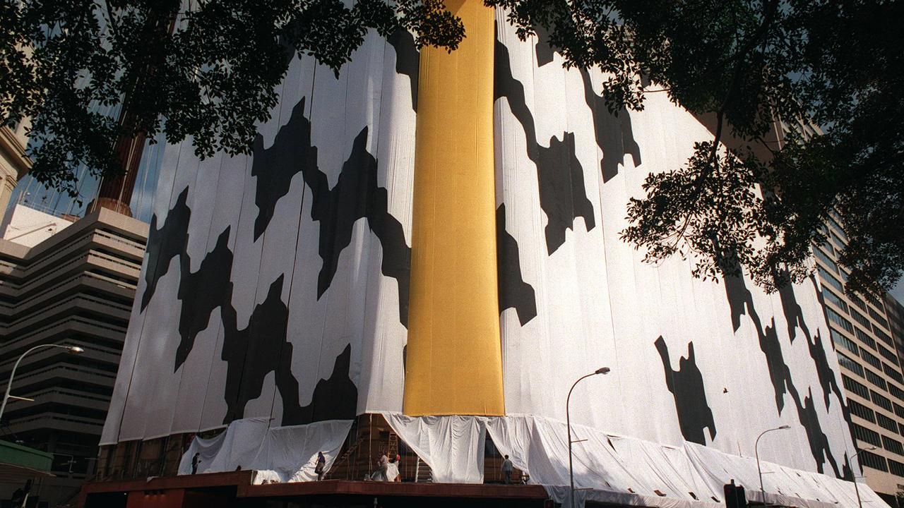
The houndstooth design, seen on many a carrier bag, is known throughout Australia as belonging to David Jones. But it’s almost unique. That’s because it’s one of a small number of marks, colours and even smells that bring to mind a brand even if the name isn’t present.
Today retailer David Jones celebrates 180 years since it opened its very first store in Sydney’s CBD. The company is so old, it predates the formation of Australia by more than six decades.
For more than half a century, the department store’s distinctive black-and-white houndstooth pattern has featured on everything from the bags to the garments draped over supermodels like Jessica Gomes.

Dr Dean Wilkie, a branding expert at the University of Adelaide, said having a visual image that lacked a name but was so closely linked to a company was “branding nirvana”.
“It’s a strong visual tool and a really important asset for DJs,” he told news.com.au.
“If they asked shoppers what the pattern reminds them of, an unbelievable number of people would say David Jones.”
Dr Wilkie said the houndstooth had taken its place alongside Cadbury’s colour purple and KFC’s Colonel Sanders — other nameless visuals that instantly evoke a brand.

David Thomas, the chief executive officer of David Jones, told news.com.au the houndstooth was “timeless” and was featured in the current autumn/winter collection.
“It’s a rare and treasured thing for any brand to have such an iconic brand identity, where people view an emblem or pattern and instantly associate it with a business or an experience. We are one of the lucky few and therefore the houndstooth remains a very important asset for us that we continue to value tremendously.”
How the houndstooth came to be, however, is not entirely clear. In a history of the company, author Helen O’Neill discovered that the origins of the pattern could stretch back to the 1950s when David and Charles Jones, the two great grandsons of the store’s eponymous founder, pondered a suitable paper to wrap up the retailer’s products.
“Charles would claim the brainwave struck one morning as her walked into his mother’s dressing room and spotted Christian Dior’s Miss Dior perfume,” O’Neill wrote.
“The packing of that scent bottle combined the Dior logo over a houndstooth pattern.”
Charles asked a designer to enlarge the graphic background, with the pattern making its store debut in around 1963.
But its origin has been disputed. Geoffrey Lee, a photographer who spent many years snapping the retailer’s models, has claimed he submitted a houndstooth design, in response to a request by DJs for new logo ideas. He says he was given 100 pounds for his troubles.
Whatever its inception, Dr Wilkie said the pattern has helped DJs stand out in a sea of similarly branded competitors.

“It’s amazing how stores trying to get up-market consumers use Times New Roman font and black and white. But if you see the houndstooth on a shopping bag, you know that person has been to DJs.”
The challenge for the retailer was to stay relevant and to live up to the promise that the houndstooth evoked.
“Their flagship stores in Sydney and Melbourne are beautiful. I remember being taken with my mum to a store and she could spend three hours there shopping and buying lunch.
“But those assets need to be invested in so they are still around in the next 180 years.”

Another worry would be if an overenthusiastic marketing manager wanted to make their mark but sweeping away the pattern. It would be a huge mistake, said Dr Wilkie.
“There are brands out there who would desperately seek this kind of asset so you ditch these icons at your peril,” he said.
Dr Wilkie said if DJs did away with the pattern, he could almost guarantee it would be resurrected later on, as tastes turned.
“If David Jones were ever to get rid of the houndstooth, I’d make an example of it in my class because it would be nuts. But unfortunately brands do that kind of thing far too easily.”
Mr Thomas said the use of the houndstooth had evolved and would continue to do so, but it was still on the bags and on DJs’ products.
“The houndstooth is so recognisable as David Jones, and you just don’t give up that kind of brand equity easily,” he said.
BRANDS WHERE AN IMAGE IS ALL YOU NEED
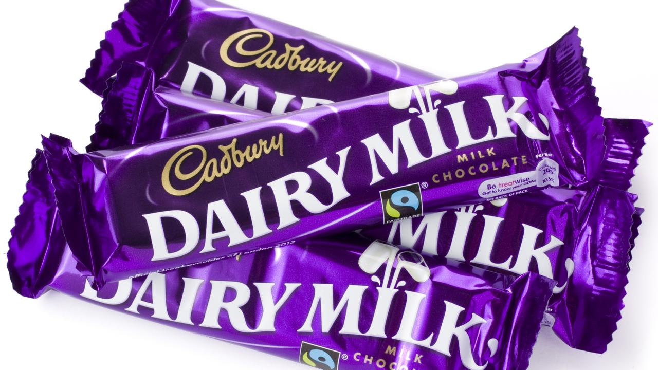
Cadbury’s colour purple
Remove the glass-and-a-half symbol and swirly font and the purple pack is still recognisably Cadbury. So protective is the brand of its hue, the company has had many global battles around the world to assert its ownership, often with arch rival Nestle.
In Australia it has won out, successfully trademarking Pantone 2685C — the official name of the colour.
“While the colour mark does not give Cadbury general ownership over all uses of that particular shade of purple, it does allow them to prevent competitors from using that shade, or a confusingly similar shade, for the packaging of their chocolate products,” states IP Australia.

Tiffany’s teal box
Don’t try opening a jewellery store with the same shade of robin egg blue as New York’s famous jeweller. The shade of teal is protected due to the fact it has become such a distinctive part of Tiffany’s marketing. Pantone named the colour 1837 for the year Tiffany & Co was founded.
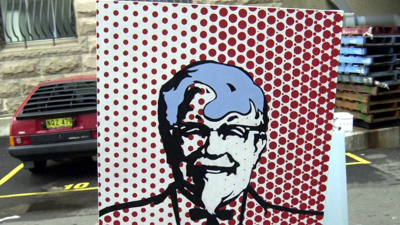
KFC’s Colonel Sanders
Colonel Harland Sanders opened his first chicken store in 1952 and went on to start a global goliath with his bespectacled and moustachioed face image as distinctive as the actual KFC brand name.

The smell of Play-Doh
It’s rare, but smells can be so distinctive they can be uniquely redolent of a brand. Last week, toy maker Hasbro succeeded in trademarking the aroma of Play-Doh.
The company describes the waft of Play-Doh as “sweet, slightly musky, vanilla fragrance, with slight overtones of cherry, combined with the smell of a salted, wheat-based dough”.


