
Aldi rolls out ‘fresh new’ logo
ALDI customers will notice something different about the discount supermarket in the near future, as it rolls out its first logo change in a decade.

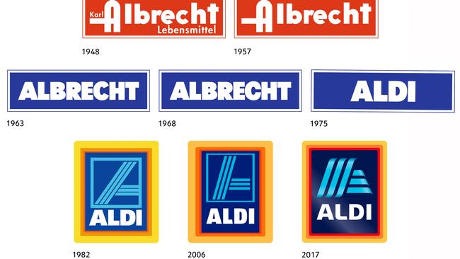
ALDI is rolling out a new logo for the first time in more than a decade.
The familiar blue lines inside a blue border will be replaced by a wavier, borderless version, while the “Aldi” font has also been changed.
The German discounter says the “fresh new look”, which will launch later this year, has been designed “to reflect the contemporary image of Aldi and key developments it has recently undertaken”.
“In Australia, this includes Aldi’s commitment to rolling out its new store format across all stores by 2020,” a spokeswoman said in a statement to news.com.au.
“For more than 50 years internationally and 16 in Australia, Aldi has been focused on a simple concept: high-quality products at the best possible price.
“The principle of simplicity is reflected in the new logo. Despite an updated appearance, it still contains the typical Aldi colours. Even the familiar ‘A’ symbol in light blue still forms part of the new logo, but now also functions as a modern independent design element.
“This is not the first time the appearance of the logo has been updated. Aldi’s first logo was created at the end of the 1940s by the Albrecht brothers for their grocery stores. Back then, the logo included a red background and the store name ‘Karl Albrecht Lebensmittel’ in white lettering.
“Following the transition to discount retail, a new logo design was introduced in 1963 which comprised the word ‘ALBRECHT’ in white letters on a blue background with a narrow white border. This version of the logo was then slightly modified for use in Austria and the USA.
“The original version of today’s logo was developed in 1982. This version included the cropped ‘A’ symbol on a blue background with a tricoloured border. In the years 2001 and 2006, several slight adjustments were also made to the logo’s colours.”
The new logo is being rolled out across the Aldi South group, which covers the likes of Austria, Switzerland, the UK, US, Australia and China. Aldi North is a separate group which operates in European countries including Spain, France and the Netherlands.
Aldi currently holds 8.9 per cent of Australia’s $105.3 billion supermarket and grocery industry, according to market research firm IBISWorld. Woolworths holds a 33.6 per cent share, followed by Coles with 29.3 per cent, IGA with 7.1 per cent and bulk retailer Costco with 2.3 per cent.
Last month, Woolworths revealed it had overtaken Coles in the crucial comparable sales growth metric for the first time in more than seven years in the second quarter, with sales increasing 3.1 per cent compared with Coles’ 0.9 per cent.
Aldi’s low-cost model has forced the two major supermarkets to lower their prices substantially over the past five years, eating into margins, and Aldi’s expansion into South Australia and WA has added further pressure.
Aldi stocks around 1350 product lines, compared with 20,000 to 25,000 at a typical Coles or Woolworths. Both supermarkets are attempting to reduce that number to move to higher-margin private label products, which now make up about 25 per cent of all groceries sold, according to IBISWorld.

Iconic Aussie retailer’s legal stoush
An iconic fashion label with more than 50 stores in Australia and New Zealand is facing legal action over alleged unpaid debts.

Spending surges on RBA rate cut hopes
Australian shoppers spent an astonishing amount online, with end of financial year sales and rate cut hopes driving customer demand.

Family of slain millionaire makes brutal call
The wealthy family of a slain businessman has been forced to make a “tough call” on their future, and they’ve done it with “heavy hearts”.