
The hidden meanings of our most well-known logos
WE SEE these brands every day, but everyone from CommBank to Jetstar is actually hiding a message in plain sight.


IT’S one of the most familiar sights in Australia — a yellow diamond, with a black chunk sliced out in one corner.
You’ve probably seen it on TV or online several times today and it hangs from hundreds — if not thousands — of branches.
The Commonwealth Bank logo is so recognisable, these days the bank doesn’t even use its full name in its advertising confident Australians will know the company by its logo alone.
But the CommBank logo has more to it than meets the eye. At least, initially.
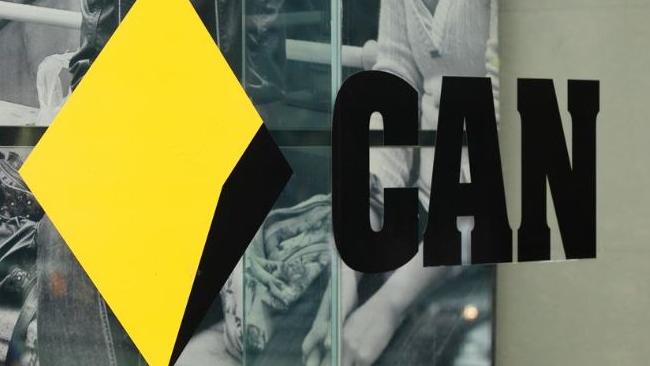
Squirrelled away in that diamond is the Southern Cross constellation.
It’s one of many logos — in Australia and abroad — that offer more than they are immediately letting on. Those geometric symbols and aerodynamic swooshes are more than just skin deep.
The co-ordinator of graphic design courses at the SAE Creative Media Institute in Melbourne, Adrian Bruch, told news.com.au one of the most well-known logos with a hidden meaning is the deceptively simple FedEx delivery symbol.
Hidden within it, in what is known as the ‘negative space’ between the letters, is an arrow denoting speed and direction.
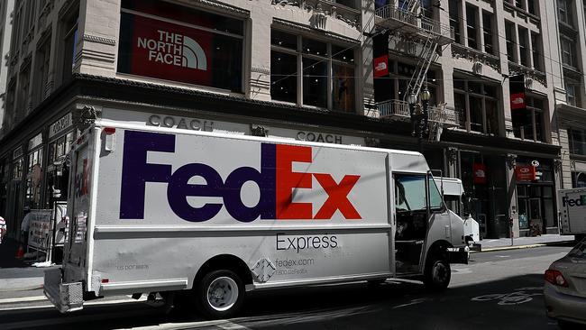
“Graphic designers embed cryptic references for several reasons,” he says. “One is because it adds a story to the brand another because you want people to spend more time with your brand and have that idea that they are an insider if can understand the hidden message.”
It’s not just logos with hidden shapes; sometimes brands will have meanings or stories within them that are deliberately vague or lost in time, urging you to delve deeper to solve the riddle.
“You want to have something people will look at again and again if you have something hidden they will do that,” Mr Bruch said.
So what are the hidden shapes and meanings in some of Australia’s — and the world’s — most well-known brands?
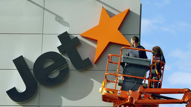
Jetstar
A classic of the hidden shape oeuvre, Qantas’ low cost subsidiary first took off in 2003.
Sure, its logo cleverly does away with the need to spell out the word ‘star’ by simply incorporating an actual star.
But, look closer — between the ‘Jet’ and the star is a forward pointing arrow.
It’s undoubtedly a nod to FedEx’s groundbreaking logo secret arrow, introduced almost a decade earlier.
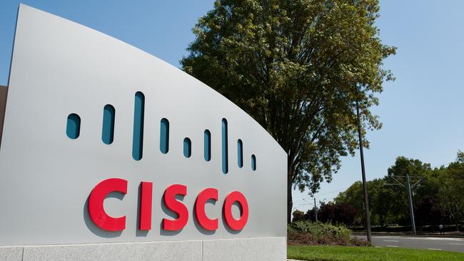
Cisco
The world’s largest networking company has a suitably techy logo, perhaps some data flashing across a screen?
But no, it’s actually an abstract rendition of San Francisco’s Golden Gate Bridge.
According to John Morgridge, Cisco’s former CEO, the founders hit on the name and logo while driving across the bridge to Sacramento to register the company.
That’s not the only clue to the company’s home town. ‘Cisco’ is San Francisco, without the ‘San Fran’.
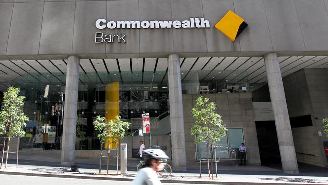
Commonwealth Bank
A surprisingly young logo only introduced in 1991. The shape is based on the formation of the Southern Cross constellation — each corner represents one of the five stars. The black wedge completes the diamond shape.

The CommBank logo has another surprise for the eagle eyed. Look closely at the double ‘m’ in ‘Commonwealth’ and you’ll see both letters are joined at the hip and share a central stalk. They have something in common harking back to the ‘Commonwealth’ name.
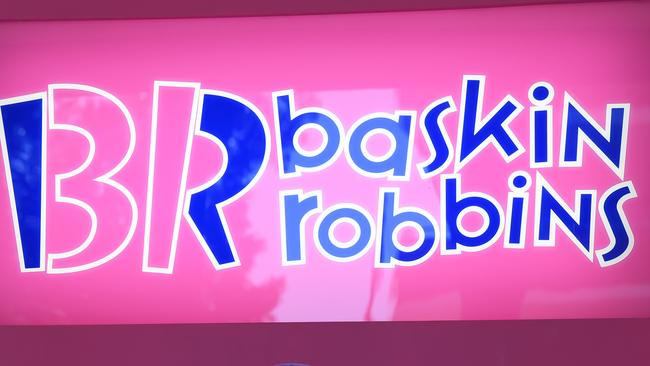
Baskin Robbins
Mr Bruch’s favourite hidden meaning logo. Within its shape is the number of original varieties of confection the ice creamery sold.
“I love the Baskin Robbins 31 logo. If you didn’t know they had 31 flavours it just looks like a modern B and R.”

Toblerone
One for the sweet toothed, the Toblerone mountain has a secret. Lurking in the peak is a reverse silhouette of a bear.
It harks back the chocolate bar’s founding in the Swiss city of Bern, the symbol of which is a bear.
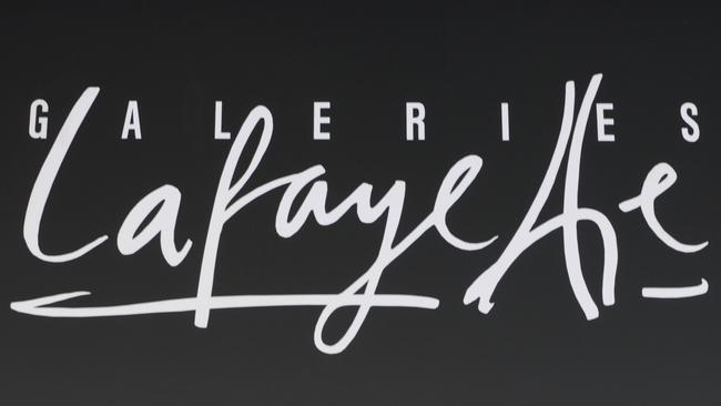
Galeries Lafayette
While we’re in Europe let’s hop over to France and luxury department store Galeries Lafayette — a must stop one stop indulgent shop in the heart of Paris.
It’s no mistake that the two ‘T’s in “Lafayette” come together to form the Eiffel Tower.
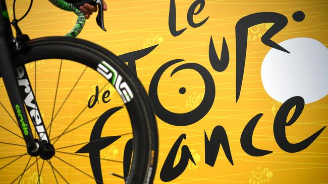
Le Tour de France
Lingering for a while in the beautiful French countryside, take a peek at the logo of the massive cycling race.
In the middle of logo, invisible on first glance, is a cyclist powering through the course. The ‘O’ of ‘Tour’ is a wheel and the ‘R’ is a rider head down and bum up.
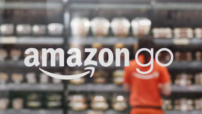
Amazon
Australia is abuzz awaiting the arrival of one of the biggest names in online retailing.
Previously Amazon had a fairly bland logo, but in recent years it’s been refreshed with a friendly smile. It’s more than a smile though — it’s an arrow getting your product, literally, from A to Z.
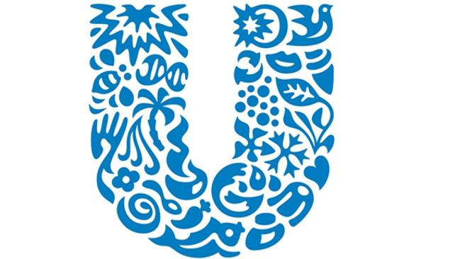
Unilever
If you’ve not seen this one, don’t kick yourself, it’s a logo that lurks in the supermarket shadows.
It’s probably on more products than any other in the store but you’d have to turn the pack over to see it. Unilever is the Anglo-Dutch giant which produces everything from Omo washing powder to Lipton and Bushell’s teas and Continental sauces.
It has a less a hidden logo and more an extremely complex one with lots of icons with no meaning. Yet every symbol has a role to play according to the company. “Each icon has a rich meaning at its core, and represents some aspect of our effort to make sustainable living commonplace,” the company says.
To name but two: an ice cream cone because it makes Streets ice cream and lips due to “openness and transparency” — apparently.
Not every icon has stood the test of time — a fish icon remains despite Unilever selling its Birds Eye frozen fish unit in 2012.

New Zealand Antarctic Research Institute
One from across the ditch. On first glance it’s a pleasing geometric shape. Not unlike the Commonwealth Bank. White too, as befits an institute with an eye on the South Pole. But it’s much more fun than that. It’s actually an abstract ice berg with just the tip above the ocean waves.

Jacob’s Creek wine
If you can’t see a wine glass, the leaves of the vineyard and the creek itself, you’re not trying hard enough.

ABC
An iconic Australian TV for sure, but what does that squiggle actually mean? It was designed by Bill Kennard in 1965 and was known as the ‘Lissajous’ after the French physicist Jules Lissajous who studied vibrations using tuning forks. The vibration shows up as a wavelength which became the logo.
“The three arms of the logo reflected the way broadcast engineers used Lissajous patterns to help tune equipment,” the ABC says.
“The three arms today can be seen to represent radio, television and online.”

$120m wiped out in childcare horror show
The company that operates the childcare centre at the heart of Victoria’s alleged child sex abuse horror is crashing, losing $120m in value since Tuesday.

What you need to do about Qantas password
Millions of Qantas customers have had their personal details hacked, but what about passwords? Here’s what Qantas says you need to do.

‘30-50’: Maccas CEO reveals big changes
An exclusive interview with the man leading Maccas in Australia has revealed big changes for the fast-food giant in the next 12 months.