
Burger King launches newly designed logo and food packaging for the first time in 20 years
In Australia, the franchise is known as Hungry Jack’s, but a global change is coming for the burger restaurant with a playful, bold and distinctive rebrand.
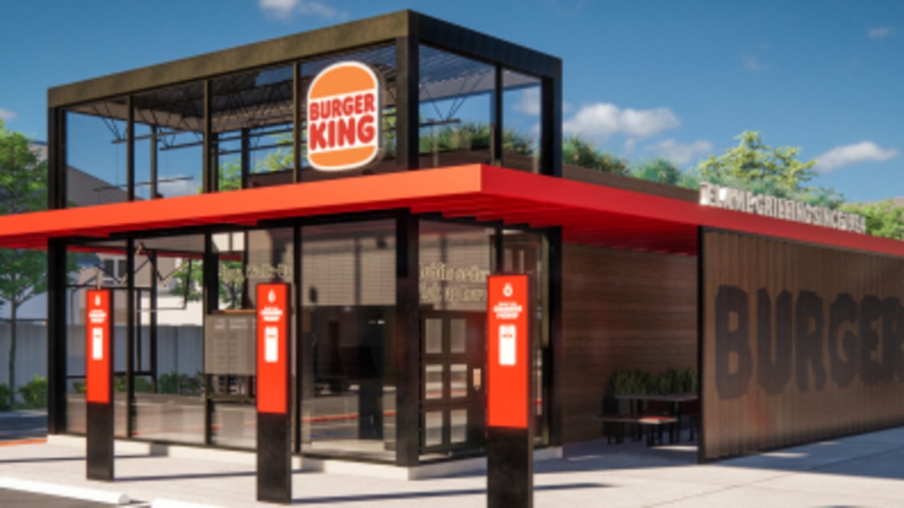
It’s a whopper of a makeover for Burger King — or Hungry Jack’s as its known in Australia — which has rolled out a range of new designs on everything from its logo to menu boards.
The overhaul was inspired by its food, which recently went through its own taste and quality change with the removal of artificial colours, flavours, and preservatives, the company said.
While the new logo is still recognisable, with the burger still prominent, the fast food giant has removed the blue curve that has been around since 1999.

But it’s not just the logo that has undergone a spruce up, with new restaurant signage and interiors, merchandise and staff uniforms also being transformed.
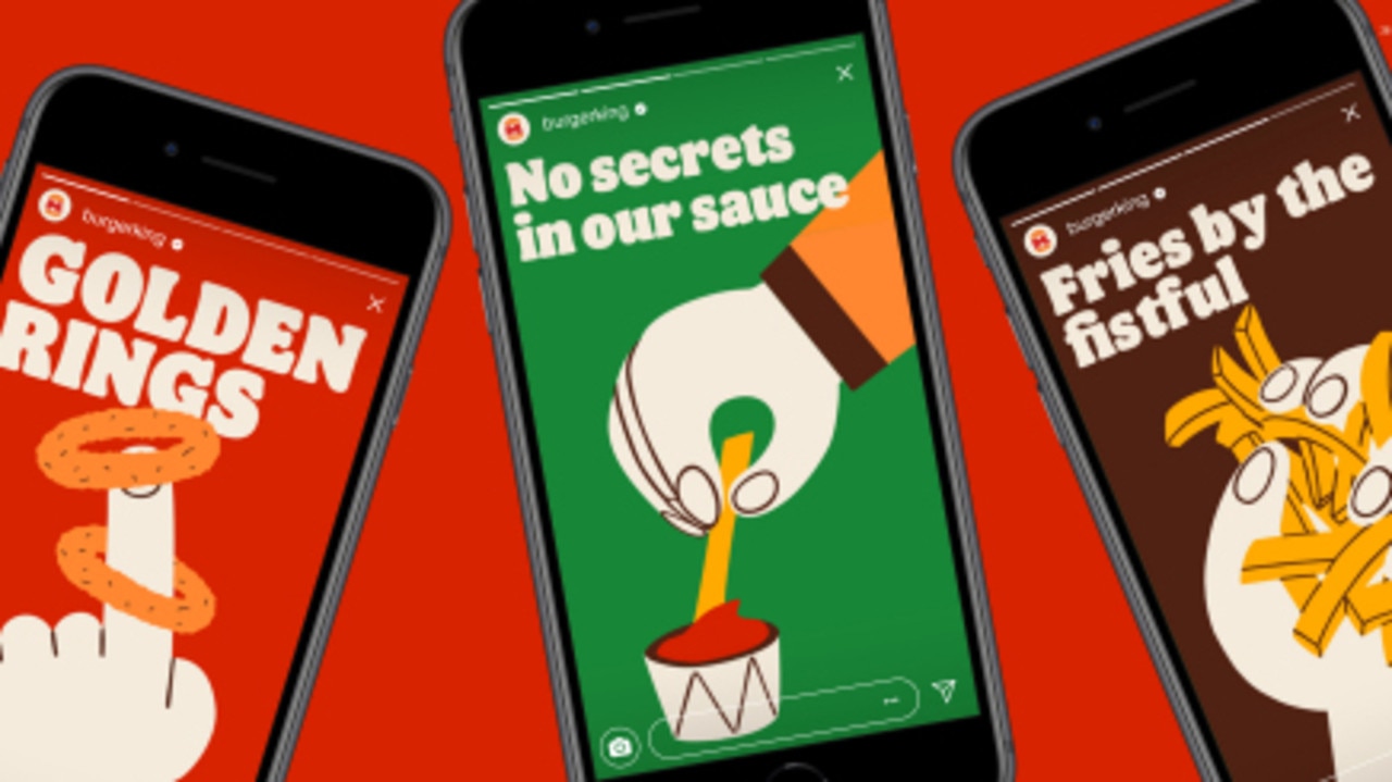
Food packaging will include “playful” illustrations of ingredients.
Colours in the new design are “rich and bold”, inspired by the iconic Burger King flame grilling process.
The company has even created its own proprietary brand of font called Flame, influenced by the “rounded, bold, yummy” shape of its food, it said.
New uniforms reflect flame grill masters, “mixing contemporary and comfortable style with distinctive colours and graphics”, it explained, and real life staff will be featured in advertising.
Design plays a vital role in creating desire for food and maximising guests’ experience, said Raphael Abreu, restaurant brands international head of design.
“We wanted to use design to get people to crave our food; its flame-grilling perfection and above all, its taste,” he said.
Restaurants in the US will be the first to be remodelled with the new look, although worldwide new advertisements, signage and packaging will be rolled out. It will take several years for the full redesign to reach the 19,000 Burger King restaurants around the world.
The new design may be part of a strategy to entice diners back into stores, after restaurant closures from the COVID-19 pandemic impacted profits in 2020.
Sales worldwide for stores open for at least a year dropped by seven per cent in the three months to September 30, reported Burger King.
It flagged further financial impact on the last quarter of the year, but has yet to release its results.

Pig farm horror ‘on another level’
A pig farm is staring down the barrel of “potential legal action” after pigs were put down on the orders of the RSPCA.

Private health giant shuts clinics
Australia’s largest private hospital company will shut 17 of its 20 psychology clinics in a matter of months.

‘Survive’: Aussie chocolatier’s big battle
A beloved boutique chocolate retailer is battling through a whopping rise in global cocoa prices, but Australia’s sweet tooth is helping out.