Paper Cuts competition sees school students redesign book covers and imagine book trailers
IMAGINE if schoolkids were allowed to design the covers of their favourite books? Or make a book trailer — Spielberg-style — in praise of their literary lions? Pick your favourite
IMAGINE if schoolkids were allowed to design the covers of their favourite books?
Or make a book trailer — Spielberg-style — in praise of their literary lions?
PAPER Cuts 2014, an Education Department competition open to all Victorian secondary-school-aged students, did just that. The results are amazing.
The children are hoping you’ll definitely be judging the books by their covers.
Here we reveal some of the finalists and what they were hoping to achieve.
The students loved the quirky and creative challenge and tell us what inspired them. The judges included Eoin Colfer, internationally acclaimed, Ireland-based author of the popular Artemis Fowl series, Half Moon Investigations and The Supernaturalist, and Beth Frey, producer of Logie-award winning teen action-adventure series, Nowhere Boys.
More than 8000 people voted in the peoples’ choice category.
While the winners have just been announced we’ll let you choose which ones you think are best before letting you know which won.
Scroll down to see the winners, and add your comments below about whether you agree with the verdicts.
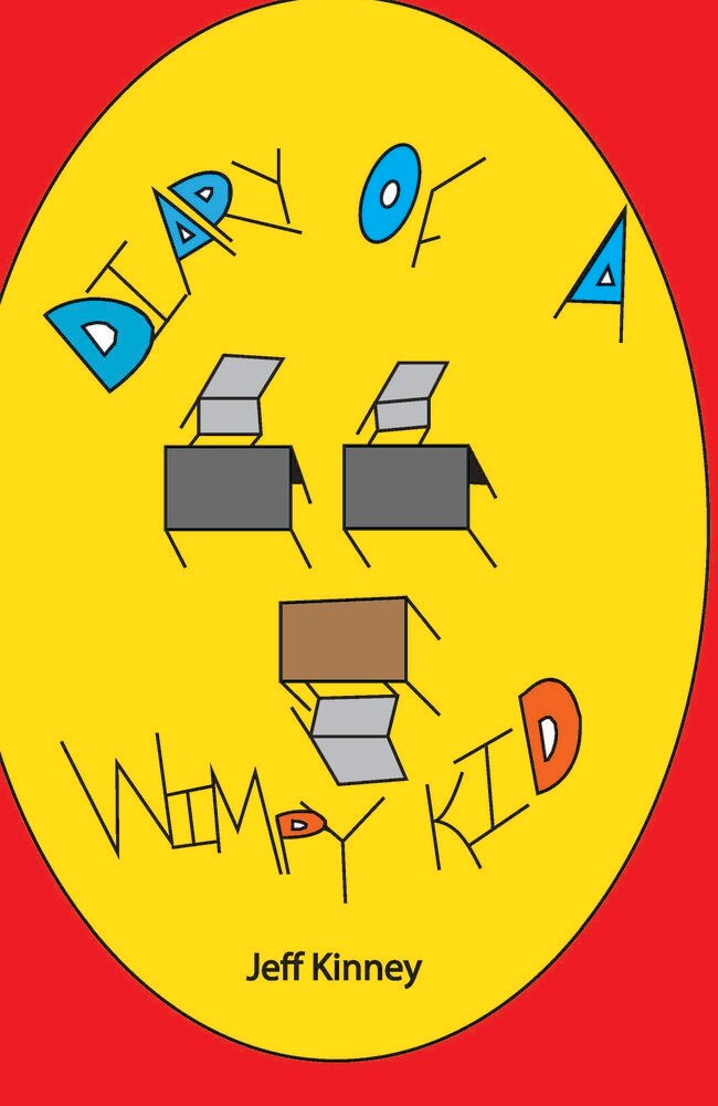
Diary of a Wimpy Kid by Jeff Kinney
Christopher Barakat, Antonine College
“The use of bright colours was influenced by Pop Art … the bright colours in the book cover bring out the poster, and it is more appealing to the people that will buy the book. The chairs and tables illustrate what the book is about and how mainly it is set at a school.
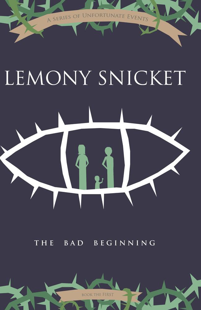
The Bad Beginning by Lemony Snicket
Olivia Wirata, Matthew Flinders Girls Secondary College
A Series of Unfortunate Events by Lemony Snicket was a series of books I read during my childhood. I loved the mystery of the book and it taught me many lessons about the world. The series had a great influence on me and I will always love the way it was written and the adventure it took me on when reading.
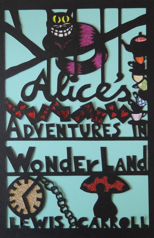
Alice’s Adventures in Wonderland by Lewis Carroll
Katharine Parker, McGuire College, Shepparton
I thought this classic book needed a different style for the cover. I cut the design from a single piece of paper and highlighted each picture with patterned, shiny and glittery papers. Each section represents part of the story; a pocket watch (White Rabbit), playing cards (Queen of Hearts), a mushroom (Caterpillar and growing/shrinking), teacups (Mad Hatter’s tea party) and the Cheshire cat.
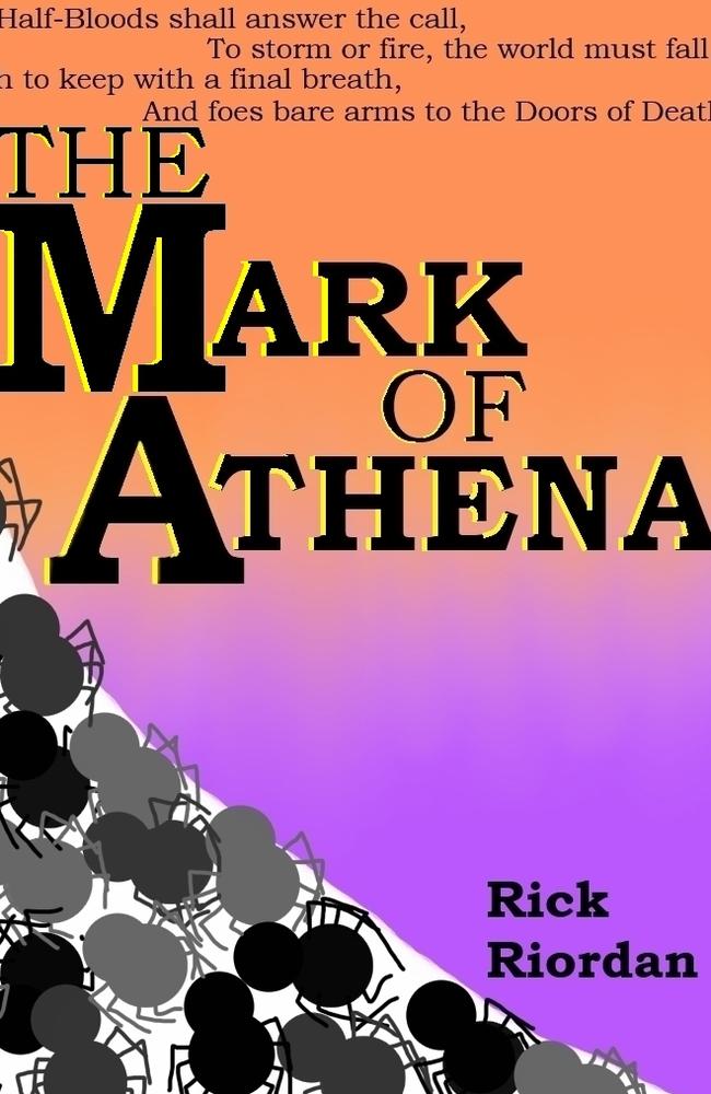
The Mark of Athena by Rick Riordan
Hannah Fitzgerald, Kilbreda College
I did a background with the colours of orange and purple, because these are the colours of the two camps in the story. The spiders represent the servants of Arachne. I included the prophecy at the top of the cover because the series is based on this.
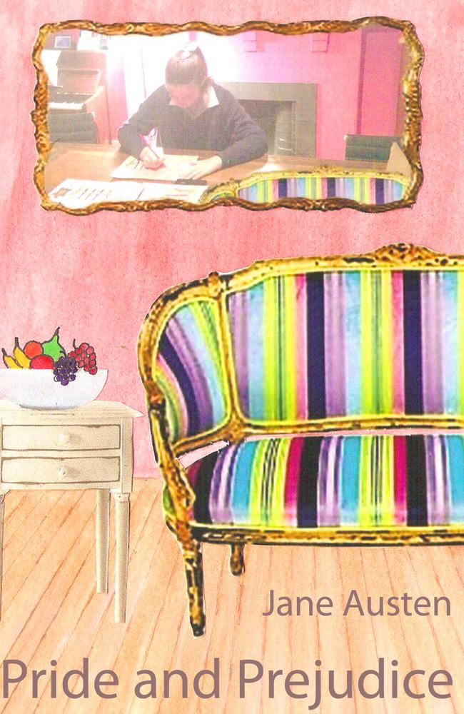
Pride and Prejudice by Jane Austen
Lauren Girardi, Loreto Mandeville Hall
Pride and Prejudice displayed a common theme of letter writing. This is reflected in the mirror in my design. In Pride and Prejudice, the written word is used as a dramatic device to further the plot and aid in the development of characters. These letters are most commonly written within the Barrett family drawing room which I have attempted to recreate in a more contemporary setting.

Obernewtyn by Isobelle Carmody
Bridgette Van Diepen, Nossal High School
Obernewytn presents a frightening and complex world which has been devastated by a nuclear holocaust. Its young heroine, Elspeth Gordie, takes the reader on a journey far into the mountains where she must unravel and confront a terrifying future, which will shape that of all remaining humanity. I’ve chosen to focus on her journey for my cover. Dark colours are used to reflect the almost tangible darkness present within this society. The birds and cat play vital roles in the development of the storyline within the novel.
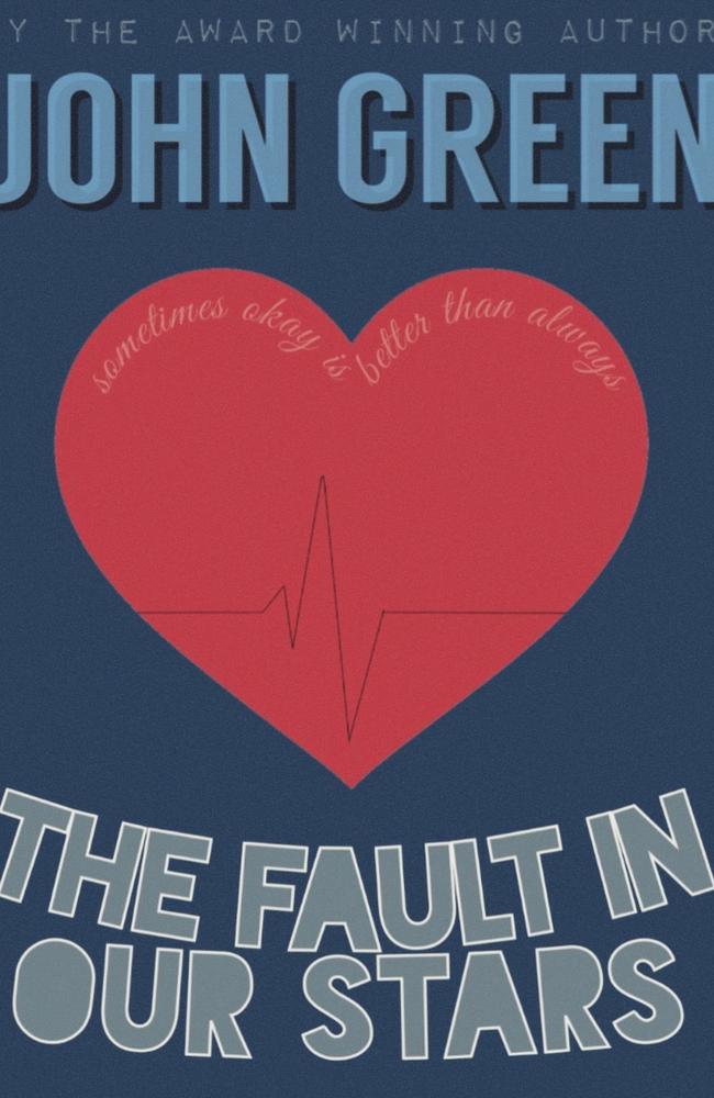
The Fault in Our Stars, John Green
Flynn Gilder-Smith, Northcote High School
My cover shows the faults and imperfections of love through the heart rate chart and love heart. The tagline means that sometimes being crazy in love within numbered days is better than having an average relationship forever. I decided to keep my colour scheme/design simple and bold which I think will draw readers in.
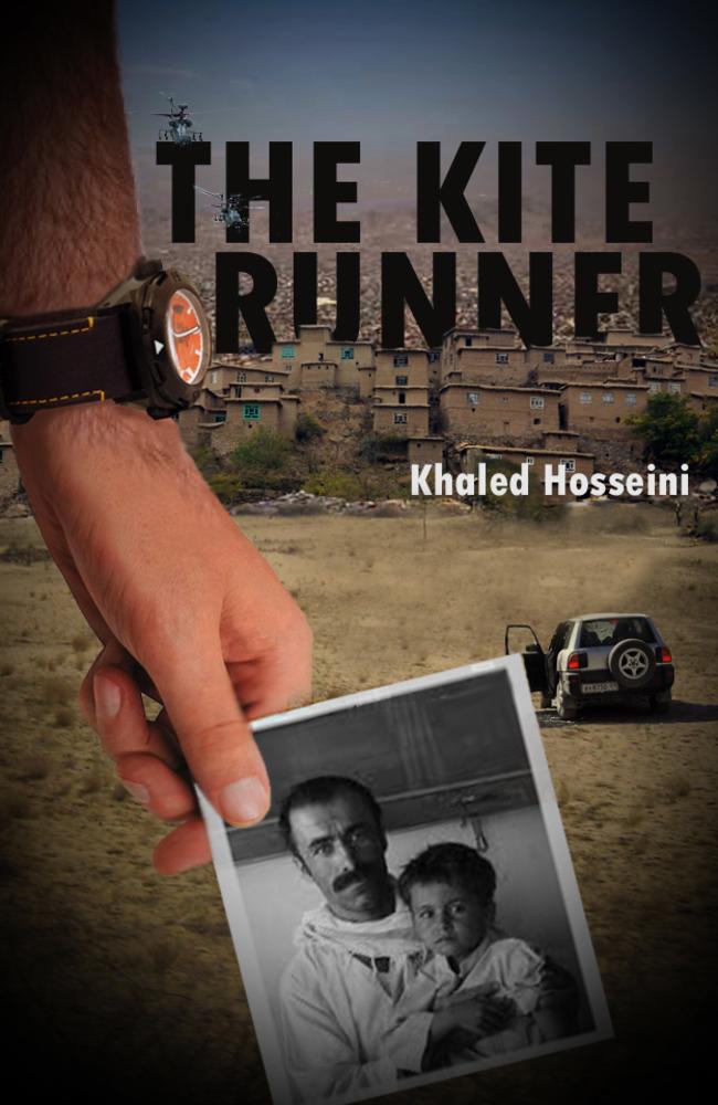
The Kite Runner, Khaled Hosseini
Anthony Luu, Wellington Secondary College
I choose to emphasise the protagonist’s (Amir) long search for his long lost nephew in the vast city of war-torn Afghanistan, Kabul. What lies before him is a dangerous and nostalgic journey and I wanted to depict Amir before he takes that journey.
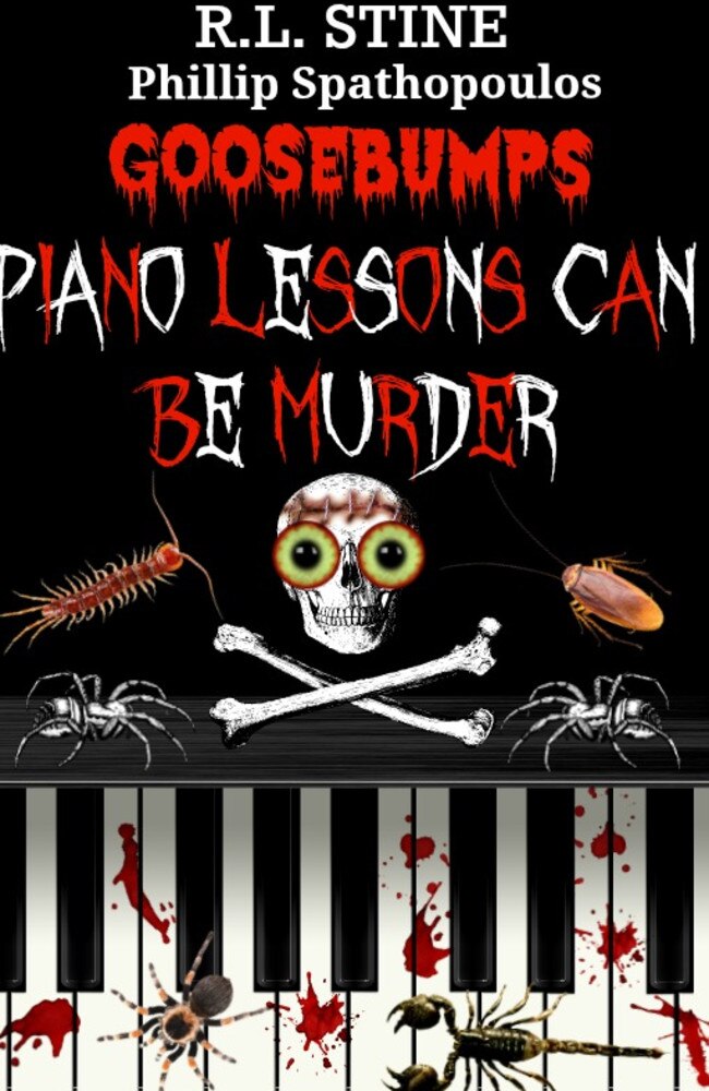
Piano Lessons Can Be Murder, R. L. Stine
Phillip Spathopoulos, Carrum Downs Secondary College
I was interested in doing a Goose Bumps book as I really enjoy reading them and I’m currently really enjoying the genre of horror! I had heaps of fun making the book cover design as I was able to express a variety of horror photo images and effects, also the video was really fun to produce as I used images, real-life video from school and font to describe different scenes
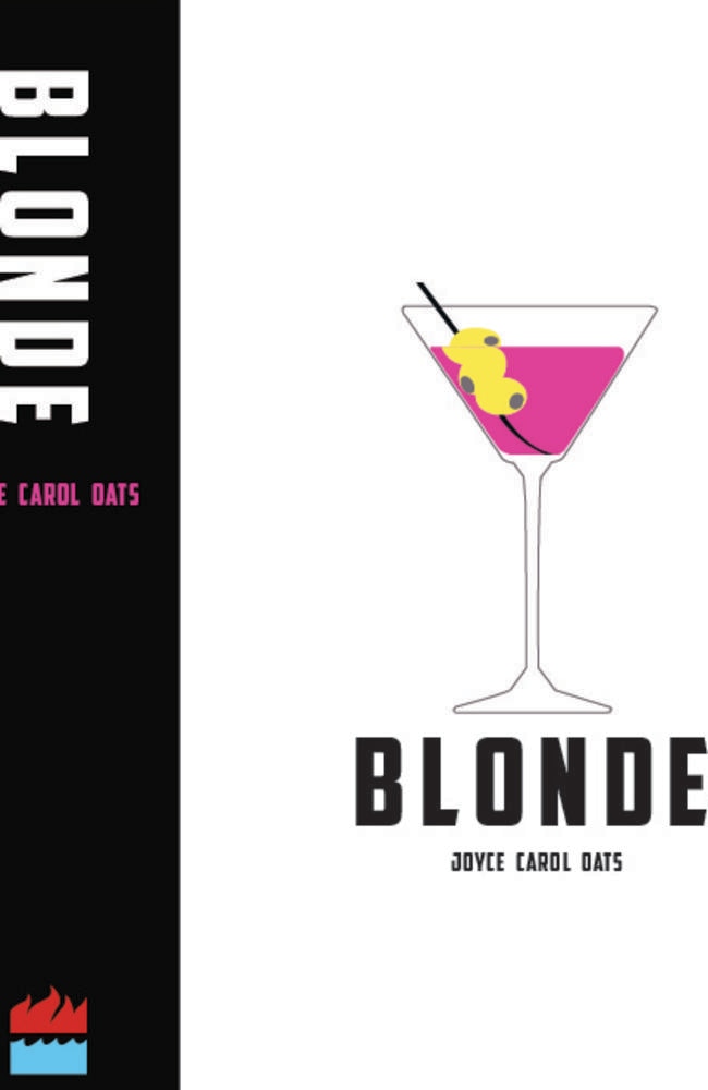
Blonde, Joyce Carol Oates
Jessica Riordan, Star of the Sea College
I wanted to create a bold, contemporary and intriguing interpretation of Joyce Carol Oats’ novel Blonde, to capture the epic and tragic story of a Hollywood star whose beauty and fame is unforgotten in today’s society. I also wanted to keep the mysterious and simple style from the original book cover, but stray from the immediate link to Marilyn Monroe to widen a viewer’s interpretation of the book.
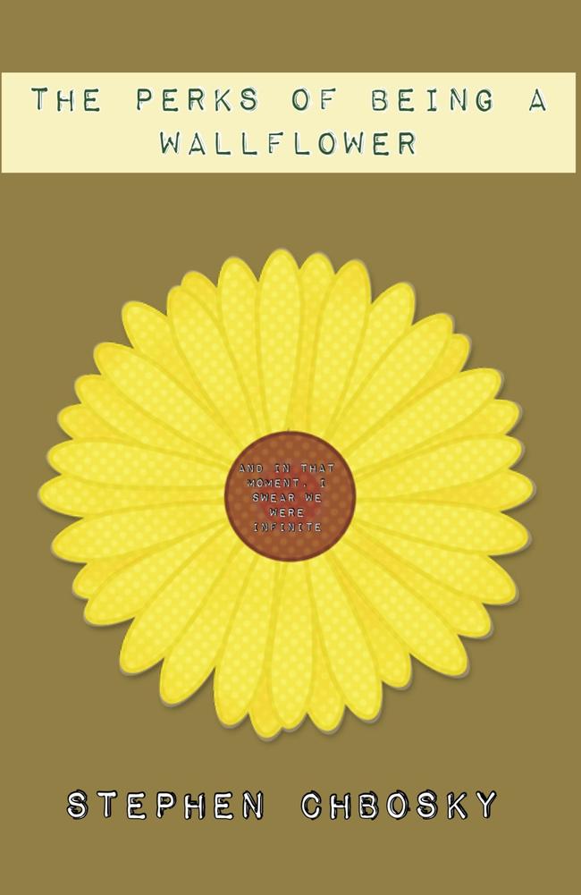
The Perks of Being a Wallflower, Stephen Chbosky
Hannah Smart, Lilydale High School
I have kept my book cover for The Perks of Being a Wallflower as simple as possible because much like the characters on the outside, they may seem simple but once you delve into they’re very existence you would find that in fact complicated messages and emotions run through these fibres. There is a flower in the centre because Wallflower is often mistaken for a flower and not a person much like these characters who are overlooked.
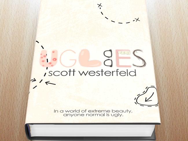
Uglies, Scott Westerfeld
Brittany Spencer, Presbyterian Ladies’ College
Pimples, being too skinny or fat, nerdy, crooked teeth and hairiness are all features associated with ugliness, so I included this in the graphics of the title. The cosmetic surgery lines adds to the idea of having to be altered to be beautiful, and gives the cover some seriousness. The grungy background is used to create the effect of imperfect skin, without actually using a picture of it.
BOOK TRAILERS
Asylum, Madeleine Roux
Chelsea Schultz, Kilbreda College
I read the book Asylum because I am into scary movies and books. I have used the creepy music because it really gets your heart pumping and really intrigued in the trailer.
Paper Towns, John Green
Grace Archer, Canterbury Girls’ Secondary College
Paper people in paper towns, with paper personalities, are too much for 18 year-old Margo. In a desperate attempt to free herself from society’s wrath she embarks on an adventure, leaving cul-de-sac clues for her neighbour and narrator of the story; Quentin ‘Q’ Jacobson.
The Hunger Games, Suzanne Collins
Summer Schultz, Warracknabeal Secondary College
My aim is to divulge the fundamental conflict in the story of The Hunger Games, where 12 boys and girls are coerced into killing one another for a tyrant city’s entertainment. By introducing the viewers to the context, and then exposing the audience to the brutal and fast action of the Hunger Games, they develop an understanding of the basic plot
Oh, the places you’ll go! Dr Seuss
Nick McKenzie, Wanganui Park Secondary College
I decided to make a book trailer on the Dr Seuss book Oh, the places you’ll go! I used lots of the pictures from the book and I also included some surprise bits too! That’s my cat, Sheba. She likes to go places so I thought that would be funny.
Hitchhiker’s Guide to the Galaxy, Douglas Adams
Chris Owens, Saint Francis Xavier College
I like creating videos for fun and contests, I enjoy editing videos and acting for Youtube, I wanted to enter this competition because I read lots and to join in on the fun.
Bluefish, Pat Schmatz
Charlotte Goodman, Kilbreda College
I chose Bluefish, because it’s a great story. My aim was to introduce the two main characters, but not to give too much of the storyline away. I like art which inspired me to draw all the pictures and then make them move.
Wonder, R.J Palacio
Chloe Chin, Shelford Girls’ Grammar
I read a book named Wonder by R.J. Palacio that touched my heart. It was a heartwarming story about kindness. I wanted to share this story by creating a trailer that will give others a glimpse of this astonishingly moving book.
The Last Thing I Remember, Andrew Klavan
William Ireland, Bellarine Secondary College
I created the trailer in hopes of immersing those who watched it into the world of the book, The Last Thing I Remember. I chose the book because it wasn’t popular enough in the community, and it had lots of action from page one. The music was copyright free and had a certain tone that I desired, and I used animation because it was more of a challenge to me.
_______________________________________________
And the winners are of the Paper Cuts 2014 Book Trailer and Book Cover Design competition are:
Book Cover Design
First prize: Katharine Parker, Alice’s Adventures in Wonderland
Second prize: Bridgette Van Diepen, Obernewtyn
Third prize: Brittany Spencer, Uglies
People’s Choice: Lauren Girardi, Pride and Prejudice
Book Trailers
First prize: William Ireland, The Last Thing I Remember
Second prize: Charlotte Goodman, Bluefish
Third prize: Grace Archer, Paper Towns
People’s Choice: Chris Owens, The Hitchhikers Guide to the Galaxy
TELL US: Which are your favourite covers and trailers? Add your comment below.
Originally published as Paper Cuts competition sees school students redesign book covers and imagine book trailers

