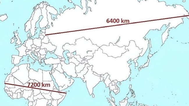
1/26A mind-blowing image comparing the width of Africa and Russia is going viral, and it’s flipping everything people thought they knew about geography. It shows Africa stretching 7200km across from west to east — farther than the 6400km between Europe and eastern Russia. Yet on most maps, Africa looks smaller. It’s left people wondering: why? Picture: X
Why the world map doesn’t add up
A viral map is challenging what people thought they knew about geography — and exposing centuries of distortion.
2/26It all comes back to the map most of us grew up with: the Mercator projection. It was never designed to be accurate and was created to help sailors navigate in straight lines. But in doing so, it massively distorts the size of countries, especially those near the poles. That means places like Europe, Canada, and Russia appear enormous, while equatorial continents like Africa and South America look shrunken and sidelined. Picture: iStock
3/26Now look what happens when you use a different projection like the Gall-Peters. This map corrects for size and shows each country in proportion to its actual land area. The result? Africa dominates the page, and suddenly Western countries look much smaller. It’s a jarring reminder that the maps we trust are far from neutral. Picture: iStock
4/26One of the most famous distortions is Greenland. On a Mercator map, it looks almost as big as Africa. However, in reality, Africa is 14 times larger. Greenland is just 2.1 million km², while Africa is over 30 million km². Picture: Supplied
5/26This viral graphic blew people’s minds: Africa is so large, you could fit the USA, China, India, most of Europe, Japan, and more all inside it — with room to spare. It puts into perspective just how much of Africa’s true scale has been hidden in plain sight. Picture: X
6/26Because Africa sits directly across the equator, it experiences less distortion than land masses near the poles when using many map projections. On projections like Mercator, areas closer to the poles are stretched, while those near the equator maintain more accurate proportions. This geographic positioning should help Africa retain its true size, yet on distorted maps, it still appears smaller than it really is. Picture: iStock
7/26The northern hemisphere gets all the visual real estate. Countries like Canada and Russia look like giants on the Mercator map, when in reality, they are significantly smaller than they appear. This has led to a world view where “size equals importance”, reinforcing Western dominance. Picture: iStock
8/26Maps often place Europe in the centre, not because it’s geographically central, but because early European mapmakers designed it that way. This is known as cartographic centrism — a tradition that stems from both practical navigational choices and historical worldviews. While this layout became standard over time, it has contributed to a perception of Europe as the focal point of the world. Picture: Reddit
9/26In the past, maps were used for both navigation and representation of power. During the age of European empires, maps often highlighted the size and reach of colonial territories, sometimes exaggerating their scale for effect. These visual choices reflected the priorities of the time, which showcased dominance and exploration alongside geographic understanding. Picture: iStock
10/26Meet Gerardus Mercator, the man behind the distortion. In 1569, he designed his map for sailors. It was revolutionary for navigation but terrible for geography. Still, it became the default map for the Western world, shaping generations’ understanding of global size and importance. Picture: Getty Images
11/26For decades, this map has been on classroom walls around the world, quietly misinforming students. The Mercator projection wasn’t chosen for accuracy but because it was familiar. Picture: iStock
12/26Now, Gen Z is catching on. TikTok and YouTube are full of explainer videos breaking down map distortions and exposing the truth behind why countries like Africa have been visually minimised. It’s part of a wider conversation about decolonising education. Picture: TikTok/@NASDAILY
13/26Africa covers 30.4 million square kilometres, making it the second-largest continent. This map helps people see just how vast and diverse it really is, containing 54 countries and over 1.4 billion people. Picture: X
14/26In true social media fashion, the viral issue has been turned into a meme. Picture: Reddit
15/26Australia appears almost comparable in size to Africa on a Mercator map. In reality, it’s not even close. Africa is nearly four times bigger than Australia. Picture: Supplied
16/26From space, everything changes. Satellite imagery — free of projection distortions — shows Africa in its full, sprawling glory. It’s a stark contrast to the warped flat maps we’re used to. Picture: NASA
17/26Even in the digital age, the distortion lives on. Google Maps still uses Mercator projection for zoomed-out views, meaning countries far from the equator are stretched and inflated. Picture: Google Maps
18/26As geographer Mark Monmonier wrote: “Maps lie. They can’t do otherwise.” Every map is a product of decisions: what to show, what to leave out, and how to scale it. Those decisions shape how we view the world, often without even realising it. Picture: Supplied
19/26This map isn’t upside down, it’s just drawn from a different perspective. The concept of “north being up” is a human invention, not a scientific truth. Flipping the map forces us to question why we accept certain orientations as “normal”, and who gets to define them. Picture: iStock
20/26Some schools are starting to move away from outdated maps and are introducing more accurate projections that show the true proportions of continents. It’s a small shift, but it could have a big impact on how the next generation sees the world. Picture: X
21/26Africa holds around 17 per cent of the world’s population, with some of the fastest-growing nations on Earth. It’s a hub of culture, history, and potential. Yet, it’s still visually under-represented. When maps downplay Africa’s size, they also downplay its global significance. Picture: Getty Images
22/26There’s no such thing as a perfect map because every projection distorts something. But equal-area maps like the Eckert IV projection aim to show countries in their true size, without dramatically skewing shape or scale. It’s less extreme than Gall-Peters, more balanced than Mercator, and offers a clearer picture of how continents actually compare. Picture: iStock
23/26The Equal Earth projection, introduced in 2018, is a modern attempt to balance aesthetics with size accuracy. It keeps continents in proportion without looking too unfamiliar, acting as a middle ground between Mercator and Peters. Picture: iStock
24/26The Robinson projection is often used in atlases. It’s not strictly accurate in area or shape, but it looks “right” to many viewers, which is why it’s common in schools and classrooms. Picture: iStock
25/26National Geographic officially switched to the Winkel Tripel projection in 1998. It aims to reduce distortion in size, shape, and distance. Picture: Supplied
26/26So which projection is best? It depends. For sea travel, Mercator. For fairness, Peters or Equal Earth. For teaching? Maybe Winkel Tripel is best. What matters most is awareness and knowing that what you see isn’t always an accurate representation of size. Picture: X