
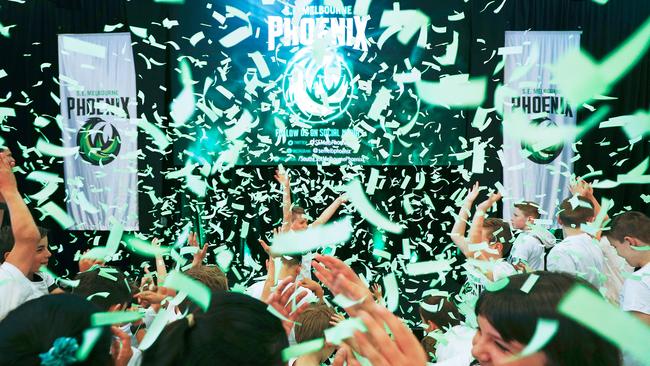
New NBL franchise South East Melbourne Phoenix unveils colours and logo
The NBL’s newest team, South East Melbourne Phoenix, unveiled its striking “fireball” logo and green colour scheme and explains the origin behind the club’s name.

Basketball
Don't miss out on the headlines from Basketball. Followed categories will be added to My News.
The NBL’s newest team, South East Melbourne Phoenix, unveiled its striking “fireball” logo and green colour scheme at the State Basketball Centre.
The Phoenix will enter the domestic league next season.
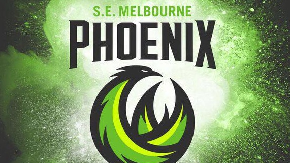
The club’s logo, which consists of spinning flames and feathers combined in a ball, is said to convey a sense of speed, action and perpetual motion, cornerstones of what the club will represent on and off the court.
It is highlighted by laser green, a nod to the picturesque landscape of Melbourne’s south east, a bold statement colour symbolising the Phoenix as cutting edge and focused on the future.
Phoenix general manager Tommy Greer said the launch was a landmark day for the NBL’s ninth team.
“When we announced the team we asked the fans to give us their suggestions for a name,” Greer said.
“We received hundreds of names but eventually chose Phoenix, a name that represents the rebirth of basketball in South East Melbourne.
“Basketball has a proud heritage in South East Melbourne, having produced some of Australia’s greatest players and teams.
“Now the fans once again have a team to call their own, the Phoenix.”
NBL chief executive Jeremy Loeliger said the region boasts a “rich history” in elite and community basketball.
“Melbourne United now has a strong foothold in the market, having won the NBL Championship last season and attracting sellout crowds at Melbourne Arena,” Loeliger said.
“The time is right for the introduction of a second team in Melbourne and to rebuild the NBL rivalries that the city was known for in the 1980s and ’90s.”
The South East Melbourne Magic, which folded in 1998, won two NBL championships (1992 and 1996).
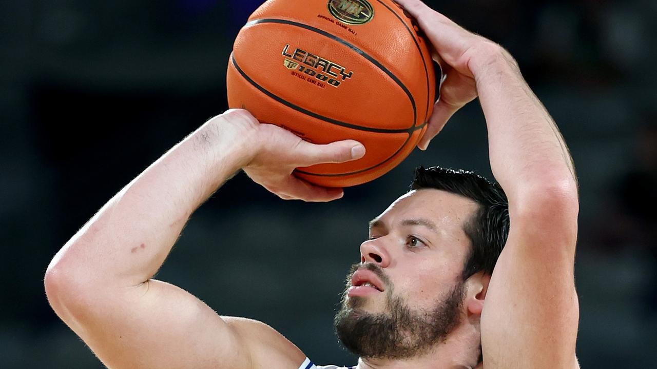
Cadee’s last dance? Phoenix out to end NBL legend’s career
One of the NBL’s great careers could come to an end on Sunday. And although he’s out to make sure that happens, even Nathan Sobey wants Jason Cadee and his impact on basketball in Australia to be celebrated.
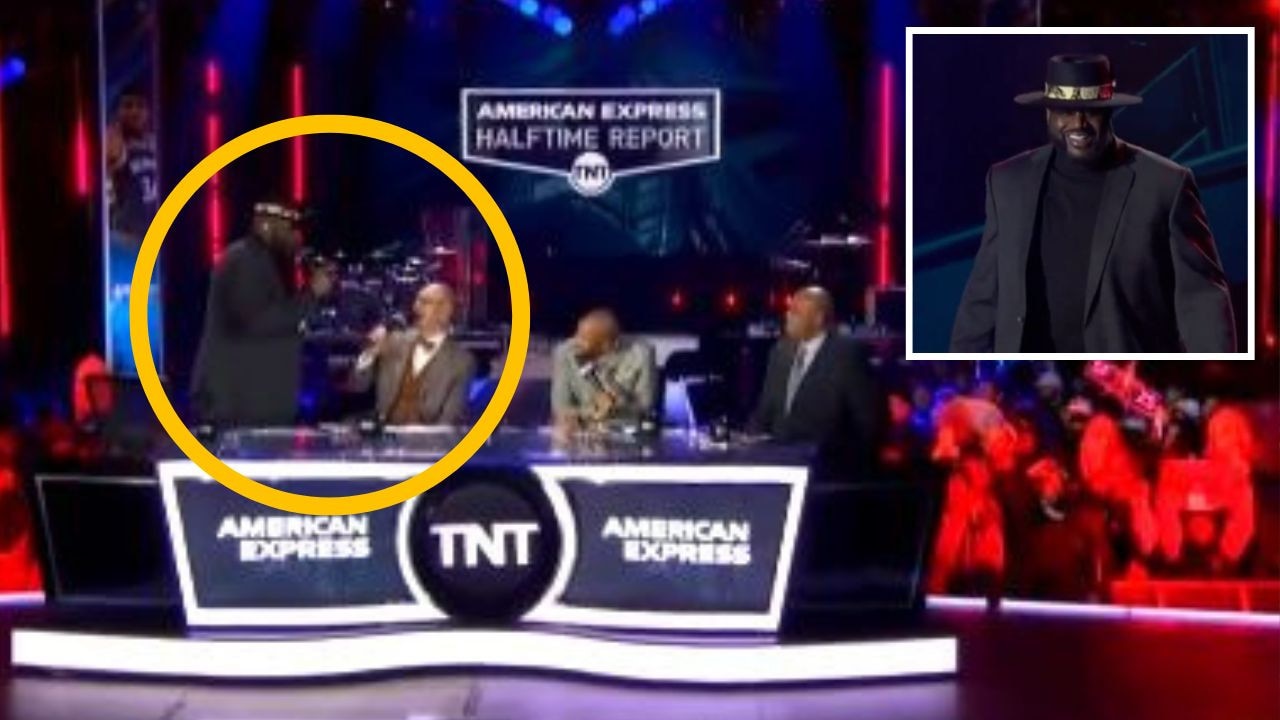
‘Getting fired anyway’: Shaq goes rogue
The basketball legend yelled “we’re getting fired anyway” as he stunned onlookers with a wild rant on a live NBA broadcast.