
Future Victoria: How to read the PwC citizen survey interactive map
Ever wondered which Victorians are the happiest about where they live? This map reveals where people most — and least — love where they live, plus how they feel about key issues such as safety, education and cost of living.
The PwC citizen survey interactive map gives a picture of how Victorians say they feel about different aspects of life.
It is based on a survey of 4612 Victorians conducted in the first half of 2019, which gauged sentiment on key areas such as community safety, job security and availability, education, financial security, access to healthcare, leisure and emergency services, cost of living and overall happiness with where they live.
The interactive map at heraldsun.com.au/futurevic shows where Victorians, on average, are least and most satisfied with each of these areas.
How to use the map
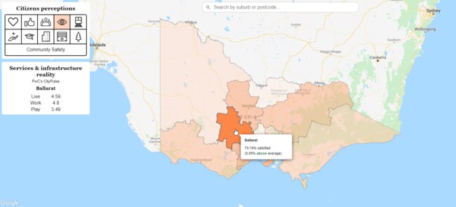
The default view of the heat map depicts Victorians’ satisfaction levels with where they live, according to PwC’s citizen research survey.
Darker areas indicate regions where people were more highly satisfied about “I Love Where I Live”, while lighter areas indicate less satisfaction.
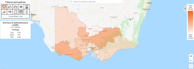
The 10 icons in the Citizens’ Perceptions panel at the top left of the map show which of the key survey areas you are looking at — a heart for I Love Where I Live, thumbs up for Life Satisfaction, three people for Inclusiveness of Local Area, eye for Community Safety, train for Transport Services, hand and first-aid symbol for Health and Wellbeing Services, graduation cap for Education and Training Services, building for Job and Work Opportunities, money for Cost of Living, and a tree for Leisure and Facilities Services.
Hover over a region of the map to see average satisfaction levels in that area for each topic, as well as how it compares against the state average for that topic.
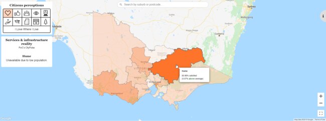
The map also shows data from complementary PwC research known as CityPulse, which gives each region a rating out of 10 in the areas of “live”, “work” and “play”.
These ratings are shown in the white “Services and infrastructure reality” panel to the left of the map.
Data for CityPulse was extracted from dozens of sources, including government departments and authorities, such as the Australian Bureau of Statistics.
PwC assessed information on transport, health services, education, crime, housing and mapping for its modelling calculations.
The “live” index was measured based on accessibility to aged care, childcare, all levels of education, churches, as well as crime rates, health services, hospitals, property prices, building approvals, household rent, mortgage payment data and the ratio of rented to owned households.
The “work” index assessed economic performance of business and building approvals, as well as job accessibility and welfare dependency.
And the “play” index reviewed data on hotels, restaurants, bars, cultural attractions, shopping centres, sports and fitness centres, local parks, ovals, public gardens, national parks, and beaches.
Accessibility scores — for services such as hospitals and schools — were based on how many locations were reachable within 30 minutes’ drive or by public transport.
Off-peak traffic/timetables were used for all except job and education indicators, which were calculated at peak. Live, work and play scores are not directly comparable between categories.
That is, 5.1 for live is not exactly the same as 5.1 for play.