
Neale Whitaker: How to find your green peace in your home
FROM soft mint shades to moody olives, you’ll see lots of green in 2017. Neale Whitaker shows you how to use them.

Stellar
Don't miss out on the headlines from Stellar. Followed categories will be added to My News.
KERMIT the Frog knew a thing or two. It ain’t easy being green, even if it was “big like an ocean or tall like a tree”. My generation has always had an uneasy relationship with green things. Avocado bath suites. Wicked witches. Marzipan. As a kid, green stood for everything sensible, such as school uniforms and brussels sprouts, but it was never fun. My mother wouldn’t travel in green cars (she claimed they were more likely to crash) and later on, as a cub editor, I was told that green magazine covers would wither and die on the newsstand. And how about that old adage “blue and green should never be seen”? Mother Nature didn’t get that memo.
But a new generation has no such reservations. If blue was last year’s black, then green is proudly — verdantly — this year’s blue. Global colour authority Pantone has chosen “Greenery” as its 2017 Colour of the Year, and it’s hard to dispute Pantone executive director Leatrice Eiseman when she says, “Greenery provides us with the reassurance we yearn for amid a tumultuous social and political environment.” If only a colour really could heal the world.
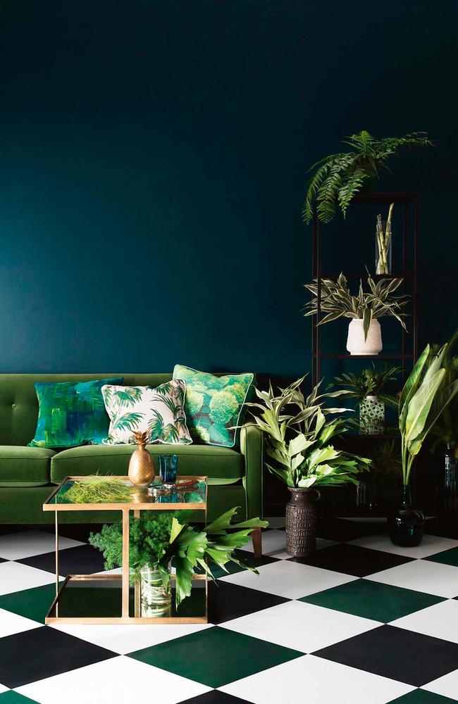
Unless you’ve been sleeping on the job, you’ll have noticed the abundance of green homewares around right now. Variations of Martinique wallpaper, originally designed for The Beverly Hills Hotel, are playing on repeat in many interiors, as are an oasis of palm-leaf prints. And there’s a lot of jade green, a popular shade in the Art Deco era that teams well with the current Deco-inspired furniture and lighting.
Our interior designers have embraced the greenhouse effect. Sarah-Jane Pyke of Sydney’s Arent&Pyke likes olive greens for their “murky depth that sits beautifully with white and grey”. Melbourne-based Fiona Lynch suggests choosing “greens with a grey tone, and stay away from lime greens that are too harsh and will date”. Brisbane’s Anna Spiro likes a tonal approach: “Soft mint, layered with deeper tones of green, sea foam, taupe and white.”
The advice is to experiment and go gently at first. For a quick green fix, Spiro suggests “mismatched cushions in an array of green patterns or some green lampshades. Green goes with most colours and I’m particularly fond of blue and green mixed together.”
She didn’t get the memo either.
Neale Whitaker is editor-in-chief of Vogue Living.
Originally published as Neale Whitaker: How to find your green peace in your home

Bizarre response to McEvoy’s Olympic gold medal
The better swimmer Cameron McEvoy trained, the worse he performed on race day – so he made a huge change that resulted in an Olympic gold medal. And while his rivals want to learn his secrets, Australian swimming officials are yet to pick up the phone.

Aussie ‘it’ girl rejects overnight success label
She is one of the rising Australian stars in Hollywood but Alycia Debnam-Carey says it takes a lot to make it. Here, the Dior ambassador reveals how ‘blind naïveté’ played a part in her success.