Home renovation ideas: Bondi Beach-inspired reno crushes winter blues
Sometimes all it is takes is a view to inspire the perfect home renovation.
Home
Don't miss out on the headlines from Home. Followed categories will be added to My News.
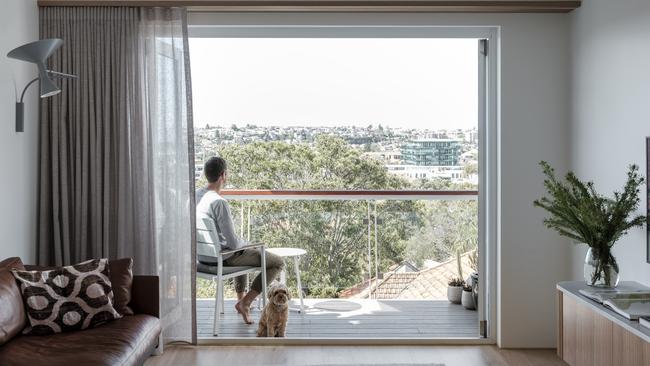
Bondi Beach is arguably one of the most iconic sites in Sydney, so when John Moore and Joey Schaasberg sought renovation inspiration, they simply looked out their window.
Their top floor apartment takes in views of the famous beach strip giving the couple a crystal clear design intention for their home.
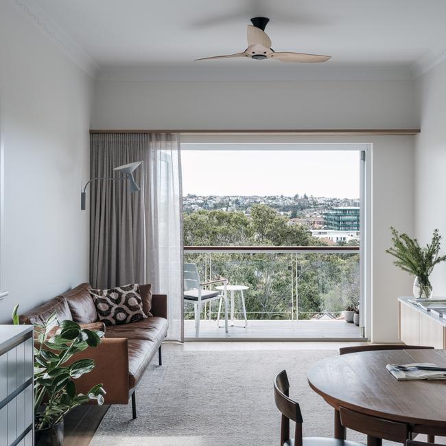
Sandy blonde timber tones with highlights of beachy soft blues naturally came to mind.
The apartment had last been heavily renovated in the 1990s, but when John bought the property in 2013 he made some minor changes to make it homey. It was far from ideal and since then, he had deliberated over tackling the bigger issues.
“I just did a basic cosmetic makeover to be able to move it, but basically it was still an old apartment with old apartment issues – namely noise transference. So we took the opportunity to renovate it properly and let in lots of light.”

There has been talk of adding an attic to the top floor project, but that would have amounted to a major renovation, so the couple worked with architect Davin Turner to make the most of their readily available floorspace.
“We mainly worked with the floorplan we had and turned it into an efficient space. It would have been rather complicated otherwise and this was a more economic way to move forward,” says Davin. “With strata there is limited scope to change the floorplan, but we created a beautiful space with two bedrooms and a sunroom.”
He says the old red brick apartment, which is typical of the area, just needed an update and some design cohesion to bring it back to life.
“It has beautiful views over Bondi, so the idea was to make the most of the views from the living areas to the balcony. One of the first things I noticed about the apartment was the kitchen could definitely function better.”
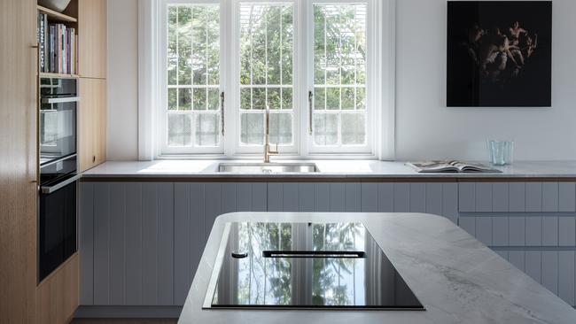
Davin explains the existing kitchen was a U-shape so there wasn’t a good connection between the kitchen and dining space.
To allow the floorplan to work better, the new brief included an island bench where people could congregate or share the cooking.
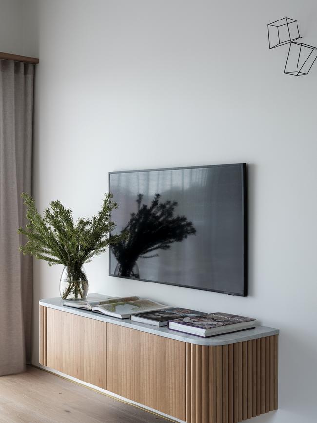
A curved edge island bench was proposed, paying homage to the Art Deco era of which the building was a product. Elegant timber dowels were wrapped around the island bench and the floating television cabinet to add interest to the joinery, without overwhelming the room.
It’s the subtle touches, including the brass plate skirting boards that take this apartment from pretty to just about perfect for the owners.
There was also a requirement for extra storage and a refined aesthetic, so tall cupboards were installed on the rear wall, allowing for bench cupboards on one side only, so as to not over complicate the space.
To make use of the existing window, an under mount sink station was perfectly positioned there to wash dishes while taking in the picturesque view. Davin says the colour and material palette in both the kitchen and bathroom consisted of duck egg blue, blonde timber flooring and light stone, marrying the view to the decor.
“By focusing on the kitchen and making it more functional it changed the dynamic of the apartment.”
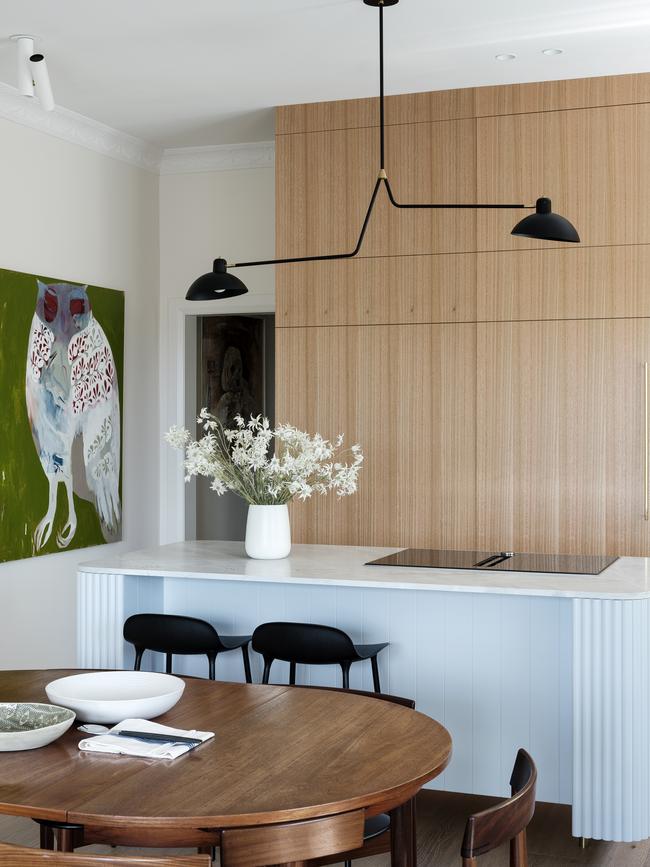
The open plan living area has made a monumental difference to John and Joey’s apartment, but it’s the colour palette that makes the biggest impression.
“The colours were chosen to match the beach and it’s a whole vibe. It’s what people comment on,” says John.
The project was completed during Covid restrictions in Sydney last year and John and Joey had taken a collaborative approach to the project, which made them feel quite involved in an otherwise isolating time.
The couple had been hesitant about renovating in a pandemic, where there were so many unknowns, but John says what eventuated was “a nice working relationship”.
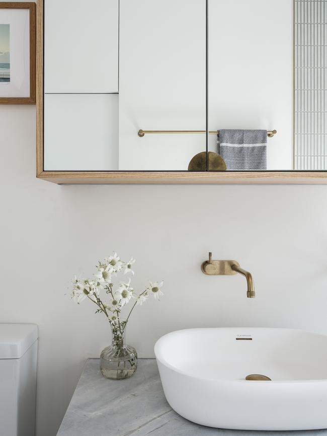
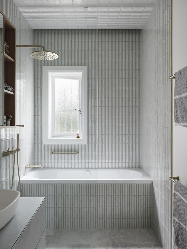
The newly minted kitchen and fresh living areas lead out to the balcony, which had been resurfaced a couple of years prior. Fashioned with a glass balustrade to allow for maximum light (and not to mention the glorious view), the north facing balcony is a delightful climax to the apartment that was remodelled based on the beauty of Bondi Beach.
GET THE LOOK
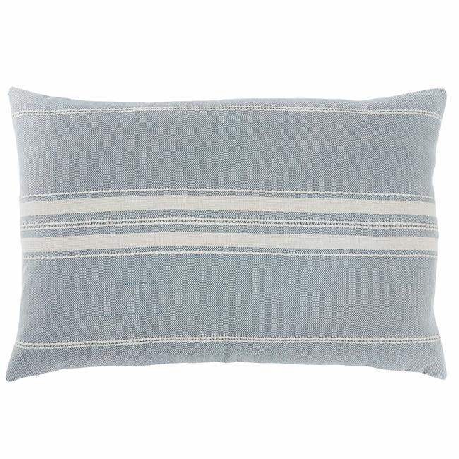
Inspired by the washed-out blue and simple white fabrics from Southern France, this cushion is perfect for dressing up chairs, sofas and beds. Marseilles cushion, $95.
weavergreen.com.au.
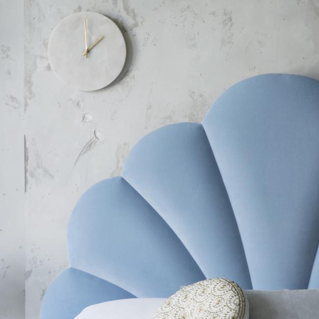
This seashell-like headboard adds a beachy flair to any bedroom, while the gold capped feet are pure glamour. Ariel upholstered bed, $4198.
sweetpeaandwillow.com
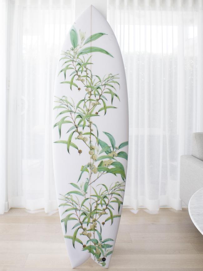
Even if you can’t catch a wave, a hand-shaped board is just at home as a piece of wall art as it is in the water. Whyte surfboard, from $990.
whytesurfboards.com
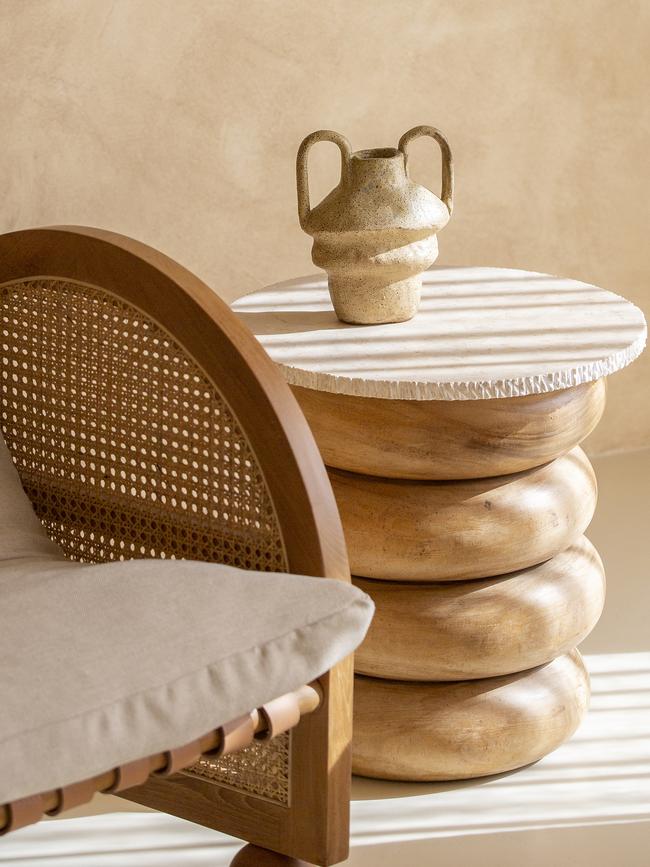
This side table features off-centre stacked timber disks with a warm travertine tabletop. It’s the sandy beach accent piece you’ve been looking for. It’s $1100.
timneve.com
More Coverage
Originally published as Home renovation ideas: Bondi Beach-inspired reno crushes winter blues


