
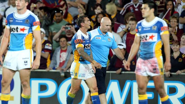
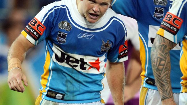
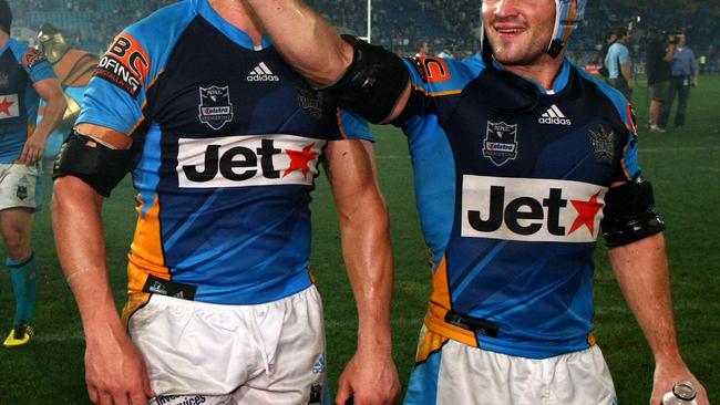
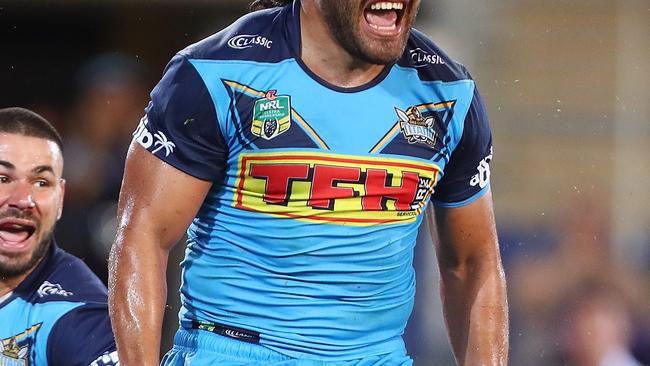
Ranking every Gold Coast Titans jersey from 2007-2020
With NRL football on the comeback trail, the Gold Coast Bulletin rugby league team have cast our eyes over the fashion on the field hits and misses.
NRL
Don't miss out on the headlines from NRL. Followed categories will be added to My News.
With NRL football on the comeback trail, the Gold Coast Bulletin rugby league team have cast our eyes over the fashion on the field hits and misses.
With some picks sure to raise eyebrows, let us know how you rate the
1. 2017
A sleek, modern design that nails the question previous designs have grappled with since the club’s inception: how much gold trim is too much? In 2017 the Titans got it perfect.
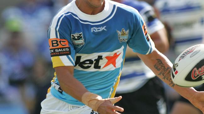
2. 2011
A personal favourite, 2011 marked an evolution in Titans kit with the adoption of coloured pants over the classic white. The optical illusion enhanced the brilliant pacific blue of the jersey for a memorable look.
3. 2012
A step behind the 2011 edition because the navy chest panel appeared more black than dark blue.
4. 2016
The precursor to the Bulletin’s top ranked design, the 2016 edition is marred only by the super-dark navy trim down the jersey’s sides, creating a clunky geometric effect.
5. 2009
They’re dated now but the 2007-09 run of Titans jerseys hold pleasant memories of a team heading for the top of the NRL.
6. 2008
The 2008 jerseys are marked a fraction behind the 2009 version because the clumping together of logos on the chest are a touch too busy.
7. 2010
A brave departure from the team’s original design, the 2010 jersey was a beauty but eclipsed by stronger efforts in later years.
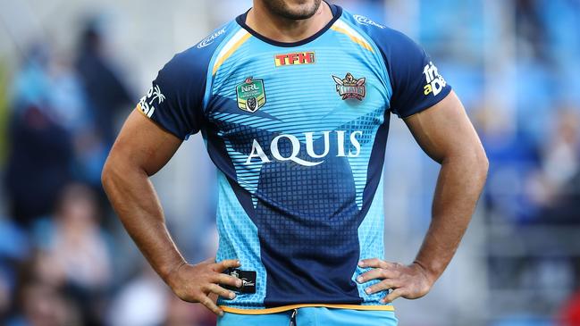
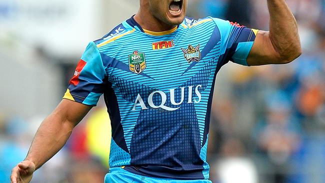
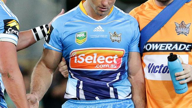
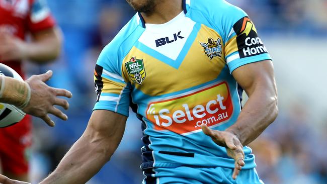
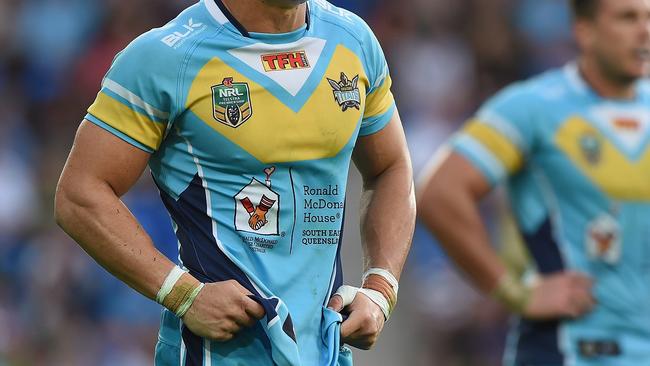
8. 2018
It’s eyecatching, with brilliant hues heightened by contrast with the logo of sponsors TFH. Ultimately the 2018 design was a touch too understated for our taste. The plain blue of the lower half misses the design flair of previous editions.
9. 2007
The original jersey from 2007 set the benchmark for what the Titans jersey should represent. It seems harsh to rank it middle of the table but the design was exclipsed for future versions.
10. 2013
This lighter shade of blue never captured attention like the sharper aqua tones did before it.
11. 2020
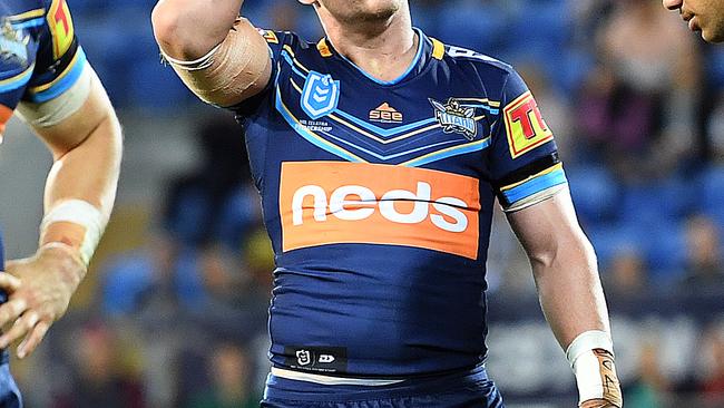
If the Titans go on to win their maiden NRL Premiership this year the all-navy affair might rise higher in our collective estimation. The Titans have never been a navy-primary team and the departure from traditional beachy blues will take getting used to.
12. 2019
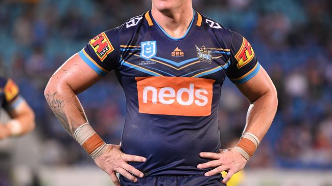
Where did the orange come from? Sponsor neds will be pleased but this jersey’s ‘burnt gold’ is a regression from the brilliant golden trim of the 2016-18 years.
13. 2014
The blue was better in 2014 but the gold on the chest came across more like a drab yellow.
14. 2015
A step backwards in colour and no attempt to fix the dullness of the gold on the chest. This 2015 jersey was rock bottom for the Titans.

Why life after Cobbo will be better than you think
Young, athletic, hungry for their chance. Here’s 14 reasons why there will be life after Selwyn Cobbo if he leaves the Broncos.

Queensland schoolgirls special: Our brave Maroons set for battle
Meet the Queensland schoolgirls who will be flying the state’s flag loud and proud at the ASSRL national championships (15-16 years) from this weekend.