The new Crows logo is bad. But it’s not the AFL’s worst | Graham Cornes
Friendships have ended over honest opinions in the past. Let’s hope that’s not the case here, writes Graham Cornes.
SA News
Don't miss out on the headlines from SA News. Followed categories will be added to My News.
There is always a risk when you are asked for your opinion on something.
Can it be an honest opinion if your answer will upset or offend the person asking you?
But what if you really don’t like something? How blunt can you be?
Wars have been waged, friendships have been torn apart, ambassadorships have been terminated; all because people have taken offence when honest opinions have been given.
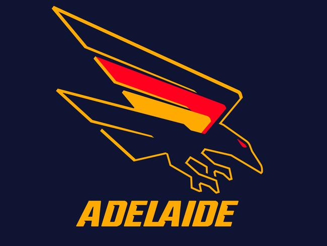
So here goes: I don’t like the new Crows logo.
Love the colours but underwhelmed by the design. Is that gap between the coloured wings really meant to signify our two gulfs?
It’s far too subtle if it is. We experimented with that concept when the inaugural Crows board was selecting the club’s first jumper.
It didn’t catch on – mainly because the graphic designer chose blue, green and white as the colours on the jumper and nobody recognised the gulfs anyway. Besides, it didn’t look like a footy jumper anyway. At least the tri-coloured jumper does.
But the new Crow?
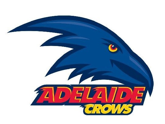
It’s lacking a ferocity that the previous logo had. I liked the steely-determination in that one’s eye and the menacing curved beak (even if crows don’t have a curved beak). The critics were quick to point out that it was too similar to the logo of the Baltimore Ravens in the NFL, but only the fanatics would notice that.
The new Crow lacks depth and dimension.
It may be swooping but it’s not intimidating. The angular lines restrict it to two dimensions whereas great artists and designers portray three dimensions, even on a flat surface. And the beak? Where is it?
It looks like the blunt nose of a plane rather than a ferocious weapon designed to savage an opponent or intended prey. What about the feet? Real Crows have murderous looking talons. Our new logo has club feet. There is no threat in that at all.

Still, we shouldn’t be over-critical. There aren’t that many intimidating AFL club logos, and the new Crows one is still one of the best.
It’s an interesting study to have look at the different AFL clubs’ logos.
Apart from the Crows there are four other clubs that have birds on their logos: the Magpies, the Hawks, the Swans and the Eagles. Apart from the Eagles, none of them look particularly threatening or intimidating.
Actually, the closer you look at all the clubs’ logos the more disappointing they are.
Even the ones with ferocious animals as their mascots are really underwhelming. They could be quite graphic but they really are only club badges.
At least the Crows and the Eagles herald some aggressive, attacking intent. The Lions, Bulldogs and the Tigers could have ferocious, intimidating club logos but they are bland, boring and static. North Melbourne’s kangaroo is supposed to look tough but he’s just a couple of blue lines above the word NORTH. (We’re assuming he’s a male kangaroo).
He doesn’t intimidate anyone. Geelong’s cat is lost in a striped blue and white shield. Essendon’s Bomber fails to lift off. The Dockers are restricted with what they can use.
After all what is a “docker”? They identify it with an anchor, which kind of makes sense. Like the Power. What does that even mean; what is a power?
Port Adelaide opt out by using a club badge and sneak some black and white stripes in just to annoy Collingwood fans. The Suns are offered a great opportunity to use images of the sun, but took the easy way out by using words.
Likewise, GWS doesn’t even try to replicate an actual giant. Their logo is a very unusually-shaped orange G. It is the most disappointing, underwhelming of all the AFL club logos.
St Kilda and Melbourne don’t capture the essence of a Saint or a Demon. Their club logos are the pocket badges for a team blazer, but at least they are recognisable.
Longevity and tradition is not such a bad thing. Apparently St Kilda is exploring options for a new logo but they should be careful; being new and modern does not make it better.
Carlton proves that.
The entwined CFC is one of the most famous, recognisable AFL brands. They couldn’t and shouldn’t change it even if a talented graphic designer could weave a concept of the word “blue” into some marketable form.
Carlton’s logo channels into the same vein as the world-famous logo of the New Yankees baseball team.
Those two entwined letters, N and Y have been lifted of the Yankees cap and are globally recognised. The NY monogram, bland as the colours are, transcends sport and identifies one of the greatest cities in the world.
There are other factors in designing sports logos. The colours are important. That’s the one positive of the new Crows logo. The colours are accentuated. They really do stand out.
And even if by convenience they happened to be our state colours, they are the right colours for a footy jumper.
Psychologists have long researched the effect of colour on mindset and motivation. Red is the colour of fire, passion, excitement and strength.
Yellow invokes creativity and warmth. Blue imbues peace, tranquility and serenity, which may explain why Carlton has fallen short in recent years.
The Crows results of recent years may condemn the combination but visually it works in combination with the other two colours on their jumper.
As an aside there was an AFL coach who tried to tap into this psychology of colour and impact on performance when writing the teams on the whiteboard before every game.
His team was always written in red, with the names on top of a respective opponent. The opposition team’s names were in blue.
It might have helped his team but he overlooked the point that the opposition team never saw their names written in that passive colour. Still, in the psychology of sport, every little bit helps.
The new Crows logo has divided opinion. Some like it, but according to the ad hoc polls and the pub tests, more don’t. It doesn’t matter. Opinion is not fact.
It will grow on us and in a year’s time no one will remember the old one. Club chief executive, Tim Silvers was on the campaign trail this week explaining, promoting and maybe even defending the new look.
What I did like about his message was that the club had listened to the fans who wanted the club to recognise its origins.
It came from the SANFL and it represented South Australia. Adelaide, the team for all South Australians.
Originally published as The new Crows logo is bad. But it’s not the AFL’s worst | Graham Cornes


