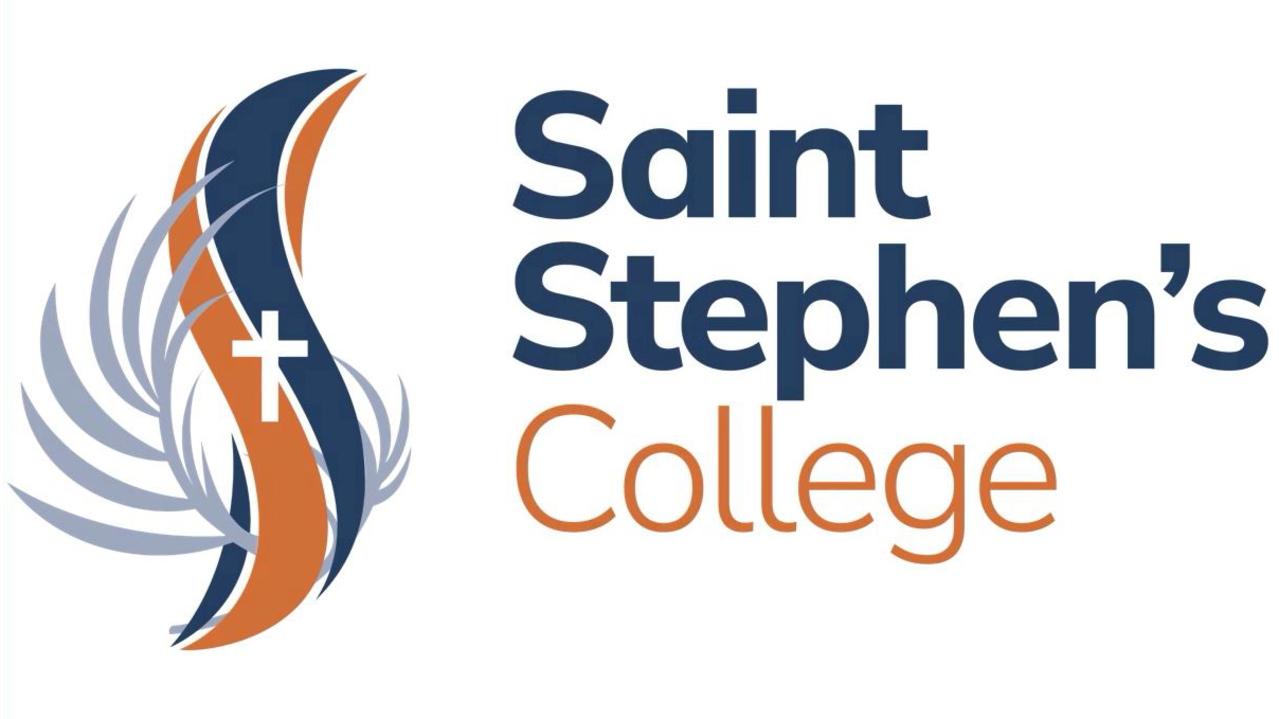
St Stephen’s College Coomera’s new logo gets mixed reaction
An elite school has unveiled a striking new logo – but not everybody is impressed. TELL US WHAT YOU THINK
AN elite Gold Coast school has provoked a mixed reaction after unveiling a new logo to replace the college crest.
Saint Stephen’s College in Coomera unveiled the new look in a slick video on Tuesday, saying that after 25 years, it was “only fitting” that the college crest showed “the same level of innovation and forward thinking that we employ day in and day out at the college”.
In the video, they said the new logo represented a “softer, sleeker” design.


Principal Kim Cohen said that after consulting last year with the college community about what Saint Stephen’s meant to them, it was decided to take a fresh look at the school’s branding.
“(It) has become rather dated and is no longer a true representative of who we are as a college,” Ms Cohen said.
“... We wanted to look at modernising our logo to make it more in keeping with who we are, whilst of course holding on to the symbolism and tradition represented in the crest.”
Ms Cohen said consultation took place with a group representative of staff, parents and board members about the new design.
However the logo got a mixed response on social media. While one person praised it as a “great new logo” for “an amazing school”, others were less impressed.
“This looks awful. Sad to see the old one go,” one former student wrote.
“Not a fan of the new logo,” wrote another. “No need to fix what wasn’t broken. Many old scholars p*ssed off.”
What do you think of the new logo? Tell us in the comments below.


