Adelaide Crows unveil ‘next generation’ new logo as part of first redesign since 2010
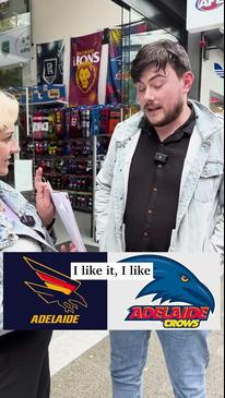
Adelaide has unveiled a sleek new logo in its first redesign in nearly 15 years, with the look cementing the Crows’ place in Adelaide and South Australia. Have your say here.

AFL
Don't miss out on the headlines from AFL. Followed categories will be added to My News.
A ‘Made from South Australia’ theme is central to Adelaide’s first logo redesign since 2010.
Crows fans have been crying out for a new logo as many of Adelaide’s rivals launched their own redesigns in recent years and with the move of its headquarters to Thebarton Oval edging closer, the club has decided on the rebrand ahead of its new era.
Crows chief executive Tim Silvers said the new logo proudly represented the past and the future and would be one supporters could be proud of.
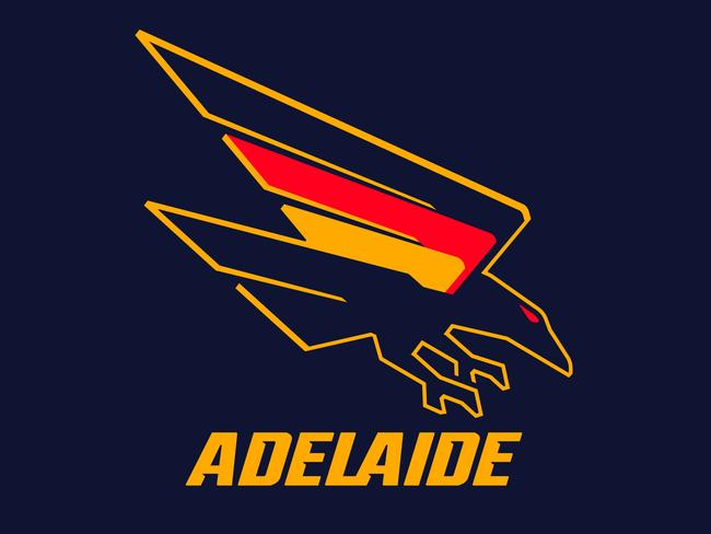
“The logo is one of the club’s most recognisable features and our supporters take great pride in it, and the throwback to the original swooping Crow reinforces our connection to this city and state by the way it now incorporates the actual shape of South Australia,” Silvers said.

“We also wanted to make sure we celebrated our heritage but with a modern look and feel, which we think will resonate with our next generation of supporters. We’ve consulted and listened to a wide range of stakeholders, including and most importantly sections of our supporter base, over the past 18-months.
“Now is the perfect time to make this change as our new headquarters at Thebarton Oval is moving closer and closer to reality, so it really is the start of a new era.”
The new logo has a nod to the club’s heritage by reverting to the original “swooping Crow” donned by the club, but with sharpened claws, beak, eye and wing for a modern look.
This is supported by a return to the original bolder colours being a darker navy blue, richer red and deeper gold.

The Crows said central to the rebrand was the “Made from South Australia” theme with the logo a celebration of the club’s birth from the state’s thriving football landscape in 1990.
As part of this the wing of the Crow emanates from the actual shape of South Australia.
Additionally the word “Adelaide” now solely sits below the crow to represent the connection between the club, the city and the state.
In the process of the logo redesign – the first since 2010 – the Crows said there was widespread consultation with members, supporters and focus groups, such as the club’s Member Engagement Panel, as well as engaging with supporter research and South Australian agency, Fuller Brand Communication.
Merchandise featuring the new logo goes on sale from Wednesday night.
More Coverage
Originally published as Adelaide Crows unveil ‘next generation’ new logo as part of first redesign since 2010


