Fair game? Looking back at 50 of Australian sport’s worst and most divisive jerseys since 2000
From Manly’s Pride jerseys in 2022 through to Hawthorn’s Power Rangers outfit in 2015, sporting tops have long divided public opinion. We take a look at 50 of the worst and most divisive since 2000.
Local Sport
Don't miss out on the headlines from Local Sport. Followed categories will be added to My News.
The Gold Coast Suns have undergone the first major change in their history with a new logo and jersey combination.
Their new strips in particular have divided opinion as the yellow is dropped from their home jersey.
It got us thinking, what are some of the other Australian sporting jerseys that have proven controversial over the years?
With that in mind, we look at 50 of the worst or most divisive jerseys since the year 2000.
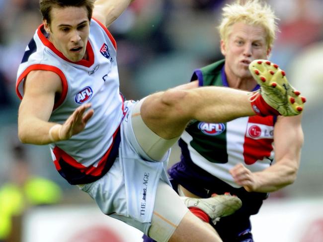
MELBOURNE DEMONS
2008 AWAY
The Demons won just three games in the 2008 season and it’s hard not to believe their ugly grey clash strips had something to do with it.
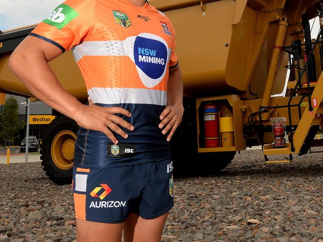
NEWCASTLE KNIGHTS
MINING
The Knights have been wearing their mining strips for over a decade with their win rate coming into question. Newcastle in orange will never seem normal.
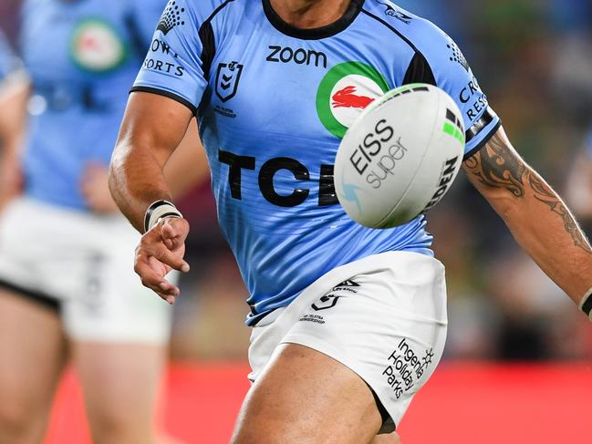
SOUTH SYDNEY RABBITOHS
2021 ANZAC
For their ANZAC Round clash on the Gold Coast the Rabbitohs honoured the navy with an all-blue strip. It left many wondering who was who in the high-scoring fixture.
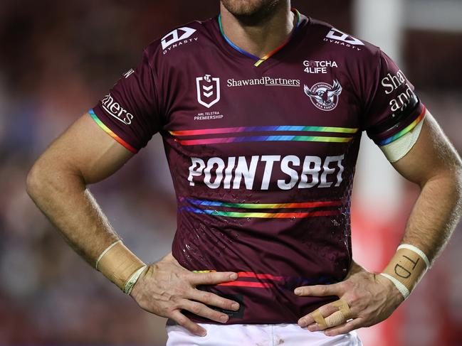
MANLY SEA EAGLES
2022 PRIDE
Easily the most controversial jersey on this list. The design was simply rainbow colours replacing the white hoops, but it led to players sitting out the fixture and the Sea Eagles’ season spiralling.
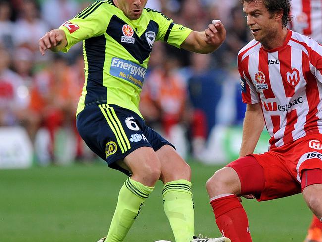
MELBOURNE VICTORY
2011/12 AWAY
Another club with a great colour scheme to work with, they somehow went with ‘Council Worker’ yellow for their clash strip in the 2011/12 season.
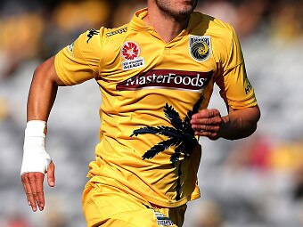
CENTRAL COAST MARINERS
2015/16 HOME
We know their home ground has the iconic palm trees overlooking a wonderful backdrop, but that’s not enough reason to put the damn tree on their jerseys.
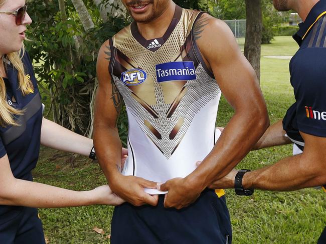
HAWTHORN HAWKS
2015 AWAY
These guernseys immediately drew comparisons to the Power Rangers, and it’s easy to see why with a questionable gold scheme at the top.
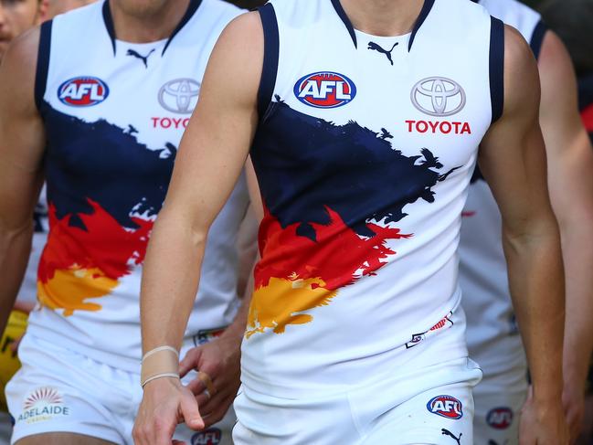
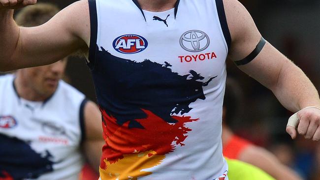
ADELAIDE CROWS
2013 AWAY
They genuinely look like someone has thrown tins of blue, yellow and red paint onto a blank white canvas.
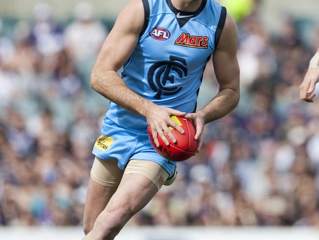
CARLTON BLUES
2011 CLASH
A highly controversial strip, so much so the club had to issue a statement on their website explaining the rationale behind the sky blue jerseys.
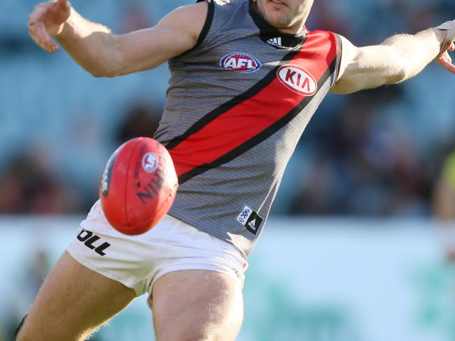
ESSENDON BOMBERS
2012 CLASH
Similar to the above, their grey strip with a red sash caused much of a stir, particularly among traditionalists.
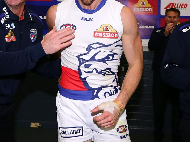
WESTERN BULLDOGS
2016 CLASH
Dogs are cute. That’s not an excuse to plaster a massive bulldog graphic over the side of a football guernsey.
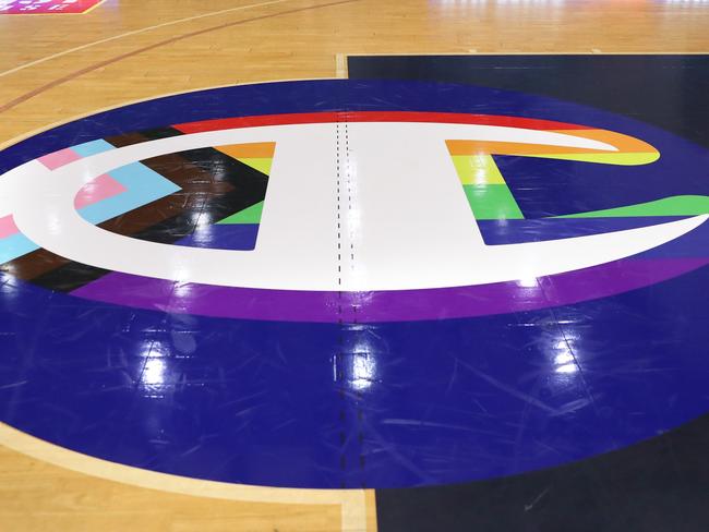
CAIRNS TAIPANS
PRIDE
Rainbow colours around the Champion logo proved divisive up north with some players opting to not wear the jersey, leading to the team not wearing it during a Pride Round fixture.
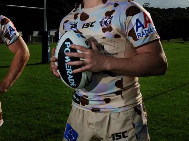
MANLY SEA EAGLES
2012 ANZAC
You couldn’t have been blamed for thinking the Sea Eagles turned into the Manly Moo Cows when they wore these horrendous strips in 2012.
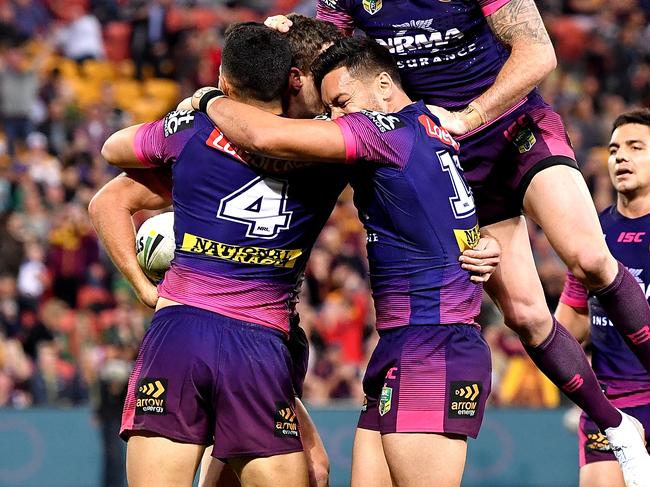
BRISBANE BRONCOS
2018 ALTERNATE
The Broncos channelled their inner Melbourne Storm with a jersey that looked much more like the southerners.
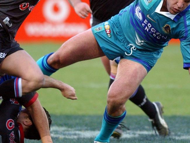
BRISBANE BRONCOS
2002 AWAY
A jersey so infamous that it was replicated years after, the turquoise jerseys of the Broncos were among the worst at the turn of the century.
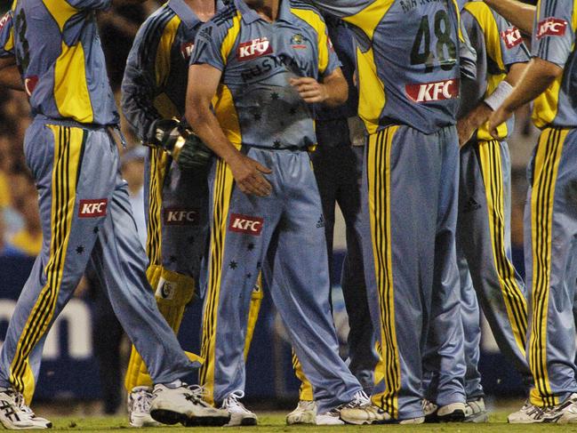
AUSTRALIA CRICKET
2006
An Australian national team wearing grey. Enough said.
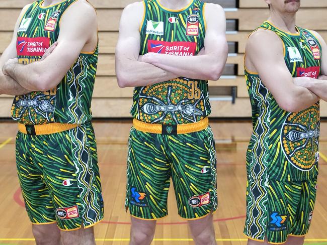
TASMANIA JACKJUMPERS
2023/24 INDIGENOUS
There was nothing wrong with the design from a visual standpoint, however the jersey was scrapped after it was accused of “plagiarising a technique from another Aboriginal culture.”
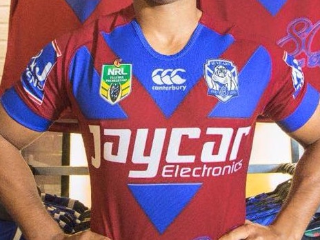
CANTERBURY BULLDOGS
2015 ALTERNATE
The claim was their alternate jersey represented their ‘Ruby Jubilee Anniversary’ - but a predominate red strip just didn’t work at all.
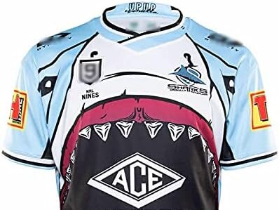
CRONULLA SHARKS
2021 NINES
It was a wonder that these jerseys got the green light. Cronulla’s jersey for the Nines featured the inside of a shark mouth. You read that correctly.
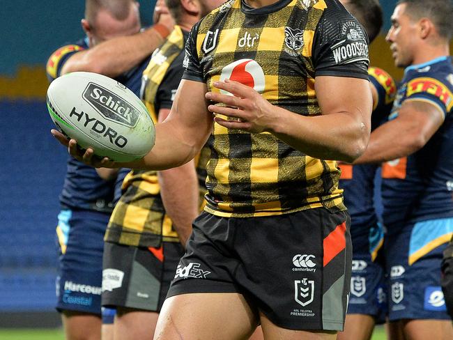
NEW ZEALAND WARRIORS
2020 WELLINGTON
The jersey drew inspiration from the ‘Kiwi bush shirt’ and the design should’ve stayed on the long sleeve shirts. Resembled a picnic table instead of a professional rugby league team.
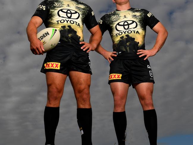
NORTH QUEENSLAND COWBOYS
2024 DEFENCE
It’s hard to put into words what the jersey actually is. If you can make sense of it let us know in the comments below.
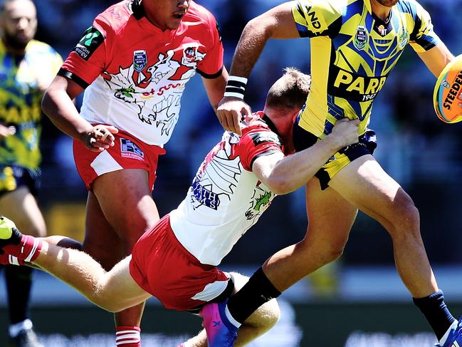
PARRAMATTA EELS
2017 AUCKLAND NINES
Parramatta had quite a few cool jerseys over the course of the Auckland Nines, but their 2017 version was far from it.
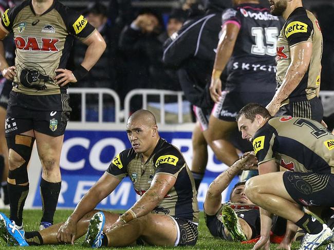
PENRITH PANTHERS
2016 ALTERNATE
Penrith’s current golden run might’ve been predicated in their alternate strip from 2016 that may have been inspired by the Olympics.
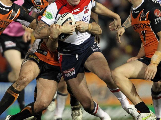
SYDNEY ROOSTERS
2011 ALTERNATE
For a club that has featured some of the cleanest away strips in the game, their 2011 edition left a lot to be desired with a strange amount of white and minimal tricolours.
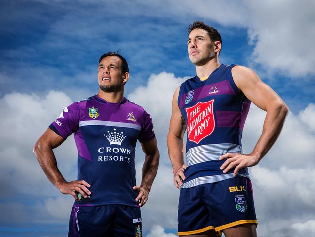
MELBOURNE STORM
2015 AUCKLAND NINES
There was nothing wrong with the design, but Melbourne tapped into their AFL roots with a sleeveless design at the pre-season Nines tournament.
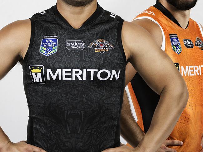
WESTS TIGERS
2015 AUCKLAND NINES
Similar to the above, the Tigers stretched the limits with a sleeveless jersey that divided opinion in a big way.
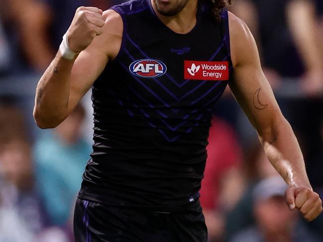
FREMANTLE DOCKERS
2023 GATHER ROUND
The Dockers have made a challenging set of colours work over the years, but their black fascination for Gather Round was a miss.
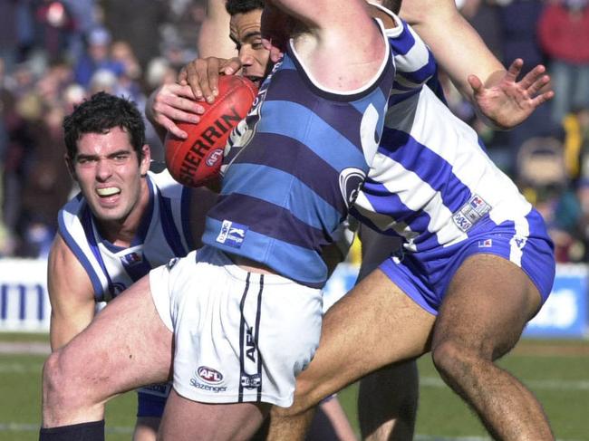
GEELONG CATS
2007 CLASH
Yes Geelong are the Cats. No that doesn’t justify claw marks on a jersey.
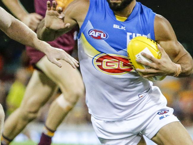
GOLD COAST SUNS
2016 AWAY
The chevrons resembled more of something from Mario Kart to help you power past Bowser as opposed to a reputable football jersey.
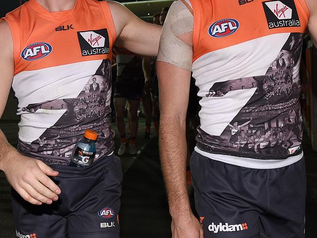
GWS GIANTS
2016 100 GAMES
2016 wasn’t a good year for expansion club guernseys. The Giants opted for photos since their inception to commemorate 100 games in the league. They should’ve left the design in the drafts.
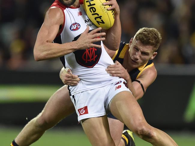
MELBOURNE DEMONS
2017 CLASH
They’ve cleaned up their act in recent times, but the Demons have had some shocking clash strips. Plastering their un-iconic logo on the front in 2017 falls into that category.
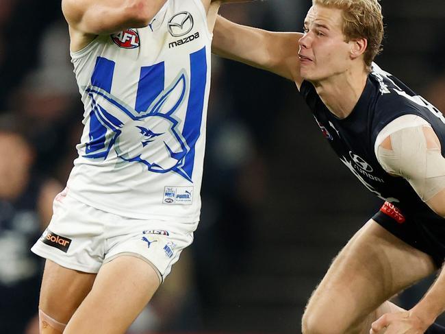
NORTH MELBOURNE KANGAROOS
2022 CLASH
Two wins for the Kangaroos in 2022 and an ordinary away strip that featured an oversized kangaroo head made it a tough year for fans.
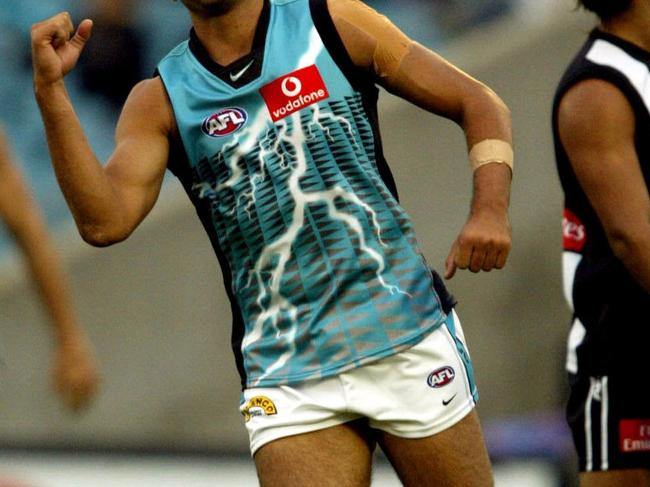
PORT ADELAIDE POWER
2004 CLASH
A big lightning strike on a powerboard and a teal background is never the recipe for an attractive jersey.
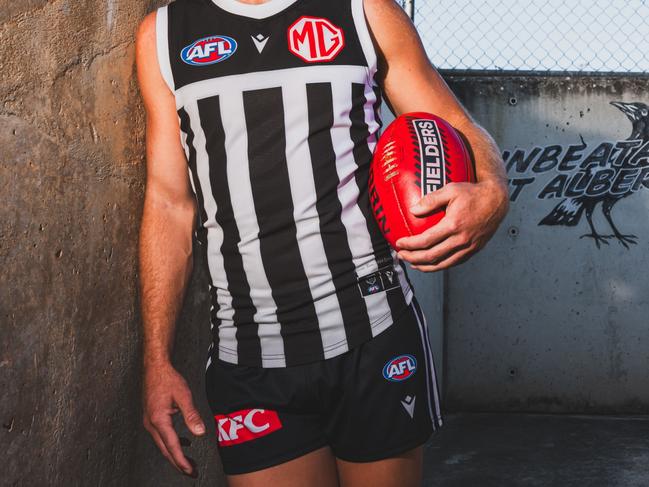
PORT ADELAIDE POWER
2024 PRISON BARS
Few things cause more of a stir among Collingwood fans than when the Power bust out the Prison Bars strip.
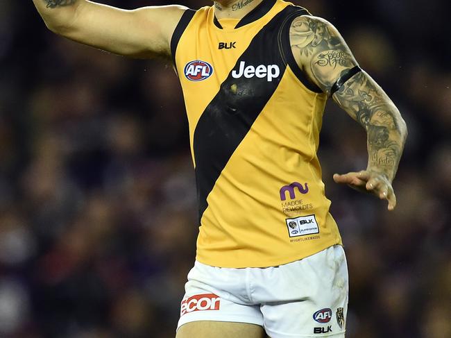
RICHMOND TIGERS
2015 CLASH
Nothing will get fans up in arms more than a traditional club out of colours, and the reverse of their yellow sash on black background certainly did that.
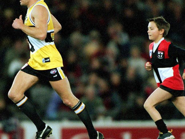
ST KILDA SAINTS
2001 ALTERNATE
St Kilda in yellow. Yikes.
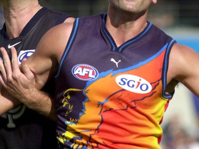
WEST COAST EAGLES
2000 CLASH
Looking at these jerseys is a trip down memory lane, with a strong emphasis on trip.
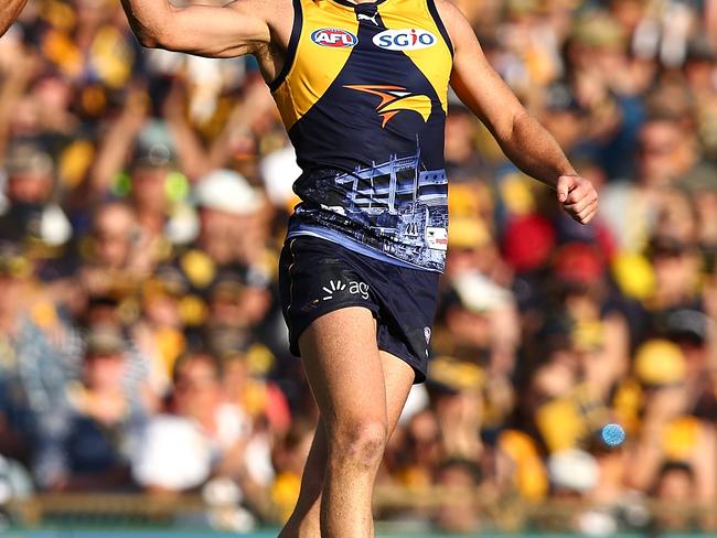
WEST COAST EAGLES
2017 SUBIACO
A tribute to their final game at Subiaco Oval, with a jersey that will thankfully never be repeated.
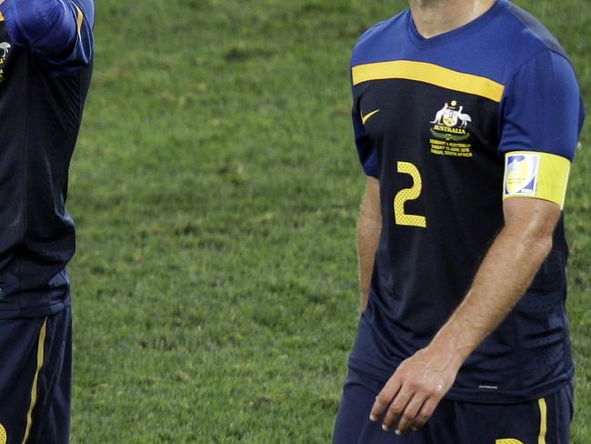
AUSTRALIA FOOTBALL
2016 AWAY
The Socceroos were dudded with their home and away strips for the 2010 World Cup, with a two-blue design failing to hit the mark.
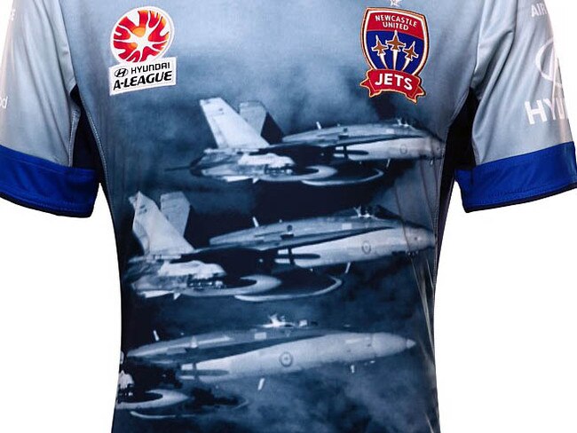
NEWCASTLE JETS
2015-16 SPECIAL
The sentiment was there in a tribute to the armed forces, but the image of fighter jets on their jerseys didn’t hit.
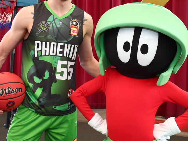
NBL LOONEY TUNES
2019-20
Yes they were designed to appeal to kids, but having a future NBA star in LaMelo Ball wearing a Road Runner jersey is a big no.
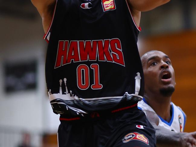
ILLAWARRA HAWKS
2022/23
The Wollongong Harbour Lighthouse might be somewhat iconic, but it isn’t needed on your home shirt.
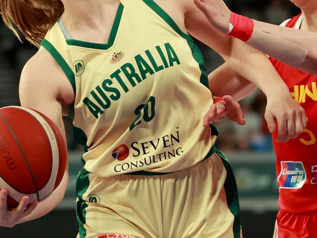
OPALS/BOOMERS
2024 LIGHT
The Boomers and Opals have opted for lighter shades of gold, but it’s a miss, particularly when watching on TV.
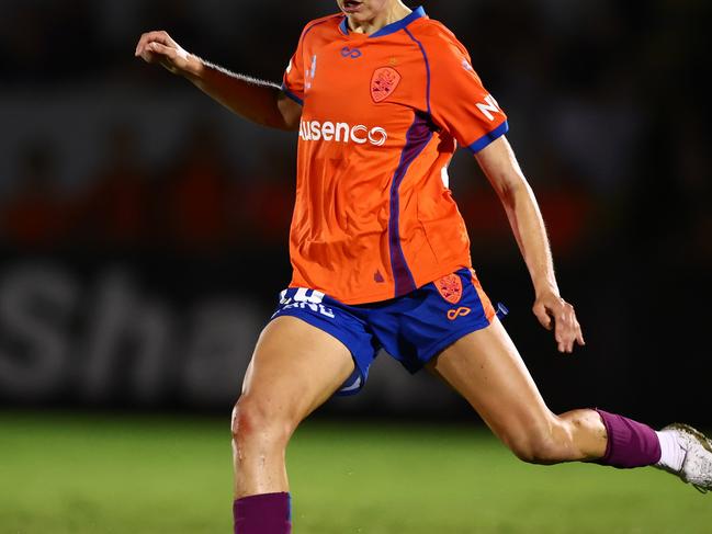
BRISBANE ROAR
2024/25 HOME
Brisbane’s home jerseys certainly will stand out throughout this years A-Leagues seasons. For the right reasons? That’s your call.
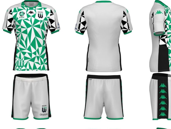
WESTERN UNITED
2020 AWAY
The new kids on the block made a statement with their away strip in their inaugural season, with a design resembling something out of a kaleidoscope.
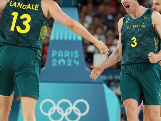
BOOMERS
2024 OLYMPICS DARK
These uniforms were panned by current and past players, with the jerseys something you’d expect the triathletes to run around in.
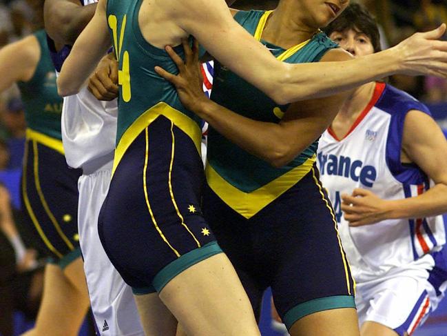
OPALS
2000 OLYMPICS DARK
The bodysuits were very controversial with both players and fans alike.
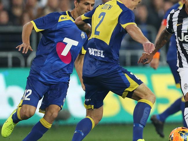
A LEAGUE ALL STARS
2014
Between the oversized logo and the horrid use of colour scheme, the A League didn’t put its best foot forward against Juventus.
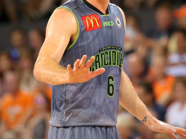
TOWNSVILLE CROCS
2015/16 AWAY
Take your pick of which Townsville design was more uninspired during the 2015/16 season - a horrid shade of green or an all grey strip.
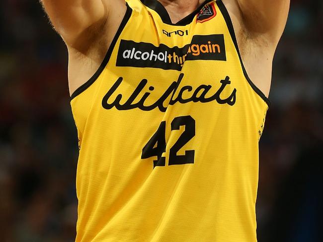
PERTH WILDCATS
2012/13 HERITAGE
Just because your club has worn colours in the past doesn’t mean they need to be given new life for heritage round.
Any we’ve missed? Let us know in the comments below.


