Half a million taxpayer dollars spent tweaking NSW Fire and Rescue logo
HALF a million taxpayer dollars has been spent tweaking the NSW Fire and Rescue logo to make it more approachable. Take a look at the new logo inside and let us know what you think.

NSW
Don't miss out on the headlines from NSW. Followed categories will be added to My News.
HALF a million taxpayer dollars has been spent tweaking the NSW Fire and Rescue brand after research suggested its existing logo was “unapproachable” while being too focused on firefighting.
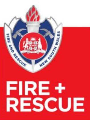
The redesign adjustment places the agency’s crest onto a red square featuring the words “Fire + Rescue”. It also replaces any signage on buildings, fire trucks and uniforms displaying the words “Fire and Rescue” or “Fire & Rescue” with “Fire + Rescue”.
The agency’s crest itself, however, retains the words “Fire and Rescue”.
MORE: DOGS BOUGHT IN TO BOOST MORALE AT AMBO CALL CENTRE
MORE: TEEN FIGHTS FOR LIFE AFTER 11-STOREY FALL
MORE: TROY GRANT WILL NOT CONTEST STATE ELECTION
Management calls it the “Plus plan” and believes it will better reflect the agency’s rescue role.
Placing the crest on a red and white background, gives it a sense of “emergency’ and more energy, managers say.
However, not everyone believes the changes were necessary with the State opposition slamming the spend as a gross waste of taxpayer funds.


Documents obtained by Labor detailing consultant discussion notes on the old logo reveal $517,142 was spent to explore a new brand for the agency. The Opposition claims the final cost was also likely to escalate as the agencies replaced its old logo on uniforms and stationary.
While the existing branding showed the agency was steeped in history and tradition, it also painted the organisation as being authoritative, formal and having an “air of unapproachability to it” or being “up there”, said one consultant’s report.
MORE: FIREYS SCRAMBLING FOR CRANES
“It lacks a sense of energy and approachability,” it said.
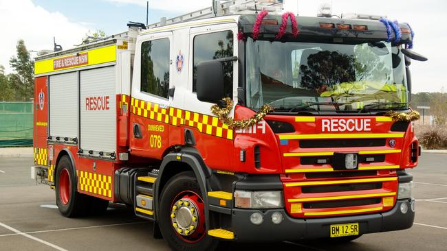
As for placing the crest on to a red background, this would “look great on trucks”.
“Red (is) seen to be distinctively fire,” it said.
“The use of white on red broadens it out to encompass emergency.” That’s really spelling it out … it would look great on trucks”.

The report said the plus symbol was “significant” in “pulling through” the emergency theme.
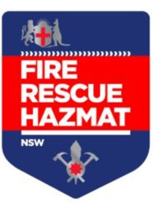
An alternative blue branding option adding “hazmat” to the logo was universally slammed as “dull”, “dated” and “horrible”.
MORE: RURAL FIREYS’ RELUCTANCE TO ACCEPT HELP
State opposition emergency services spokesman Guy Zangari said the brand change was worthy of an another episode of Utopia, the hit ABC satirical series on public servants.
“This money should have gone into updating equipment and technology, instead of a ridiculous rebranding,” he said.
“Half a million dollars to change .. to a ‘plus sign’ just proves this government has the wrong priorities when it comes to our emergency services.”

In a letter to unions last month, NSW Fire and Rescue Commissioner Paul Baxter said the new branding was designed to address the lack of understanding of the organisation’s role in the community, from ambulance assist jobs to counter-terrorism activities.
“The branding represents what we do now and expect to do in an increasing way in the future,” he said.
A Fire and Rescue NSW spokeswoman the community had expectations of wide ranging capabilities delivered by a modern fire service.
She said the updated brand will be added to new fire trucks, while stickers on existing vehicles will be replaced “at minimal cost” when they undergo maintenance.
