
Failsafe colour combinations that work every time
FAILSAFE colour combinations that work will make your interiors shine
Home Mag
Don't miss out on the headlines from Home Mag. Followed categories will be added to My News.
THERE’S a reason some rooms just seem to look right. Sometimes, it’s about the scale of the furniture or keeping to a particular style such as the Hamptons look or Hollywood Regency but, more often than not, it’s about the colours.
Dulux colour expert Andrea Lucena-Orr says there are tried and true methods to picking winning colour combinations. And one of the easiest ways to create a palette is by working with one colour in different tones.
“If you’re a bit nervous about using colour, it’s a great place to start,” she says.
“Dulux Blue Oar and Sea Breeze are really soft blues you could use in quarter or half strength on the trim and then try Sea Breeze full strength. Keep it tonal.”
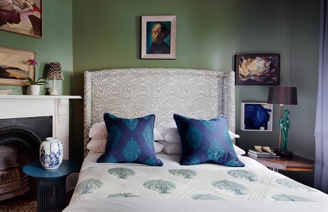
Build the colour by using the darker tones up to dado rail height on the walls and then going a lighter tone above it. If it’s starting to feel a bit cold, small doses of soft pink with a hint of peach in a single chair, a footstool or a throw rug while warm the space up.
Soft pinks also work well with muted greens, such as Dulux Spanish Olive.
“It’s a very contemporary but timeless look,” Andrea says.
If you’re feeling more adventurous, use a stronger colour in greater amounts on a single wall or even the whole room.
“Good colour combinations are about volume and balance,” Andrea says. “If you want the space to feel decadent, go dark.”
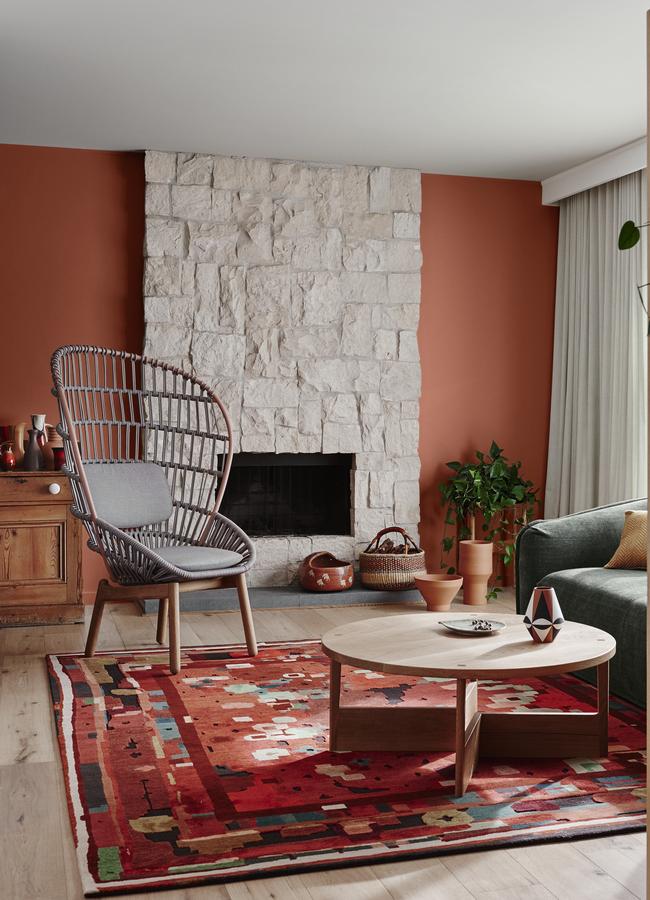
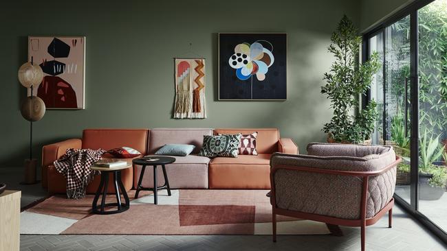
TERRIFIC TERRACOTTA
Interior designer Juliette Arent from Arent & Pyke says her favourite colour combination at the moment is warm terracotta teamed with peachy pink and deep blue.
Thoughtful use of strong colour is what her firm has become known for.
“It brings such a beautiful energy and personality into a room,” Juliette says. “It could be a piece of furniture, a vase or even a colourful artwork.”
When building a colour scheme she says she and design partner Sarah-Jane Pyke are always looking to balance deep tones and then adding a lighter colour and a mid tone.
“We’re definitely using a lot more green and then the same depth of the blue,” she says. “We’re loving the terracotta and light peach and then we’ll choose a mid tone, which is often a brighter hue.”
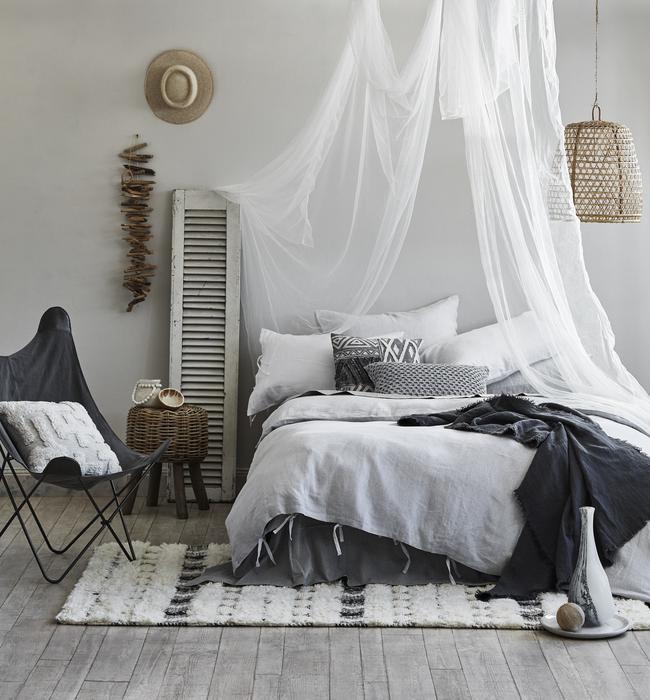
If you’re working on your own colour scheme, interior designer Karen Akers says
a neutral base of soft grey is a good start.
“A neutral colour palette of white, beiges, greys and browns are pretty fail safe and
tried-and-true colour combinations,” she says.
From there, you can add small doses of quite strong colour to bring the room to life.
More:arentpyke.com; dulux.com.au; haymespaint.com.au; karenakers.com.au