
Lyle’s axes ‘hideous’ Golden Syrup logo after 150 years – people are only just realising what it meant
The oldest unchanged brand in the world has undergone a revamp – and shoppers have only just worked out how grim the original logo was.

Eat
Don't miss out on the headlines from Eat. Followed categories will be added to My News.
The world’s oldest unchanged logo – which has been in its present form for 140 years – has got a makeover which has stunned some as it’s suddenly made them aware of how grim the original brand was.
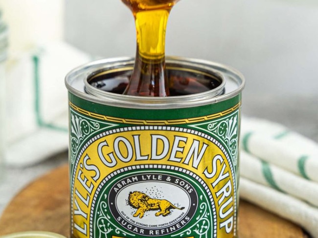
Britain’s Lyle’s Golden Syrup, tins of which can be found in many UK homes, has replaced the distinctive image for the first time since 1883.
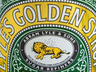
Lost on many was that the 19th century brand, still in use until 2024, showed a dead lion being swarmed by bees, reported The Sun.
The rotting animal – yum! – was a nod to a Christian allegory of sweetmess coming from strength.
The new version depicts a happier, very much alive, animal and a single bee.
It will feature on products, including the firm’s plastic syrup and dessert bottles.
The syrup is made by Tate and Lyle, the company which the famous Tate galleries in London are named after.
It has said that in a nod to its history the classic Lyle’s Golden Syrup tin will be excluded from the rebrand, keeping the dead lion.
Lyle’s packaging was first launched in 1881 and holds the Guinness World Record for the world’s oldest unchanged brand packaging.
Despite the logo being around for decades, many people have never realised what the image depicts.
Writing on social media one said: “Used it for years in the UK. Can say I never noticed!”
A third commented: “Is that what it was? I thought it was a sleeping lion, surrounded by bees to represent the king of syrups that tastes so good even the bees think it’s like honey”
A fourth posted: “Crikey, never noticed it!”
While a fifth said: “I never noticed Lion was dead! How hideous.”

Tate and Lyle, owned by America’s ASR. said the branding has been “revitalised for the modern UK family” in a move to “refresh the brand’s legacy to appeal to a 21st-century audience”.
James Whiteley, brand director for Lyle’s Golden Syrup, said: “While we’ll continue to honour our original branding with the heritage tin, consumers need to see brands moving with the times and meeting their current needs.
“We’re confident that the fresh new design will make it easier for consumers to discover Lyle’s as an affordable, everyday treat, while re-establishing the brand as the go-to syrup brand for the modern UK family, featuring the same delicious taste that makes you feel ‘Absolutely Golden’”.
The rollout of the new packaging design – a golden illustration of a lion’s head – will begin this month and continue throughout the year.
What a dead lion?
The original packaging design was the idea of the product’s founder, Scottish businessman Abraham Lyle, who decided to include a Christian analogy on the tins.
In the story, Samson kills a lion with his bare hands before returning to the carcass a few days later to find a swarm of bees had created a hive in its body.
Samson then took honey from the hive and fed it to his parents without telling them where he got the honey from.
He later asks guests at his wedding to solve the riddle: “Out of the eater, something to eat; out of the strong, something sweet”.
A version of the riddle – “out of the strong came forth sweetness” – was chosen for the logo of Lyle’s Golden Syrup, and has remained on the tins ever since.
Lyle’s isn’t the only brand to undergo some work recently.
This story appeared in The Sun and is reproduced with permission.


Originally published as Lyle’s axes ‘hideous’ Golden Syrup logo after 150 years – people are only just realising what it meant
Video sparks global supermarket shortage
Coles and Woolies have issued statements after a viral food craze saw stock of one item depleted from supermarket shelves globally.
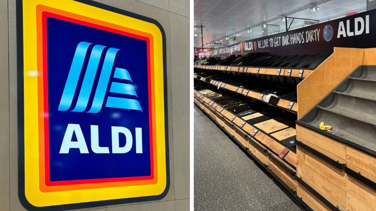
Wild reason why Aldi shelves stripped bare
Photos revealing the fresh food section of one popular supermarket completely stripped bare has left shoppers stumped.