
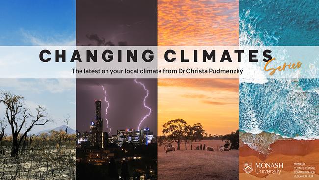
Art and climate data unite to visualise our warming planet
A series of vertical coloured bars can paint us a picture of our warming planet without words, numbers or graphs, explains Changing Climates series author Dr Christa Pudmenzky.
Hyperlocal
Don't miss out on the headlines from Hyperlocal. Followed categories will be added to My News.
Yesterday we saw the internet splashed with a striking series of red and blue stripes, as the world marked its 6th annual #ShowYourStripes day.
#ShowYourStripes day is a time to start conversations and spread awareness about climate change and rising global temperatures.
At the centre of this day are the iconic 'warming stripes'.
Put simply, the warming stripes graphics are a visual representation of how a region'sannual average temperature has changed over the past 100+ years.
And, they show how rapidly our planet is warming.
Each stripe represents one year, and the colour corresponds to the temperature – blue stripes are years below the long-term average, while red stripes are years above.
The darker the colour, the greater the departure from the average.
If we take a look at the warming stripes for Queensland, you'll notice the stripes start out primarily blue, representing cooler than average temperatures.
However, around 1970, the stripes transition to more frequent, and darker shades of red, showcasing a rapid shift to warmer conditions.

As the latest IPCC report reveals, this trend is likely to continue unless we significantly reduce our greenhouse gas emissions.
Australia is currently the world's 14th highest emitter, with around 30 per cent of our emissions coming from the burning of fossil fuels for electricity.
Transportation, agriculture and industrial processes are also major contributors, making up a further 40 per cent.
This means we'll need to cut emissions across the board to stabilise our climate.
Why all the stripe hype?
The simple, colourful graphics designed by Professor Edward Hawkins from the University of Reading, are a stellar example of effective science communication.
They are underpinned by two key elements: colour and data.
From a very young age we begin to associate temperature with colour.
It's as simple as looking at the water faucet handles in our homes or schools: red means hot and blue means cold.
So, no matter the age or background of the viewer, the message is clear.
Secondly, the warming stripes translate complex climate data from Berkley Earth into an accessible, highly-shareable format that needs very little explanation.
This simplicity has allowed warming stripes to infiltrate pop culture, making a statement on the catwalk during London Fashion Week in 2021, and featuring on the cover of environmental activist Greta Thunberg's 'The Climate Book'.
Warming stripes have also made their way into mainstream fashion, featuring on the ties and outfits of weather presenters, music festival sets, and even on Teslas.
And, the increasing prevalence of the stripy sensations in the public consciousness has seen the hashtag '#ShowYourStripes' take social media by storm.
In fact, we've seen digital users harness the ability to localise the stripes down to a state or city level, creating unique, shareable visualisations that show how the climate is changing in their own backyards.
Take a look at the animation below sharing climate stripes from around Australia.

Changing the nature of science communication
The creation of the warming stripes has inspired others to use art to communicate science.
In August last year, Professor Miles Richardson from the University of Derby created Biodiversity Stripes to showcase changes in plant and animal life over the past 50 years.
While these stripes feature earthy hues of green, yellow and grey, they follow a similar trajectory to those focussing on the climate, with a 69 per cent decline in global biodiversity since 1970.
Professor Richardson highlights the need to increase discussion around issues highly connected with climate change, like our disappearing flora and fauna, to show the full extent of its impact.
He notes that to re-create a stable planet for future generations, it is important to take a holistic approach and address both climate change and ecological breakdown.
As individuals, we can all step aboard the warming stripes train by sharing the visualisations on social media or using them to spark conversation with friends, family and colleagues.
In addition, making small changes to our daily lives like catching public transport rather than taking the car can help lower our emissions and reduce the pressure on our planet.
For more tips on how we can tackle climate change, look out for our columns published every fortnight.
By working together we can lighten the colours of our future stripes.
Want more information on how your climate is changing? Check out the Dr Christa Pudmenzky is a climate scientist at the University of Southern Queensland.
This column is part of a collaboration between Monash University and News Corp to deliver hyperlocal weather and climate information.

Here’s what you can expect with today’s Ipswich weather
As winter sets in what can locals expect today? We have the latest word from the Weather Bureau.

Everybody appearing at Ipswich Magistrates Court, Friday, July 18
Here is a list of matters listed at Ipswich Magistrates Court on Friday.