
Eight QLD projects named finalists of colour awards
A Queenslander with a Japanese-inspired sunken garden, beacons along a popular cycleway and six other QLD projects have made the finals of the Dulux Colour Awards. See why.


Property
Don't miss out on the headlines from Property. Followed categories will be added to My News.
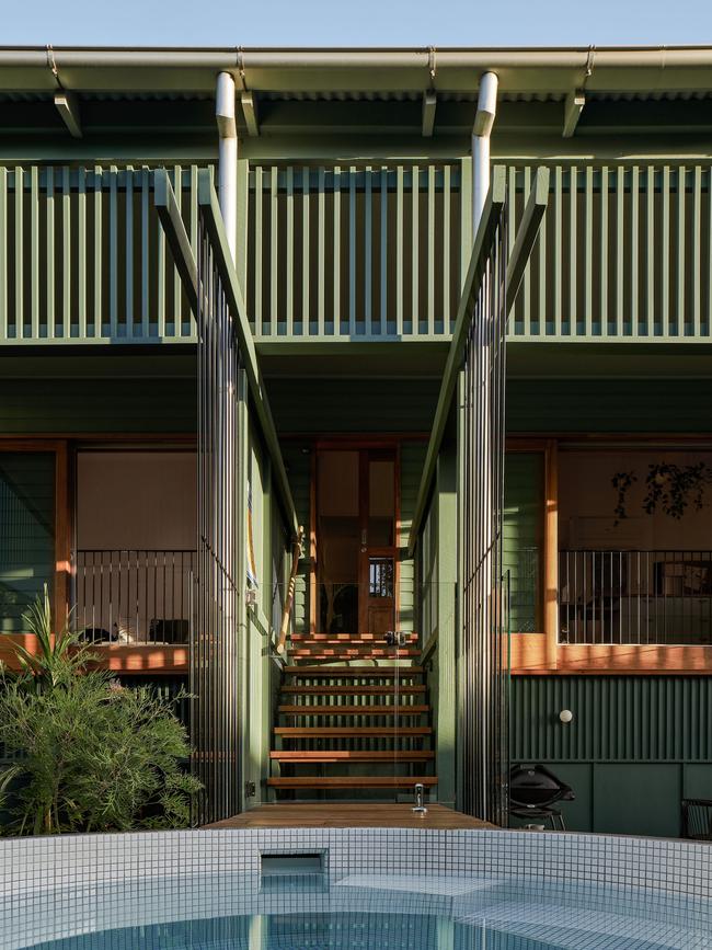
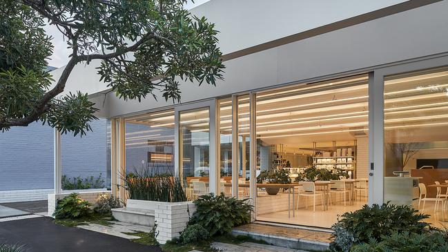
A beautiful Queenslander with a Japanese-inspired sunken garden has been announced as a finalist in the 2021 Dulux Colour Awards.
Engawa House by Arcke is one of five Brisbane projects recognised for their exemplary use of colour in the built environment.
In Japanese architecture, an engawa is a covered area facing a garden that also serves as a passageway or sitting space.
In this project, the architects peeled away the rear of this Queenslander to create multiple spaces occupying the edge or threshold between inside and outside.
MORE QLD REAL ESTATE NEWS
Coastal barn dream home hits the market
Aussie cricket fans will love this
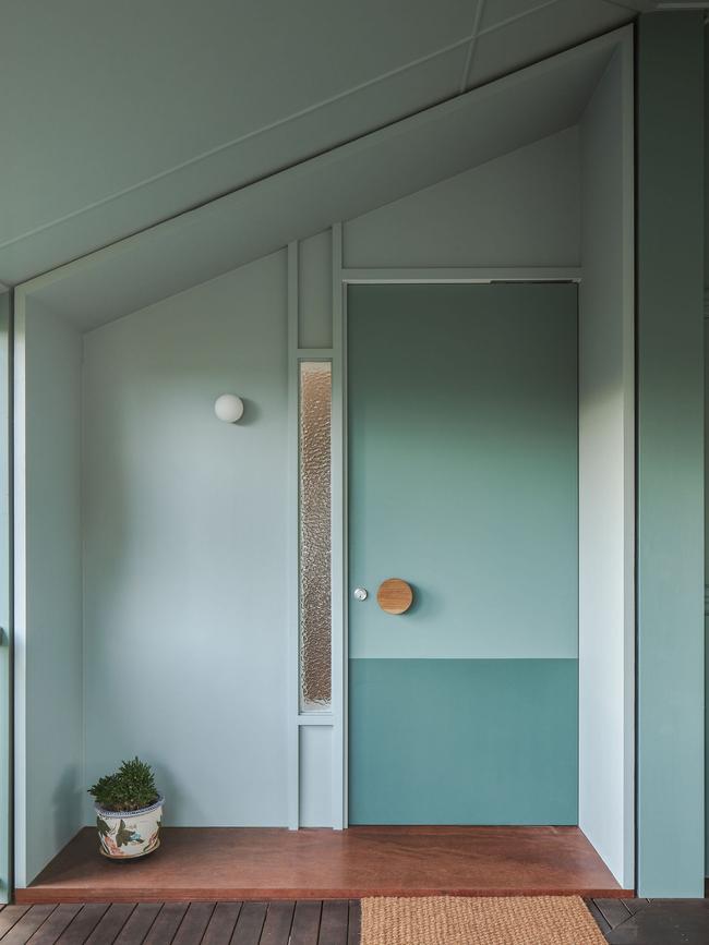
Where a bathroom was once tacked on, now there is a sunken garden.
By opening up this bookend to the house, a serene green space has been created that is enjoyed from above, below and within.
The client had knowledge and passion for Japanese gardens and interpreted a landscape concept design into living sculpture.
Dulux colour and communications manager Andrea Lucena-Orr said the range of finalists were particularly noteworthy.
“We can’t help but view this year’s projects through a slightly different lens. While our focus is always on recognising innovation and excellence in the use of colour, our appreciation of the quality of work is heightened given the challenging climate in which these projects were created and completed,” Ms Lucena-Orr said.
“Undoubtedly, this has contributed to the increased use of biophilia in design, and a resulting swing towards more nurturing tones and natural finishes. The prevalence of concrete, stone and timber, as well as warm metals, paired with warm earthy hues and deep greens and blues, indicates the need for a return to nature and its grounding effect in chaotic times.”
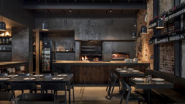
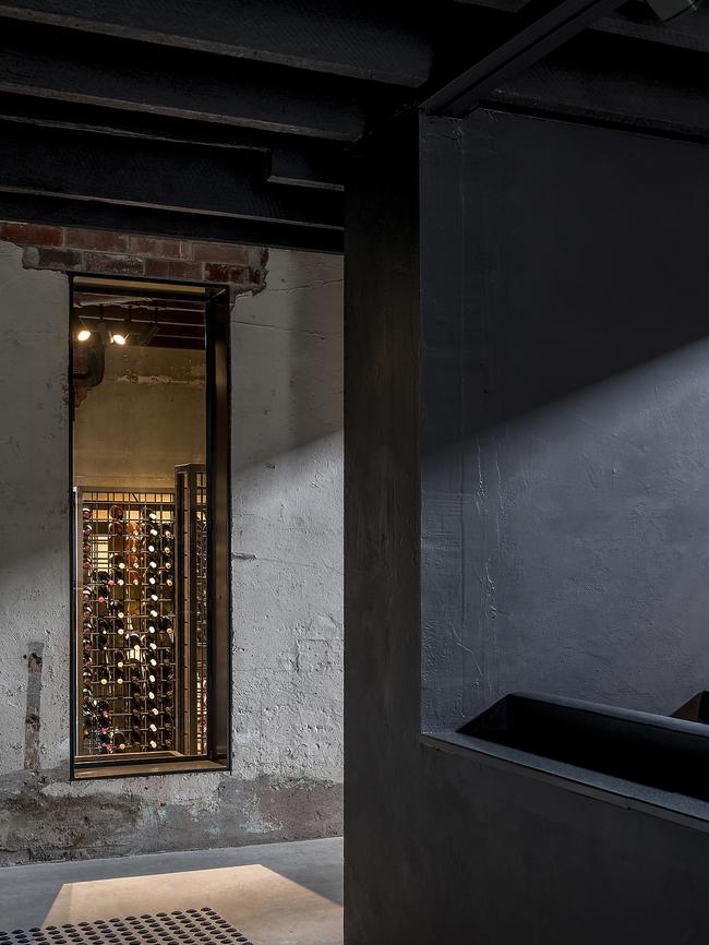
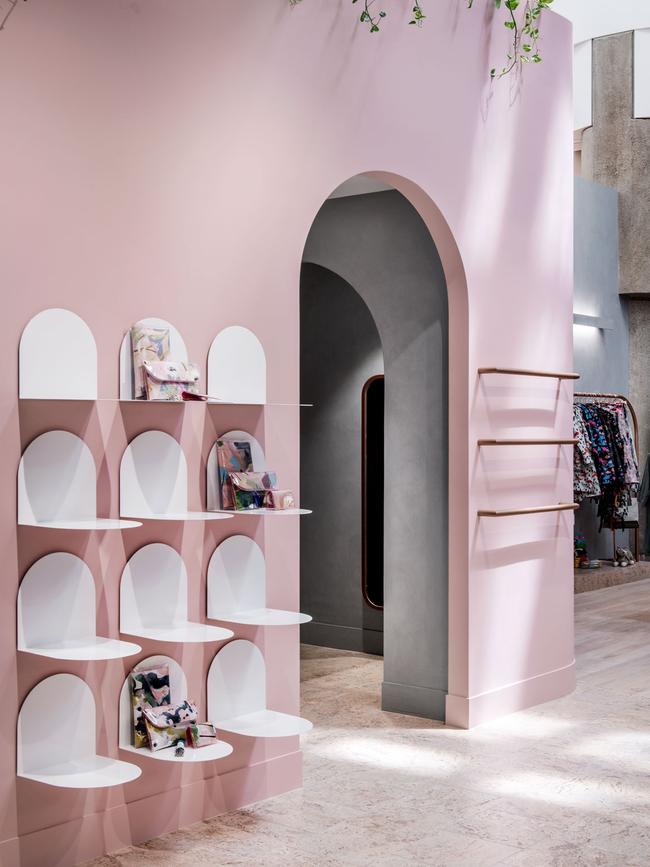
A finalist in the Commercial Interior – Public & Hospitality category is Agnes by Amok (Fortitude Valley).
Housed within a once dilapidated warehouse, the interior experience winds through four unique levels, with an evocative woodfire kitchen serving as the heart and soul of the venue.
From the inception of Agnes, the focus was to create a venue that celebrates the theatre of woodfire cooking and offers a genuine experience of sharing a meal.
The kitchen was a strong focus in the design process, with the dining spaces configured to maximise views to the impressive wood-fires. Surrounded by aged brick, concrete and render, the stairs constructed of steel and recycled timber connect guests to each of the unique spaces, some of which are encased within custom steel framing. In the basement, the amenities adopt a controlled palette of rustic concrete, mirror, and charcoal finishes.

Ms Lucena-Orr observed a return to timeless treatments, particularly the ever-stylish pairing of black and white, in both the Australian and New Zealand entries.
“Reflecting the mood of the time, we are seeing a trend towards dark cocooning exteriors, with deep greys, charcoals and black contrasted with light, warm interiors, especially in residential projects. These combinations are no less innovative, but they are suggestive of designers and clients seeking reassurance, permanence and security,” she said.
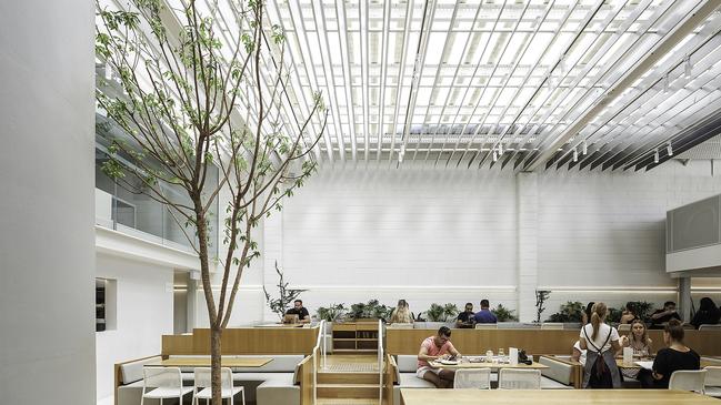
Industry Beans Brisbane by Platform by DesignOffice is a finalist in the Commercial Interior.
The project represents the remodelling and extension of the existing warehouse to create a
layered, coffee-focused, lifestyle destination for casual dining and events.
Defined by clean lines and a refined minimalist approach, Industry Beans Newstead
premises demonstrates a continuation of brand language.
White walls and concrete floors create a crisp, uplifting interior, softened by abundant greenery and grounded by an edited material palette of brickwork and timber.
Natural light is diffused through a series of fins overhead, casting a dynamic pattern on surfaces throughout the day.
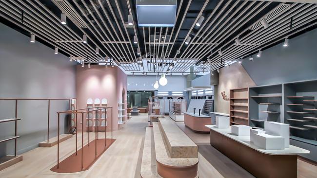
Commercial Interior: Workplace & Retail finalist is Mott & Mulberry by The Retail Designers.
The Mott & Mulberry design had to achieve the elegant atmosphere that is expected in an up-market shopping precinct. The design intent was to incorporate the existing structure of the building, inclusive of the vaulted ceiling and copious amounts of natural lighting.
A Dulux concrete effect finish was applied to the walls to mimic the existing columns; applied pale timber-look ceramic and colour-washed cork tiles to the floor; introduced rich velvet for the fitting room curtains and ottomans and finished off the colour palette with a gorgeous copper look to all metal and skirtings.
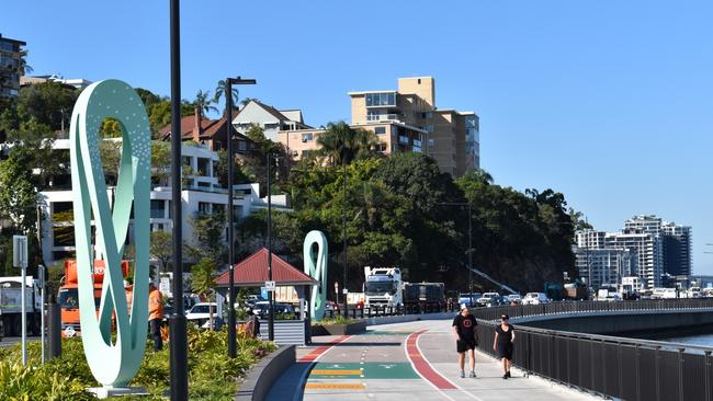
A finalist in the Commercial & Multi Residential Exterior category is Kingsford Smith Beacons by Albert Smith Signs (Hamilton).
Albert Smith Signs were commissioned by Lendlease to manufacture the 10 sculptural beacons designed by artist Kenji Uranishi, with the first beacons already installed along the river pathway. The public art structures enhance the landscape and have been positioned to help visitors find their way and double as path lighting.
The beacons were shaped and welded from 3mm aluminium to Kenji’s design, painted to the artists specified colours then finished with a hand rolled coat for ease of paint maintenance.
QLD FINALISTS
Agnes – Amok
The Australian Stockman’s Hall of Fame rejuvenation – m3architecture (representing both Brian Hooper Architect and m3architecture)
Industry Beans Brisbane – Platform by DesignOffice
Mott & Mulberry – The Retail Designers
Buddina State School – Tanya Mathers Architecture + Design
Goodna State School Prep / Yr 1 Building – arkLAB Architecture
Kingsford Smith Beacons – Albert Smith Signs
Engawa House – Arcke
Auction blog: Home sells for seven times what owner paid
The hot pre-Easter weekend auction action kicked off with a cottage selling for seven times what its owner paid, one of more than dozens of homes set to change hands today as strong demand continues across South East Queensland.

Warnie’s home trend that’s taking over Australia
Shane Warne was ahead of his time on the cricket field and he was ahead of the curve when it came to relaxing away from the game too.