Little-known detail at Aussie train stations shocks commuters
Sick of ending up on the most packed carriage? If only there was some way to avoid that?! 🧐
Lifestyle
Don't miss out on the headlines from Lifestyle. Followed categories will be added to My News.
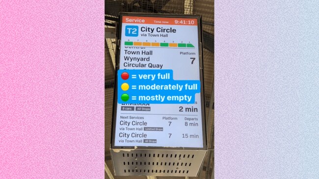
A video shared by Transport For NSW has revealed a little-known detail on Aussie train platforms that could just make your daily commute a bit more bearable.
Taking to their account, they shared a clip of a train station screen, pointing out the colourful diagram that looks like a train at the top.
Each 'carriage' in the diagram is a different colour, which apparently indicates how crowded each one is.
Want to join the family? Sign up to our Kidspot newsletter for more stories like this.

RELATED: Mum’s stern advice after voicing common baby problem
"They give you the down low on where to sit"
"Sick of ending up on the most packed carriage on the train?" the caption read.
"If only there was some way to avoid that?! 🧐 Oh wait, there is... use the carriage graphics on platform screens to give you the down low on where to sit."
According to the key, red means it's very full, yellow means it's moderately full, and green means it's mostly empty.
Introducing our new podcast: Mum Club! Listen and subscribe wherever you get your podcasts so you never miss an episode.
RELATED: ‘Thought it was ok’: Woman booted from café for entitled act
"Taking notes"
In the comments, people shared their disbelief. "Aww! I never knew that. Thanks for sharing, 😊" said one viewer.
"I had no idea either," a different person replied.
Another wrote: "Ohhh, I've always been curious about what that meant."
"I'm taking notes," claimed someone else.
Others joked that they wouldn't be using the information, even though they appreciated it: "Oh cool *gets on the one where the door is closest to the stairs at my stop anyways*"
More Coverage
Originally published as Little-known detail at Aussie train stations shocks commuters


