
Controversial ‘Women’s Network’ logo taken down after Twitter backlash
The logo for the Prime Minister and Cabinet’s ‘Women’s Network’ has been taken down after it was ruthlessly mocked for its phallic appearance.

At Work
Don't miss out on the headlines from At Work. Followed categories will be added to My News.
The logo for the Prime Minister and Cabinet’s (PM&C) “Women’s Network” has been taken down, after it was mocked on social media for its phallic appearance.
Rather than draw focus to the purpose of the Network – which, according to a description, ”promotes gender equality and supports members to succeed in their personal professional lives” – the logo ignited controversy when it was shared to Twitter on Sunday.
Many at first assumed the logo was a fake because of its overt resemblance to male genitalia, while others were furious that it detracted from the actual purpose of the Network.
Now, in a turn of events that echoes back to the infamous taxpayer-funded “milkshake” sexual consent ads last April, the logo has been removed from the PM&C’s website.
A spokesperson for the Department of PM&C told news.com.au in a statement that staff first rebranded the “staff diversity networks” – which includes the Women’s Network – in 2019, “to establish a consistent look and feel”.
Stream more tech news live & on demand with Flash. 25+ news channels in 1 place. New to Flash? Try 1 month free. Offer ends 31 October, 2022 >
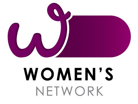
“The Women’s Network logo retained a ‘W’ icon which staff had been using for a number of years,” they added.
“The rebrand was completed internally, using existing resources, and designs were consulted on widely. No external providers were engaged for this work.
“The logo has been removed from the department’s website, pending consultation with staff.”
The spokesperson said Prime Minister Scott Morrison and the Prime Minister’s Office “were not part of this logo design”.
Earlier on Monday, Women’s Network Australia (WNA), which has been supporting women in business for more than 30 years and is one of the nation’s longest-running membership-based groups for women, called for the logo’s removal after people began confusing the PM&C’s Network with theirs. Suffice to say, the WNA logo also does not look like a penis.
“WNA is in no way affiliated or associated with ‘The Women’s Network’ being promoted by the Department of the Prime Minister and Cabinet, or the logo for this group, which has attracted criticism,” a WNA spokeswoman told news.com.au.
“The WNA logo is trademarked and there should be no confusion with this government logo. There is no connection between our organisations and the PM&C network.”
WNA CEO Cheryl Gray said while it was encouraging to see the Prime Minister’s Department considering equal opportunity as an issue, the choice of logo and name was “unfortunate” and should be removed.
Twitter users were surprised that nobody flagged the logo’s design before it was published on the PM&C website.
“I really thought this logo for the Department of the Prime Minister and Cabinets women’s network was fake but uh … do they know?” wrote one Twitter user alongside an image of the logo.
“Why have the juvenile idiots in your department made male genitalia out of the Women’s Network logo?” political and social commentator Ronni Salt wrote.
“How hilarious. Let’s degrade women. Again. Anybody who understands graphic design knows this is deliberate. Anybody who didn’t catch this isn’t doing their job.”
Salt shared a screenshot of one graphic designer’s response to the logo, who in their tweet noted that “the designer knew EXACTLY what they were doing from font choice to layout to colour”.
“This isn’t a mistake. It reeks of teenage boy malevolence,” the graphic designer added.
Author and journalist Quentin Dempster agreed, tweeting that the logo’s appearance “satirises what all women and men of goodwill are trying to achieve: the empowerment of women, equal rights and an end to a culture of violence, sexual assault and misogyny”.
Either someone has a very dark sense of humour, or….
— Amy Remeikis (@AmyRemeikis) March 13, 2022
(From the PM&C website) pic.twitter.com/Pru8o2a4jy
Why have the juvenile idiots in your department made male genitalia out of the Women's Network logo?
— RonniSalt (@RonniSalt) March 13, 2022
How hilarious. Let's degrade women. Again.
Anybody who understands graphic design knows this is deliberate.
Anybody who didn't catch this isn't doing their job.
. pic.twitter.com/OqZSMvw1QR
I thought this was satire, but it is either thoughtless or an insult. Public money was spent getting a graphic artist, choosing the designing, selecting colours, approving, printing and publishing this logo for the Prime Minister's and Cabinet's Women's Network.
— National Older Women's Network Australia (@OlderWomenNetAu) March 13, 2022
Poor messaging. pic.twitter.com/jDYKNdMCkg
It’s not the first time the validity of a Federal Government campaign has been questioned – lest we forget those consent ads.
The $3.7 million campaign was pulled after fierce public backlash, with hundreds of people – including government officials and rape prevention campaigners – labelling it a dangerous waste of money and a “big fail”.
One bizarre video showed a woman smearing a man’s face with a milkshake, while another used an example of a man eating a taco to explain sexual assault.
“Young people are more sophisticated than this content gives them credit for. And sex and consent is far more complicated than videos about milkshakes and sharks at the beach,” End Rape on Campus Australia’s Karen Willis, a prevention educator with 30 years experience, told news.com.au at the time.
“These resources fall well short of the national standards, and what experts know is needed to actually change behaviours and prevent abuse.”


Originally published as Controversial ‘Women’s Network’ logo taken down after Twitter backlash

Tradie dies after being struck by 250kg ramp
A construction company has been fined over the death of a tradie who was struck by a 250kg sea container drawbridge ramp.

‘When I talk, you shut up’: Councillors erupt
An extraordinary screaming match has erupted at a Sydney council meeting after a local member told his female colleague to “shut up when I’m talking”.