- Business
- Consumer affairs
- Architecture
This pint-sized Chippendale terrace is as edgy, exciting and brave as a Stanley Kubrick film
An architect threw caution to the wind and let inspiration bubble to the surface during the transformation of a pint-sized terrace in Sydney’s Chippendale with a tiny 3.2-metre street frontage. The result is simply brilliant.
Words fail to match the sheer panache of this award-winning renovation by architect Victor Alcami, director of Alcami Architecture.

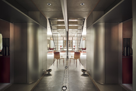
The mirrored wall in the entrance doubles the width of the boundary walls, at least in perspective.Credit: David Wheeler
With ideas that can be traced to the owner and also the architect’s Barcelona origins, one is immediately transformed into another world, past the restored Victorian facade.
Lived in by the client for 20 years, it took a passing conversation on the street to initiate what would become an award-winning project – recipient of an architecture award and the EmAGN Award, both from the Australian Institute of Architects (NSW Chapter).
“Bruno (the owner) and I share a similar history, and we both enjoyed discussing the options for the renovation,” says Alcami, whose brief was to maximise the site, a mere 57 square metres in area, and inject colour – primarily orange, being Bruno’s favourite colour – into the mix.
Reworking the spaces and blurring the lines between inside and out was taken to the max, with mirrored walls distorting the boundaries and extending the sight lines immediately past the front door.
With the brief including a bath and the importance of being in a light-filled space, the bathroom was given the highest priority in the planning. Occupying what was formerly the front living area (just over 3 by 3 metres), the main and only bathroom features orange-coloured penny tiles that frame the translucent orange Perspex basin and bath.
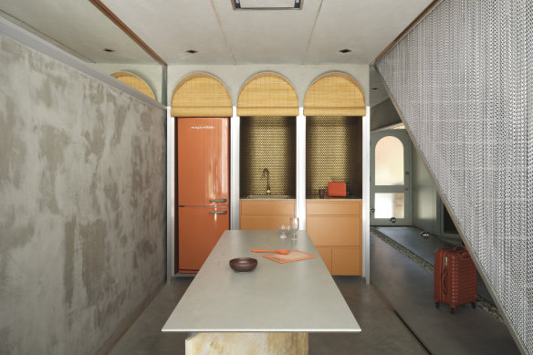
There was certainly an appreciation of the 1970s but also of orange (Bruno generally wears orange shoes and shirts and surrounds himself with orange objects). The Spanish fashion designer Paco Rabanne, who made his mark in the 1960s with his chain mail dresses, can also be seen as an influence, with a sliding chain mail curtain separating the kitchen from the main passage, together with appearing as a balustrade for the “floating” steel staircase.
The kitchen, which spills out to the internal courtyard, also has a touch of the glam late 1960s, with the joinery and fridge in the gallery-style kitchen concealed behind operable bamboo blinds. The golden alcove niches behind the bamboo also offer depth and an element of surprise.

The Spanish fashion designer Paco Rabanne, who made his mark in the 1960s with his chain mail dresses, can also be seen as an influence.Credit: David Wheeler
And while there’s an island bench, as found in most kitchens, this one, complete with induction hotplates, is primarily used for cooking. Given the dimensions of the site, the idea was to expand the width and length of the house. The mirrored wall in the entrance, for example, doubles the width of the boundary walls, at least in perspective, as do the mirrored surfaces above the cement-rendered walls along the passage.
The use of pebbles in the courtyard, appearing as a fixed rug, also provides the illusion of space between the kitchen and the living area. “I’ve always admired Donovan Hill’s D-House (located in Brisbane and completed in 2000) and the way they stretched the boundaries,” says Alcami, who also took inspiration from the way architect Adolf Loos used mirrors in the “American Bar” in Vienna from the early 20th century.
The illusion of space can also be seen at the rear of the property, with inverted fibro-cement arches also creating a sense of ‘floating’ and a space beyond via the use of a mirrored backdrop. “You think there’s another room,” says Alcami. Mirrors also play an important role on the first floor, with the main bedroom and a guest bedroom feeling considerably larger and now substantially lighter with a new skylight.

The kitchen, which spills out to the internal courtyard, also has a touch of the glam late 1960s, with the joinery and fridge in the gallery-style kitchen concealed behind operable bamboo blinds.Credit: David Wheeler
When the original French doors of the main bedroom are open, the home’s ornate Victorian balustrade provides a reminder of what this home used to be. But for those who walk straight in and fail to notice the period facade, it’s like stepping into a brave new world – a Stanley Kubrick film – edgy, exciting, brave and, above all, truly memorable like many of the films he produced. Alcami is also a star in the making – proving that even with the narrowest house and smallest plot, “the sky can still be the limit.”
The Market Recap newsletter is a wrap of the day’s trading. Get it each weekday afternoon.