
How SA's new brand logo got the whole state in a buzz
IT was worth $1.3 million and hyped for months. SA's new brand was announced amid much fanfare - but many people really didn't like it. Designer Ken Cato: I'm not a one-tricky pony
IT was worth $1.3 million, and hyped for months. SA's new brand was announced amid fanfare - but many people really didn't like it.
The new logo generated a huge reaction on adelaidenow and across social media.
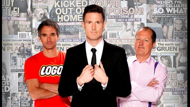
Comedian and host of advertising and branding TV program The Gruen Transfer, Wil Anderson, says that love it or hate it, our logo essentially doesn't matter.
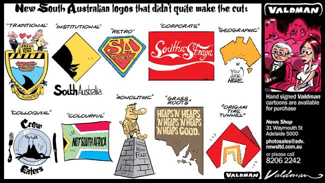
The comic - in town to perform at the Adelaide Fringe - compared the new logo with "an origami Pope hat" but added that it's not an image that will draw people to a place.
"Here's the good news - logos don't matter," Anderson said.

"It's overpriced and overcharged and no one ever has gone to a state based on their logo.
"No one cares about a logo, it's ridiculous. But this one is particularly crap."
Anderson - who is considered a brand aficionado having hosted ABC-TV's The Gruen Transfer alongside advertising industry heavyweights Todd Sampson and Russel Howcroft since 2008 - wasted no time in criticising the design and Tasmania's omission.
"I'm sorry South Australia but do you really want a logo where your part of Australia is a hole?" he said. "It's like the tiny doorway from Willy Wonka - that's what it looks like.
"Obviously as a tribute to the Pope leaving they've made his hat the logo for South Australia.
"I saw it in the paper this morning and thought ... it's like if people were saying 'the Pope has retired and as a promotion The Advertiser has got your own origami pope hat you can make' - that's what it is."
Anderson - who is performing in the Garden of Unearthly Delights until March 17 - called into question the $1.4 million budget spent on the logo.
"I hate when they spend this much money on these advertising w***ers," he said on radio.
Earlier on Thursday, the man behind SA's old Brilliant Blend logo said the new brand was a "lost opportunity".
And the designer of the new brand said we would all eventually love it.
As the Opposition says they wouldn't drop the new brand if they won government, Ken Cato, the Melbourne-based designer of the new 'door-map' brand, said he expected people to "dump on" it at first.
READ MORE: Ken Cato defends his creation
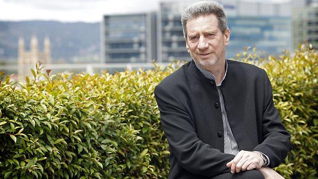
But he believes South Australians will eventually take great pride in the symbol, which cost a total of $1.3 million to develop.
"A number of people are just going to dump on this, say 'what's that about?' but five years from now they will be the ones that remember how they were the only one that thought it was really good," Mr Cato said.
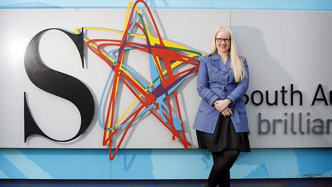
Among the 35 other companies to pitch for the rebranding job was Parallax Design whose creative and managing director Matthew Remphrey designed the previous "SA, A Brilliant Blend" logo.
While Mr Remphrey stressed his comments were not "sour grapes", he said the industry had eagerly anticipated Mr Cato's design but was left "underwhelmed" by a very "literal" interpretation, and lamented the outcome as a "lost opportunity".
"At the end of the day it's a map showing where South Australia is," Mr Remphrey said.
"Perhaps it could have been a bit more symbolic.
"We don't have a Sydney Harbour Bridge or an Eiffel Tower or something to latch on to, we need to be a little bit more abstract in that regard."
Mr Remphrey said he had been excited by the brand's potential, and what could have emerged.
"There does seem to be a bit of a lift going around in terms of (state) confidence, it's a perfect time to rebrand," he said.
"All the signs that were coming out around this was that it will be iconic, like the (Canadian) maple leaf (but) I was quite underwhelmed when it was revealed.
"It could have been that it was hyped up a bit too much."
Mr Cato and his team took about six weeks to develop the image - a stylised red map of Australia with a set of doors depicting the borders of SA at its centre.
It uses angular lines and an origami style, which has been likened to two other brands Mr Cato created, for Channel 7 and the Commonwealth Bank.
Mr Cato said any similarities were not intended.
"I'm not sure if that's supposed to be a negative or a positive thing but if it (SA's brand) sits alongside two of Australia's most successful brands then I think that's pretty good," he said.
"If I showed you a couple of thousand pieces of work that we have done I think you'd find enormous differences of style."

Mr Cato said the power of the brand he designed for the state lay in its simplicity.
"It's about clarification of (SA's) identity," he said.
"I would have thought some people would gain an enormous amount of pride in that brand representing them."
Meanwhile, Opposition Leader Steven Marshall promised to retain the state's new brand if the Liberals won the 2014 election.
Mr Marshall was guarded in his reaction to the brand image saying it was "one of those things that you've basically got to let grow on you".
"Last night at the launch there were plenty of companies there that said this was important to them so we'll be backing that," he said.
"You certainly won't have the Liberal Party coming out and saying we're going to remove this if we win the 2014 election.
"I'm not sure that we'll be using it on the South Australian Liberal Party letterhead but we would be encouraging businesses to look at it (and) work out whether it's going to add value to their organisation."
EARLIER:
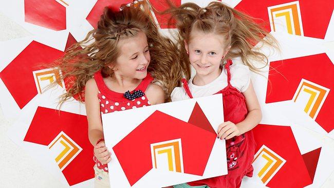
SOUTH Australia's new brand literally puts the state on the map, depicting its borders as a doorway to the nation.
Premier Jay Weatherill launched the brand last night in a public light and sound show in Elder Park where its image was projected on to the sails of the Festival Theatre at 9pm.
Featuring a bright red map of Australia with doorways at its centre, representing SA's borders, the new brand is meant to "make a bold statement about our place in Australia and our place in the world", Mr Weatherill said.
"Too often people are unaware of where South Australia is," he said.
"The success of this brand will lie in its uptake. All of our industries ... could use this brand to pitch their products on the world stage."
"It shows our place in Australia - it is a doorway, it welcomes and it liberates. It is a symbol of how we welcome people into our culture and into the spiritual heartland of South Australia - people of all races, ages and talents.
"It is a symbol of our capacity and willingness to venture far beyond our borders, through our best and brightest people and our best products and ideas."
Opposition Leader Steven Marshall said: "Time will tell whether people take it up. I am hopeful that this will be a good brand to help sell our state overseas and help bring dollars into South Australia."
"Only through people using it will it become as prominent and well known as the maple leaf is for Canada."
Designing and launching the brand cost $1.34 million, taken from existing government agency budgets.
Guests at the launch were divided in their opinion, some describing it as striking and versatile, while others thought it was a bit conservative.
Some people said they were reminded of a home and others said it "shows a sense of place".
Research found South Australians wanted a brand which portrayed South Australia as a creative, innovative and can-do place.
The colour made some think of red wine and the Sturt Desert Pea.
World-renowned branding expert Ken Cato designed the image, which features the name of the state but no slogan to prevent it becoming rapidly out of date and ensure it is flexible enough to be used across government and the private sector in fields such as tourism, education and business.
The logo was revealed in a seven-minute audio-visual display last night, using high-definition projectors to splash the image across the Festival Theatre's white roof.
The light and sound show will be repeated nightly at 8.30pm, 9.00pm and 10.40pm until Sunday.
It uses cutting-edge 3D technology and eight high-definition projectors to run a seven-minute production revealing the brand.
Pixel-mapping software enables producers to fit animated images to the shape of the Festival Theatre's white roof.
The same technology was used to turn Buckingham Palace into a canvas for animations set to music to celebrate the Queen's Diamond Jubilee, last year.
Artist and 3D modeller Nils Porrmann, who was involved in the British spectacular, has worked with SA companies to oversee the state brand production.
Event and film company Kojo has had a team of 25 animators, sound composers, designers and special effects artists working on the brand production for the past month.
Creative designs for the show were done by advertising agency kwp!.
Audio-visual production company Novatech projected the show using 100kg-plus projectors which are ten times more powerful than an average machine.
------------------------
WHAT THE DESIGNERS SAY
WHEN Cato Partners created Brand South Australia, our job was to create a brand to help South Australian businesses attract economic prosperity into South Australia and sell our products outside our state.
Outside the highly distinctive brand mark that clearly communicates to the world where South Australia is located, Cato Partners have created a whole master brand design system that can be used and applied by any industry or company to sell South Australia and their services or products.
Essentially its a distinctive design system that unites the state's identity and over time people will eventually know that it is a South Australian company talking without the brand mark even being present.
Ken Cato is Brand SA designer and Cato Partners executive chairman and creative director
------------
I SEE something amazing in the South Australian DNA.
Simply put, it's our ability to rally behind the state we love, work and live in.
The journey my team from the Economic Development Board and (branding) steering committee set out on nearly 12 months ago was to create a powerful identifying endorsement brand mark for our state - a destination brand.
The team who brought this brand mark to life has done a brilliant job.
They have delivered a vibrant, exciting and flexible brand solution which gives us all permission to feel more confident about South Australia's place in our country and the world.
It is unashamedly bold and literally puts South Australia on the map.
This is not the end of the brand mark journey - far from it - it is but the beginning.
Darren Thomas is an Economic Development Board member and brand project leader
****COMMENTS HAVE NOW BEEN CLOSED ON THIS STORY***