
South Australia falls behind other states on public release of coronavirus data and information
SA is dragging its heels on releasing locations of coronavirus cases, even with “heat maps” being revealed, writes Paul Starick.

Opinion
Don't miss out on the headlines from Opinion. Followed categories will be added to My News.
Heat mapping revealing coronavirus hot spots is a good start but SA Health’s data release lacks detailed information supplied by other states.
Heat mapping revealing coronavirus hot spots is a good start but SA Health’s data release lacks detailed information supplied by other states.
Given Health Minister Stephen Wade’s insistence upon nationally consistent data, this poses some important questions about public information and scrutiny of this state’s seemingly excellent response to the pandemic.
SA has taken a world-leading role in testing per capita, which Premier Steven Marshall has rightly publicised to build confidence, yet has taken a back seat in the public release of information.
Victoria, New South Wales and Queensland release the precise number of confirmed COVID-19 cases by local government area, local health district and hospital/health service area respectively.
By contrast, South Australia’s heat maps, unveiled yesterday after sustained requests from The Advertiser, show cases by local government area but only in numerical bands – such as 1-4, 5-9, 10-14 etc.
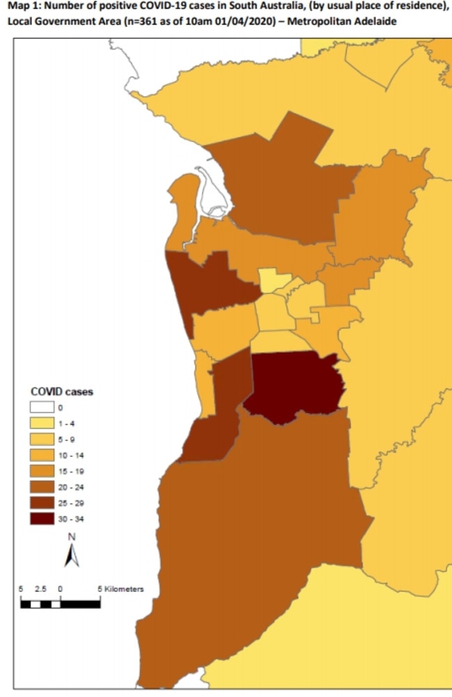
The Advertiser has improved on SA Health’s original heatmap by creating a new version with the latest data, below, featuring clearer labelling to help users clearly see the number of cases in each council area, the number of total residents per area, household incomes and the median age of residents for each area.
COVID-19 IN SA DATA MAP
Not only does Queensland release more comprehensive case figures, its health department website also publishes detailed public health alerts for contact tracing. These include the region, precise location and date and time that people might have been exposed to a person with COVID-19.
Queensland’s contact tracing regimen also includes publishing flight numbers, dates and even seating rows in which people might have been exposed.
Western Australia also publishes detailed information about locations visited by confirmed coronavirus cases.
In the virus’s national epicentre, NSW, there are data for the number of confirmed cases, tests, per cent positivity, and rates of cases and tests per 100,000 residents of each local health district.
The Australian Capital Territory publishes numbers of confirmed cases, people testing negative and people who have recovered.
SA’s public information is more detailed than Tasmania’s, which contains only daily updates on case numbers and, most recently, whether they are from the state’s south or north. The Northern Territory has similar statistics.
Baltimore-based John Hopkins University’s Coronavirus Resource Centre publishes an excellent global interactive map, that includes the number of recovered patients in SA. However, that number has been static at six for some time.
SA Health’s website publishes: number of positive COVID-19 cases in metropolitan and regional areas in number “bands”; an age and sex breakdown of confirmed cases; confirmed cases; number in intensive care units; deaths (none as yet); median age of cases; testing numbers; and sources of infection, broken down by locally acquired (close contact of a confirmed case), locally acquired (interstate travel), locally acquired (contact not identified), and under investigation.
The Advertiser has asked Mr Wade whether more detailed case numbers by region/local government area would be released in line with other states, including statistics on recovered patients, and whether other data releases are planned.
The Advertiser also has asked Mr Wade his view on the transparency of data release to enable people to be informed and scrutinise public health measures, along with his opinion on privacy issues relating to data release.