
US decorator and author Abigail Ahern tells how to add colour to your home
SURROUNDING yourself with rich colour can make for a brilliant and beautiful life, writes Chelsea Clark.
WHEN it comes to interior design, bold and bright colours can be a scary proposition, especially if you’re thinking about painting a feature wall or buying a large piece of statement furniture. But US decorator and author Abigail Ahern says using colour isn’t something to be afraid of.
“Pushing your colour choices will utterly reinvent your space, turning it into a place you will never want to leave,” she says.
Abigail’s latest book is simply titled Colour and is a how-to for novice designers wanting to build a room through colour.
We asked her about how to gain more confidence when using colour in the home.
What does colour bring to a space?
Colour brings everything to a space. It intrigues, delights, enhances, relaxes, stimulates. It makes spaces look cosier and more spacious. It’s the most transformative thing you can doto any room, ever.
How do you create a palette that is personal to you?
I think you have to get away from following trends and not worry about what is in or out. Choose colours that you gravitate towards, look at your wardrobe, stroll to the flower market, be inspired. The more you can come out of your comfort zone and embrace colours that could possibly scare or challenge you in some waythe more intriguing your space will look.
Explain your 60-30-10 rule?
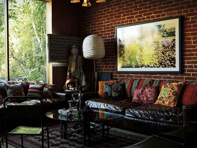
When I start with a room I’ll begin by choosing one dominate colour and apply it throughout, so think ceilings, walls, even floors. This is my 60 percenter, my dominant unifying hue. Next up I’ll introduce a few colours (my 30 per centers) that harmonise, so think upholstery, rugs that sort of thing. Finally I’ll add in some blingy accents like metallics or bold shots, these are my 10 per centers. These take my scheme to new heights and add a whole different dimension. If I went over 10 per cent the space could feel crazy and confusing, but 10 per cent keeps it sophisticated yet edgy.
Do you have any favouritecolour combinations?
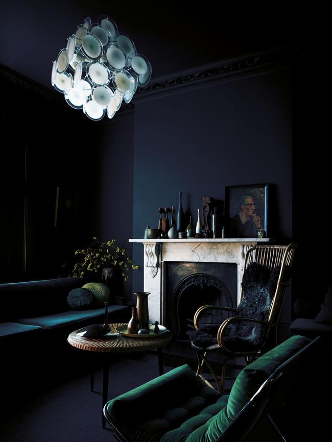
I have so many. Deep deep grey partnered with forest green and gold is my all-time favourite combo. Those hues are a marriage made in heaven, each one enhancing the other. Burnt orange and chocolate, purple and gold. All my choices are quite ballsy, but you can’t be too shy when combining colours. You’ve got to get confident because that’s when magic happens.
Do you need to paint entire walls to get the benefit of colour, or can the same effect be created using soft furnishings?
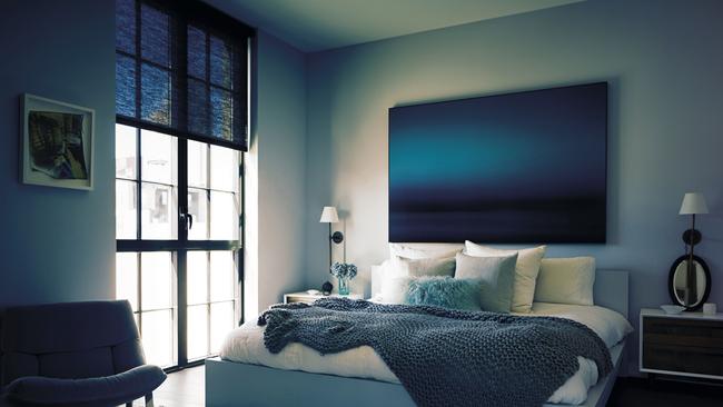
I’m the biggest fan of painting all the wallsout in one hue. You can create a certain atmosphere with the soft furnishings but it will have nowhere near the same dramatic effect.
Are there any combinations thatshould be avoided?
Colour is so personal I think today anything goes. Personally, I have a complete aversion to pastels, sugary pinks and blues but, like I said, that is personal. When it comes to colour you can clash, combine, blend, anything.
Why is it important to add texture to a room?
Texture is like a herb — it adds instant pizzazz to a room. Rooms without texture suffer from bland room syndrome. Overdose on texture, I say, as it’s one of the most under considered components in the decorating puzzle.
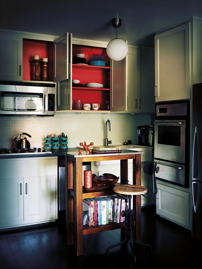
Lots of people shy away from colour in the kitchen or bathroom. What colours do you suggest for these spaces?
Be as dramatic in these spaces as you would in your living room or dining room. I’ve got dark kitchens and bathrooms so I don’t think practical spaces have to be painted out in a beige haze of blandness. I say quite the reverse.
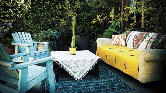
How can you add colour to outdoor spaces?
You can add colour through accessories, chairs, pots, lighting soft furnishings, anything. In my garden I’ve kept it sophisticated by restricting the amount of hues so I have large metallic gold pots, lots of green and black. Another tip — which applies to inside as well as out — is to restrict the amount of colours you use in any one space. The more you restrict the more sophisticated it feels. So in my spaces you find no more than three — occasionally four — shots of intense hue. Everything else is swampy,dark or neutral.
Originally published as US decorator and author Abigail Ahern tells how to add colour to your home