
The Block 2020 recap: Upstairs room reveals | Photos
Block frontrunners Jimmy and Tam have finished last for the second week in a row but that wasn’t the worst part of the judging.
Interiors
Don't miss out on the headlines from Interiors. Followed categories will be added to My News.
There was laughter and tears on The Block this week as the teams revealed their remaining upstairs rooms. But forget the design; this week Neale Whitaker delivered one of the best insults to ever come out of the series, and it’s a term I’ll be using on-the-daily whether it makes sense in context or not. Let’s talk it out …
SARAH AND GEORGE CAME FIRST
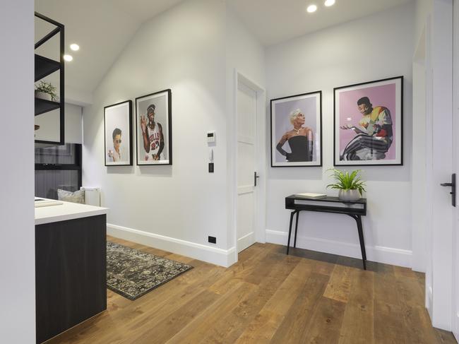
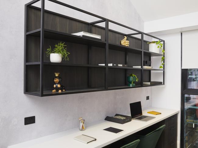
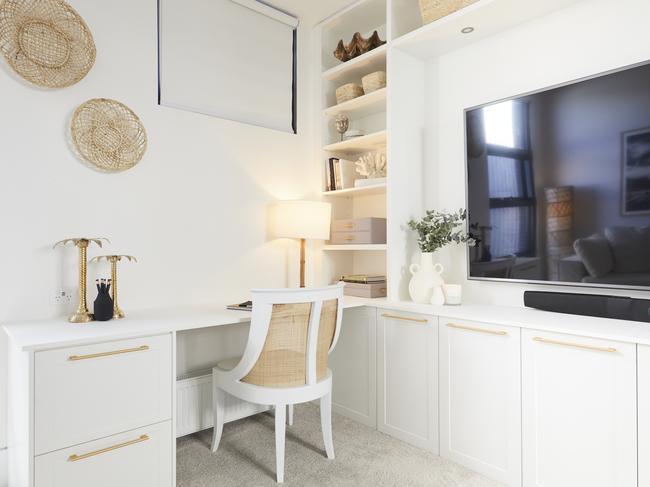
Sarah and George finally took out first place this week, delivering three zones on the upper level. The office is delicious in every way possible, although what in God’s name is going on with the art? Sure I had more Spice Girls pictures blu-tacked to my wall than I care to admit, but I was 16 at the time and not trying to sell a luxury home. I’ll tell you what I want, what I really want – that art to cease production immediately.
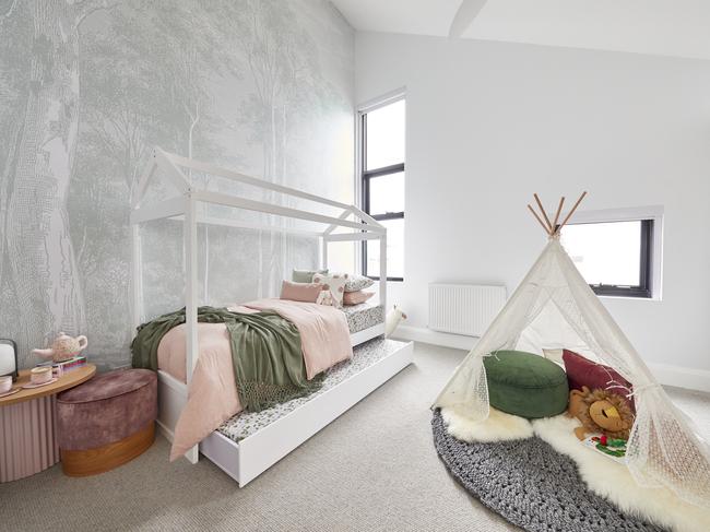
The powder room needs a huge wall of mirrors to give it a moodier vibe and mix up the materials. It feels claustrophobic. You’re meant to urinate, not hyperventilate. In the kid’s room though things got glorious. Neale is right that it could transform into a guest bedroom in an instant, and the wallpaper choice is genius. I can’t fault it. Although what kid would consider being sent to that room as punishment? It’s too cute to curb bad behaviour. A well-deserved win this week.
HARRY AND TASH CAME SECOND
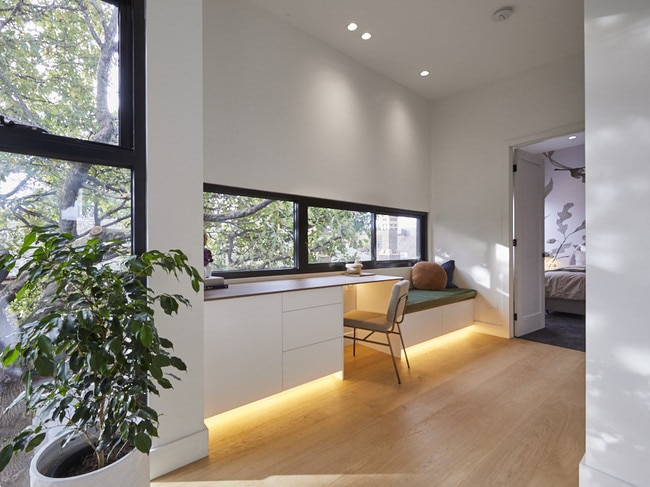
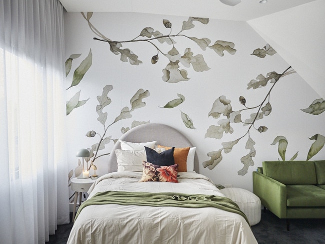
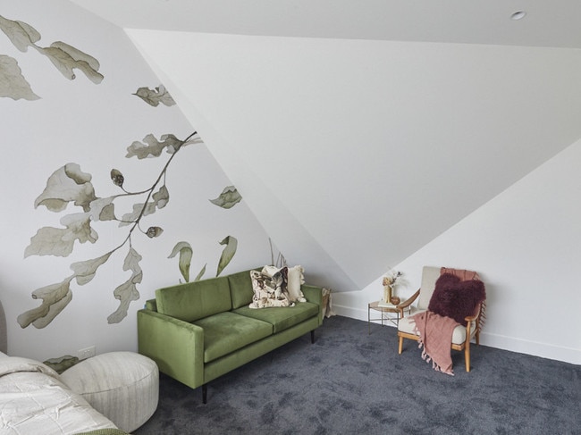
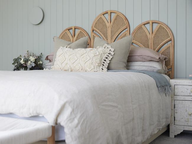
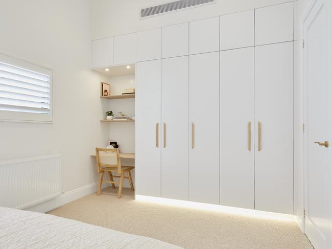
Harry and Tash delivered a bedroom and study zone on their first floor. While the ideas are great, the colour palette is soothing, and the individual pieces are lovely, there are issues to talk through.
The desk zone needs to cater to more than one person. I’d rip the bench seat out and make this a two-person situation. The thin oak desktop, like the entire cast of Geordie Shore, comes off as a bit cheap. Thin tops might be a trend, but not when you’re dropping a few mill on a home.
The bed half of the bedroom is dreamy, but the sloping ceiling with the wallpaper on it feels like a moment from Willy Wonka’s chocolate factory. The room gets smaller and smaller as you move into it. I expected to see a tiny door in the corner that I can crawl through to find the everlasting gobstopper. Love the wallpaper; do not love it on that wall.
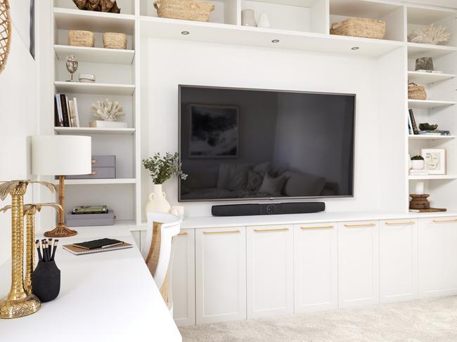
DANIEL AND JADE LANDED IN THIRD PLACE
The idea of a multipurpose TV and study zone is a good one, but like my pores after a big night out, it’s so clogged and congested. The TV unit needs to be floating and attached to the wall to give the room a sense of luxury, while the sofa is too big to allow enough room for the chairs at the desk. The entire desk zone itself is unattractive. Great idea, poorly executed. I agree with my girl Shaynna: Way too much going on here.
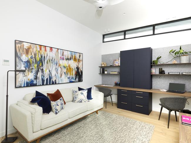
In the bedroom things are the opposite. Sure it’s a small space, but you can still fit two bedside tables with reasonable lamps on them. It felt like an afterthought. They get points for the storage space though. A buyer will love it.
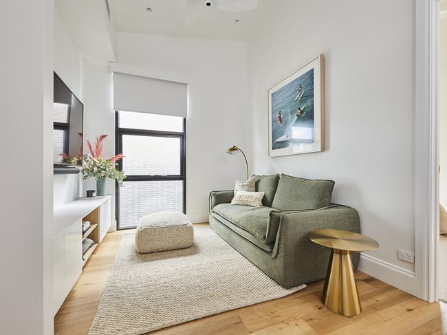
LUKE AND JASMIN SCORED FOURTH
This is the best multipurpose zone of the week. It feels refined, expensive, calm and inviting. In a small space they got a lot in and yet it didn’t feel overcrowded. Beautiful joinery, lovely colour palette, great art choices. Yes, plantation shutters would be better and there’s an issue around the desk drawer. But overall I’m smitten.
On a side note, being in Luke and Jasmin’s home would be the best diet plan ever. All that white furniture deems eating anything near it absolutely not allowed. Sign me up. It’s been a tough winter.
Shaynna said the bedroom didn’t feel relaxed enough but I say it’s too relaxed. I’m missing the grandeur. A fabric headboard and larger bedsides would give this space more wow-factor. It’s currently Kevin Jonas but it has Joe or Nick potential. The VJ panels are amazing, but I don’t see the green wall working with the rest of the home’s vibe. Overall this space is a little Adairs catalogue. There, I said it.
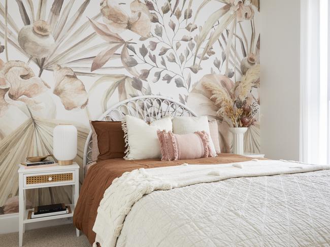
JIMMY AND TAM CAME LAST
Jimmy and Tam’s media room was an odd choice. I have to agree with the judges; it’s too small and has ‘home office’ written all over it. Even if they are going to do an office in their studio zone, a space here for kids to study seems smarter than a chiropractic torture chamber. It’s less Netflix and more neck-fix.
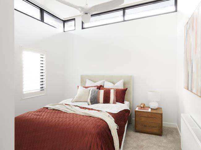
The bedroom is better and speaks to the style of the other room on this level. The two spaces look like sisters and not twins, which is always a nice design approach. The wallpaper is gorgeous but it does make the room feel narrow, and I have to say no thanks to the bedside tables; too small, too cheap. Like Shaynna, I don’t see where they spent their money.
But it was Neale’s comment on the dried flower arrangement that stole the show. He called it “funerial in its ugliness” – and that is going to be my new insult for anything I don’t like. Bad home delivery order? Funerial in its ugliness. Grim weather? Funerial in its ugliness. The offer Jimmy and Tam will get for their home come auction day? Funerial in its ugliness.
Bring on next week!
Chris Carroll is the Melbourne-based designer behind TLC Interiors; an interior design studio and home style blog helping everyday Aussies transform their spaces without breaking the bank. www.tlcinteriors.com.au | Instagram
Originally published as The Block 2020 recap: Upstairs room reveals | Photos