
Pantone have announced their colour of the year, and everyone HATES it
EVERY year since 1990, the Pantone Colour Institute has nominated a Colour of the Year - but things haven’t quite gone to plan for this year’s pick.
Interiors
Don't miss out on the headlines from Interiors. Followed categories will be added to My News.
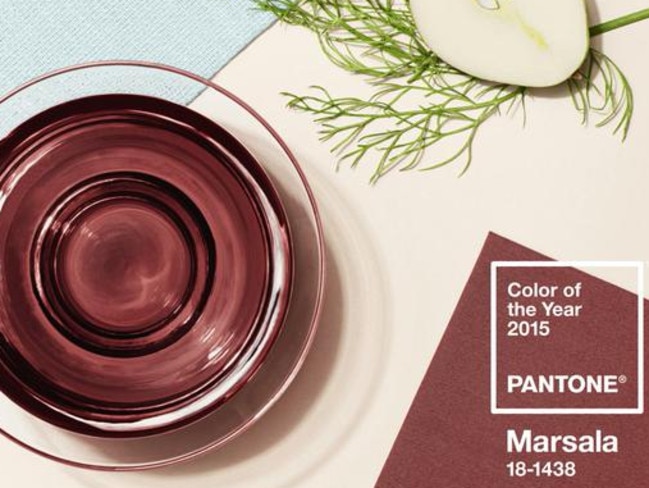
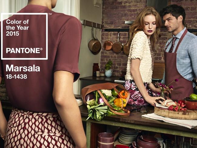
EVERY year since 1990, the Pantone Colour Institute has nominated a Colour of the Year, forecasting which specific hue designers and consumers will all supposedly be using, wearing, and buying for the following 12 months. Last week, Pantone announced that the 2015 Colour of the Year is Marsala.
In a company press release, Pantone described the colour as “a naturally robust and earthy wine red.” While last year’s Colour of the Year, Radiant Orchid, “encouraged creativity and innovation, Marsala enriches our mind, body and soul, exuding confidence and stability,” said Leatrice Eiseman, executive director of the Pantone Colour Institute.
“Much like the fortified wine that gives Marsala its name, this tasteful hue embodies the satisfying richness of a fulfilling meal, while its grounding red-brown roots emanate a sophisticated, natural earthiness. This hearty, yet stylish tone is universally appealing and translates easily to fashion, beauty, industrial design, home furnishings and interiors,” Pantone proclaimed.
While the design blogosphere largely reported the company’s annual marketing gimmick as if on cue, not everyone was as enthusiastic about the colour. After all, colour is a subjective, emotional experience, and there is no accounting for taste. (An even more pointed French expression of that idea suggests that there is no accounting for taste or colours: Les goûts et les couleurs ne se discutent pas.)
New York magazine’s The Cut called Marsala “icky.”
In a post titled “The Problem With Pantone’s Colour of the Year,” The Atlantic pointed out that Marsala reminded some people of “rust, the grimy, gag-inducing type that lines corners or frat boy dormitory-style bathrooms. Or blood, the freaky dried kind whose iron content has been exposed to the air long enough to evoke a dull brick.”
Instead of the gourmet associations of Marsala wine and pomegranate fruit, as featured in the colour campaign’s marketing images, the magazine suggested that it conjured visions of elementary-school mystery meat, liver, and meatloaf.
Here are some of the reactions on Twitter:
Aaaand it's back to the 70s. Why not throw in some burnt orange? RT @WSJ Pantone names Marsala the color of 2015: http://t.co/uBVdmNWZI5
— Murphy Christmas (@murphymiranda) December 4, 2014FFOTD: @Pantone's 2015 color of the year 'Marsala' (http://t.co/Jbf90hfdXn ) was inspired by this: pic.twitter.com/7eqTswstW2
— TheFortDesignStudio (@The_Fort_) December 3, 2014Marsala, colour of 2015? How did I not see this coming? *takes bottle of red and sprinkles clothes* Now it's current, and artsy.
— André (@andreimuri) December 8, 2014Dear lemmings, PMS Color for 2015: Marsala Home Decor. And everyone buys into it. Who decides this stuff? And WHY? http://t.co/DNHqTp9gl6
— being stray (@beingstray) December 8, 2014God, why did Pantone pick such a gross pooey colour as their Colour of the Year? Marsala? More like Arse-ala.
— Mel Campbell (@incrediblemelk) December 8, 2014Eiseman of the Pantone Colour Institute was unavailable for comment on the selection process, but press materials explained that it “requires careful consideration,” adding that Pantone “combs the world looking for colour influences,” including the fashion and entertainment industries, art, popular travel destinations, technology, sports, and more.

This article was written by Kristin Hohenadel from Slate and was legally licensed through the NewsCred publisher network.
Originally published as Pantone have announced their colour of the year, and everyone HATES it
‘Love it’: Kmart selling $390 item for $39
Kmart is no stranger to a good dupe, but this one might just take the cake, with it already flying off the shelves.
Kmart item kicks off viral new food trend
The budget retailer has got behind a much easier and cheaper version of a popular food trend.