
Who decided to shake up one of the world’s most recognisable brands?
IT’S ONE of the world’s most recognisable brands, but Uber has changed its logo — and it’s confusing the hell out of people.

Travel
Don't miss out on the headlines from Travel. Followed categories will be added to My News.
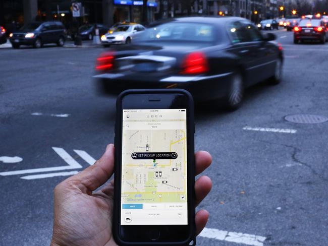
IF YOU’VE updated your smartphone apps this morning, you may have trouble finding Uber on your homescreen.
The ride sharing app has a new logo, and it’s confusing the hell out of people.
Unlike the monochrome U-shaped design that has imprinted itself in the minds of budget-conscious travellers everywhere, the new logo bears no obvious relationship to the company name.
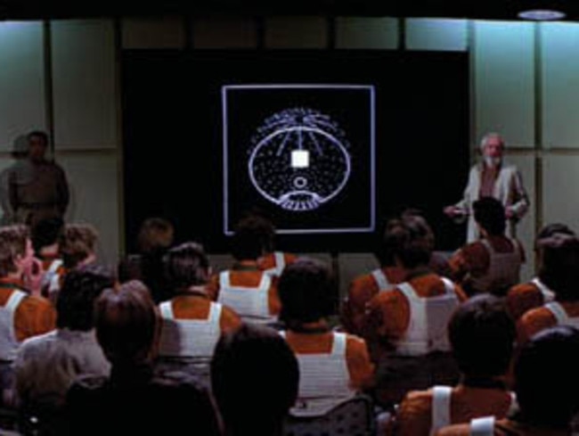
Users will now click on a colourful, patterned icon with a geometric shape in the centre (a circle for riders, and a hexagon for drivers) surrounding a small, bit-like square.


The new look has left some riders bamboozled, with one writing on Facebook, “I don’t like it. At all. The original is super clean. Hate the swirly corners.”
Another tweeted, “I mean, I can’t even tell it’s a logo for Uber.”
Others said the new logo looked like that of a bank, plans for the Death Star I in Star Wars, or OCP, the evil corporation in the film Robocop.
Announcing the redesign this morning, Uber co-founder and chief executive Travis Kalanick said it aimed to reflect the fact the company’s expanded mission.
“Uber no longer moves just people; we’re now moving food, goods, and soon maybe much more,” Mr Kalanick said.
While many in his position would leave the redesign to a creative agency, the entrepreneur took a hands-on approach, hitting the drawing board with his design team — despite having no design background himself.
The result was, ironically, an icon that had to be canned because it was too similar to one launched by the State Bank of India, according to Wired.com.
Along with a new, more legible logotype, Uber’s design team tweaked their overall design concept, incorporating a patterned background that allows different coloured and shaped versions to be used for different aspects of the company’s business.
“With the potential for many apps with many app icons, we needed one approach that connected them all,” Mr Kalanick said.
“This is a framework that will also make it easy to develop different icons for new products over time.”
The brand concept hangs on the idea of “bits and atoms”, with the former representing technology, and the latter the humans who make use of it.
“The old Uber was black and white, somewhat distant and cold,” Mr Kalanick said.
“This belied what Uber actually is — a transportation network, woven into the fabric of cities and how they move.
“To bring out this human side — the atoms — we’ve added colour and patterns. The team has spent months researching architecture, textiles, scenery, art, fashion, people and more to come up with authentic identities for the countries where Uber operates.”
If this all sounds like it’s been conceived by a computer geek, that’s because it has.
But one branding expert thinks this isn’t such a bad thing.
Future Brand’s Australian chief executive Richard Curtis said critics of Uber’s new design did not properly understand how consumers interact with brands.
“People tend to get up in arms when there’s a change of brand, but they ignore the fact that there’s been a change of business,” Mr Curtis said.
“To focus on the aesthetics is missing the point.”
He said it was “perfectly natural” for Uber to transform its brand and logo when it had evolved into “so much more than a taxi service”.
“I don’t think it’s such a bad thing to be designed by an engineer,” Mr Curtis said.
He said creating a brand in a systematic way was preferable to some of the more ill-conceived conceptions by creatives.
“There’s a lot of brands that are superficial, and customers see through it.”
“Branding used to be all about recognition, but now it’s far less about the logo. People don’t buy awareness.
“It’s more about ‘how do I use this brand?’ ... With Uber, you use the brand through the interface.”
Whatever your thoughts on the new look Uber, you’d better get used to the shifting sands.
Mr Curtis said while companies once reassessed their brands every five years, it was now an ongoing concern, as branding took on a wider importance.
And just like Apple has conditioned us to expect regular system updates and product launches, we should get used to brands changing.
And so what if Uber’s new logo looks like that of a bank?
“If you’re walking into a bank it might be confusing, but you’re not,” he said. “So the likelihood of confusion is minimal.”
The new Uber logo makes it looks like a financial-services company, which is already pretty much what it is. pic.twitter.com/xNGls2H9NW
— Robinson Meyer (@yayitsrob) February 2, 2016
Uber has a new logo. It's basically a bank now. pic.twitter.com/cuA56eHKnq
— Brian Solomon (@Brian_Solomon) February 2, 2016
The new Uber logos remind me of 'OCP', the evil corporation from Robocop. pic.twitter.com/mrUPLF3yTe
— dan barker (@danbarker) February 2, 2016
Originally published as Who decided to shake up one of the world’s most recognisable brands?

Urgent travel warning for Aussies
Escalating warfare has forced the Australian government to issue a dire warning, saying flights out of one country may soon not be an option.
After nine years what has ad man Todd Sampson done for Qantas?
As the longest-serving member of the Qantas board, Todd Sampson has been in the firing line over his contribution to the airline but is the criticism deserved?